21+ Best Squarespace Templates for Online Courses
If you are a course creator or coach looking to expand your business by creating online courses, you are on the right track! The online learning industry has been estimated to be worth over $370 billion by 2026, and the number of online learners will likely grow to 60 million people in the near future, according to devlinpeck.com.
Therefore, this is the best time to launch your online courses! So, if you are wondering about the best Squarespace template to build your website as a coach or course creator, which will also serve as a place to host your online course, then you are in the right place!
Did you know that Squarespace has recently launched its course page, which allows you to create limitless courses and offer them at a price? Of course! So, you don’t have to worry about hosting your online courses on Squarespace; it is easy!
Looking for a custom website design for your business? Explore our Squarespace Web Design packages for a stunning website. Need to enhance your site's visibility? Our Squarespace SEO services are here to assist you. Curious about our work? Take a look at our Squarespace website designer portfolio for some inspiration!
Check out this guide on Squarespace Courses
The way to go is to purchase a tailored template for online creators and courses! It is affordable, saves you the stress of designing, and can be set up within days! So, let’s look at the best Squarespace website to host your courses.
Best Squarespace Templates For Online Courses!
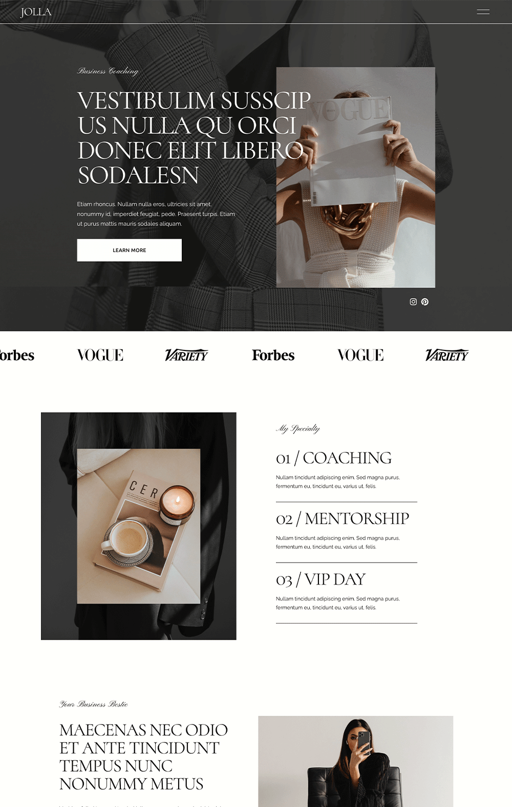
Jolla - Squarespace 7.1 Fluid Engine Template
Talk about elegance and sophistication. Establish your credibility and experience with this sophisticated, clean, minimalist Squarespace template specifically for you and your courses. Jolla is a clean Squarespace website meant for course creators and coaches looking for an online home to house their brand. It comes with a simple home page that highlights your services and includes converting CTA buttons that prompts visitors to take action. If the first homepage isn’t your biggest boast, then you have another home page that is more conservative and short to meet your expectations.
One thing that makes Jolla stand out is its robust and converting service page that tells a short story about your services and comes with a Learn More button where visitors can book that particular service. Beyond this, you get a robust blog page to share your wealth of wisdom and show your expertise. You also have a portfolio page that can serve as a testimonial page for past clients. Beyond this, Jolla is flexible to take as many course pages as you want
If you are looking for a sophisticated, luxurious website that makes visitors perceive your brand as a trustworthy and experienced business, then you should definitely go with Jolla.
Sophia - Squarespace 7.1 Fluid Engine Template
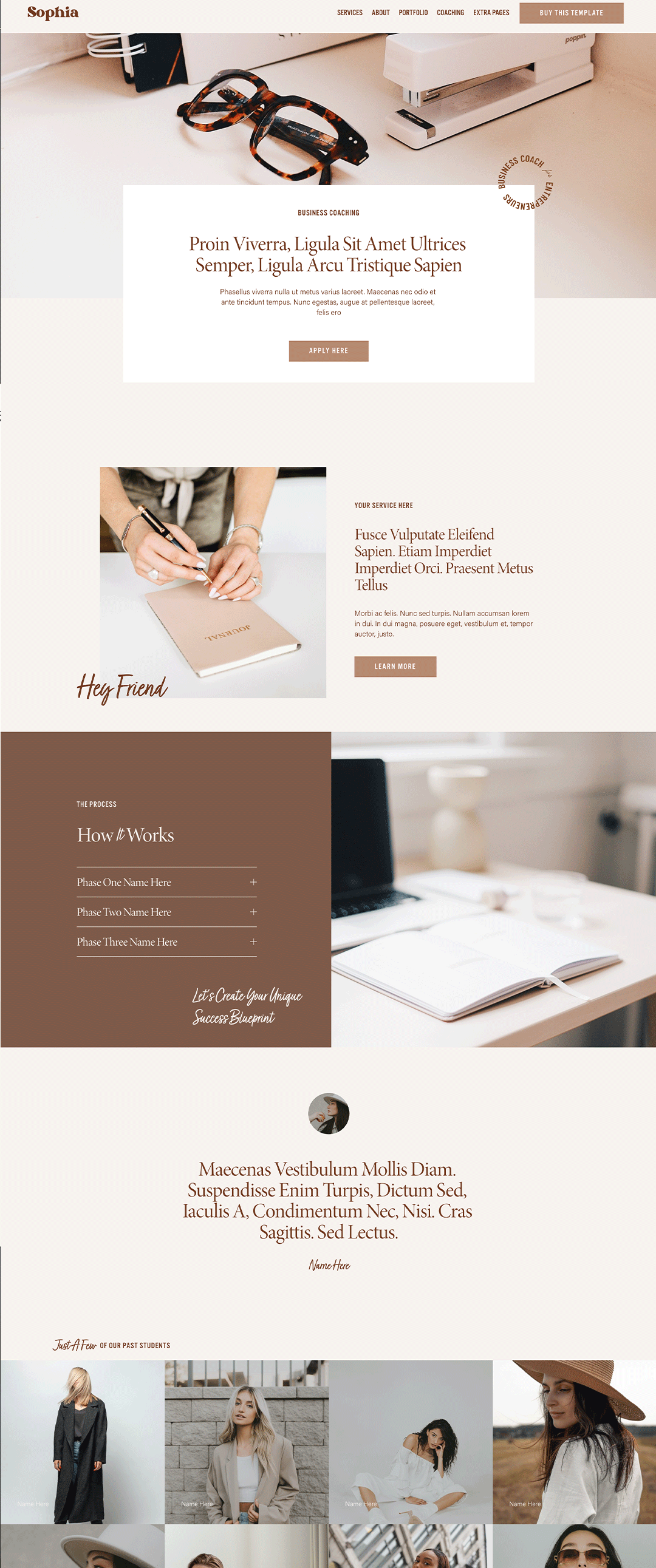
Let your visitor know what you do at first glance with Sophia. With its strategic homepage, Sophia goes straight to the point and lets visitors know you are involved in coaching and courses. It adopts a storytelling layout that guides visitors through your services, your own story, and your past clients' testimonials. You also get a section to promote your freebie for email campaign growth.
Sophia establishes stability and trustworthiness with its earthly brown color scheme that gives warmth. Now, what makes Sophia stand out is its coaching page, which is super beneficial if you are a coach. The coaching page explains the problem you solve and the processes involved in your coaching style. You can highlight your experience and establish your credibility with this page. Beyond this, there is a course page where you can host all your courses and even explain what each course entails.
Sophia is a simple and minimalist Squarespace template that makes visitors feel welcome.
Alia - Squarespace 7.1 Fluid Engine Template
If having a professional yet friendly website is your goal, you must check out Alia. Alia is a professional website built for coaches and course creators; it also gravitates towards the minimalist side by keeping everything clean and polished. I love how visitors can find out how you can help them with their problems on the homepage. The homepage consists of a section explaining what you do and how it can benefit the visitor. At the latter part of the home page, you can talk about your courses or masterclasses. Alia was built with conversion in mind. Therefore, it comes with a strategic layout and converting CTA buttons, ensuring your visitors aren’t disinterested before taking action.
Other pages you can find on Alia are the services pages where you can explain your services, a coaching page to showcase your expertise, a portfolio, blog, courses, instagram, about, and contact page. If you are thinking of expanding your business soon, Alia can make the dream a reality.
Creative Studio - Squarespace 7.1 Fluid Engine Template
The course page of Creative Studio was built with Conversion in mind, and it tells you what to do at each given section. The course page is perfect if you have a course you want many people to enroll in. The course page allows you to explain what the course is all about and then break down the modules and what the students will learn in the course.
After this, prospects can see convincing testimonials from past students, further reinforcing their decision to enroll. That’s not all; you get a section where you can establish whether the course is right for the student. A section tells the students what they can achieve after taking the course. For emphasis' sake, Creative Studio was built with conversion in mind. A prospective student with the Creative Studio course page will find it hard to resist your course offer. However, it isn’t only the course page that takes the limelight, other pages such as the services, shop, portfolio, and about pages are well-designed.
Social.co - Squarespace 7.1 Fluid Engine Template
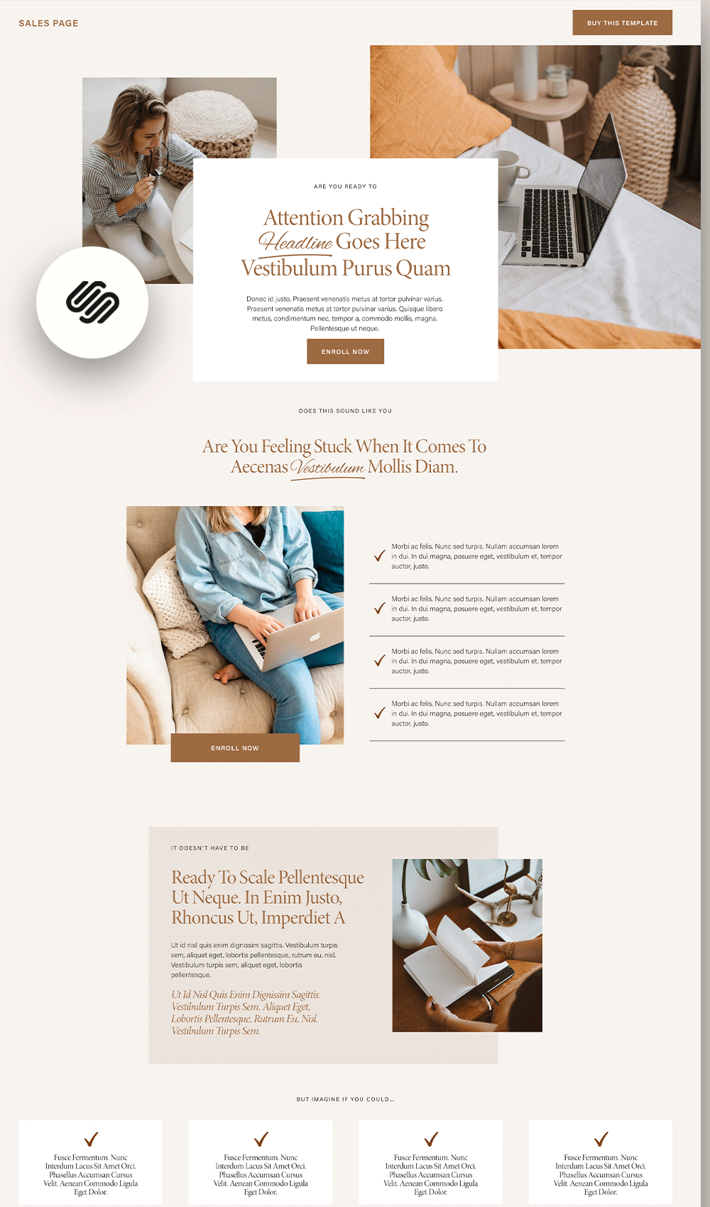
Make it irresistible for your visitors to leave your course page without enrolling by using Social.co sales page. Social.co is a converting sales page arranged strategically to build a sense of urgency in the minds of your visitors until they drop their card details. First, it comes with an appealing aesthetic that sets the tone and gives them valuable expectations. Next, they are greeted with a powerful headline stating the valuable benefits of your course and a CTA button. As they scroll down, they are greeted with the major problems they currently face and how your course can solve them. Their purchase decision is reinforced by strong testimonials and results that are not negligible. Social.co uses storytelling, strategic layouts, and an abundance of CTA buttons to promote your course. You don’t want to miss out on this template.
Sales Bomb - Squarespace 7.1 Fluid Engine Template
Whew! We can’t help but appreciate the visual of this sales page. It comes with stunning designs and elements that tease the eyes. But beyond the professionally designed interface, Sales Bomb forces visitors to enroll in your course without trying too hard. It comes with short but strong copies that scream value. Also, it breaks down what the students stand to gain and what to expect in the course. Giving prospects a glimpse of your product or course works up their appetite and lets them know they are paying for value.
Sales Bomb also comes with a pricing section that breaks down the payment plan; the students can either pay in installments or make a full-time payment. This is perfect as your course isn’t necessarily affordable but value-packed. You can allow students to pay for parts to access the course. Lastly, you introduce yourself and answer frequently asked questions that may hinder students from enrolling in your course. If you want to increase your course revenue, don’t hesitate to purchase Sales Bomb now!
Course Sales Page - Squarespace 7.1 Fluid Engine Template
The last sales page we will look at is this sophisticated course page that brings your course to the limelight. It comes with a conversion layout that tells a story around your course and puts the benefits of taking it in the forefront. It has many image blocks where you can add visuals to your course. Do not forget that images can convince prospects to purchase your course, which is a strong point on this sales page. Beyond the images, the page layout allows each element to stand out and prevent your visitors from becoming overwhelmed. To ensure that the attention is on the copy, neutral colors were used in the sales page which is a great one because the main purpose of the sales page is to get students to enroll in your course.
Influence Course - Squarespace 7.1 Fluid Engine Template
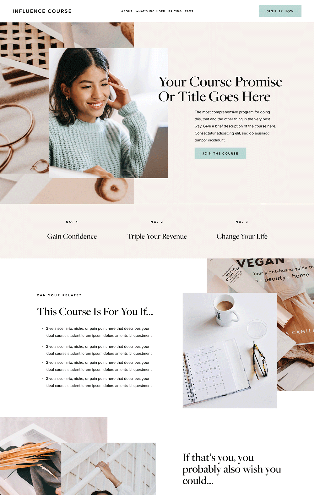
Whew! When discussing aesthetics and cleanliness, Influence should be chosen twice. The interface of this website template instantly brings a smile to your visitors' face and let them know that your business is top-notch and they can expect the highest course quality. Influence is a beautiful and professional template perfect for your course It is a one-paged course website built specifically for hosting your course. One major advantage of this page is that visitors won’t be distracted by another page that isn’t your course page. This template explains everything your prospects need to know before buying your course such as what they need to expect, the benefits of the course, the modules, and success stories. Also, the layout and cute animations add a positive vibe to the overall look. What are you waiting for? This is the template you need!
Shine Program - Squarespace 7.1 Fluid Engine Template
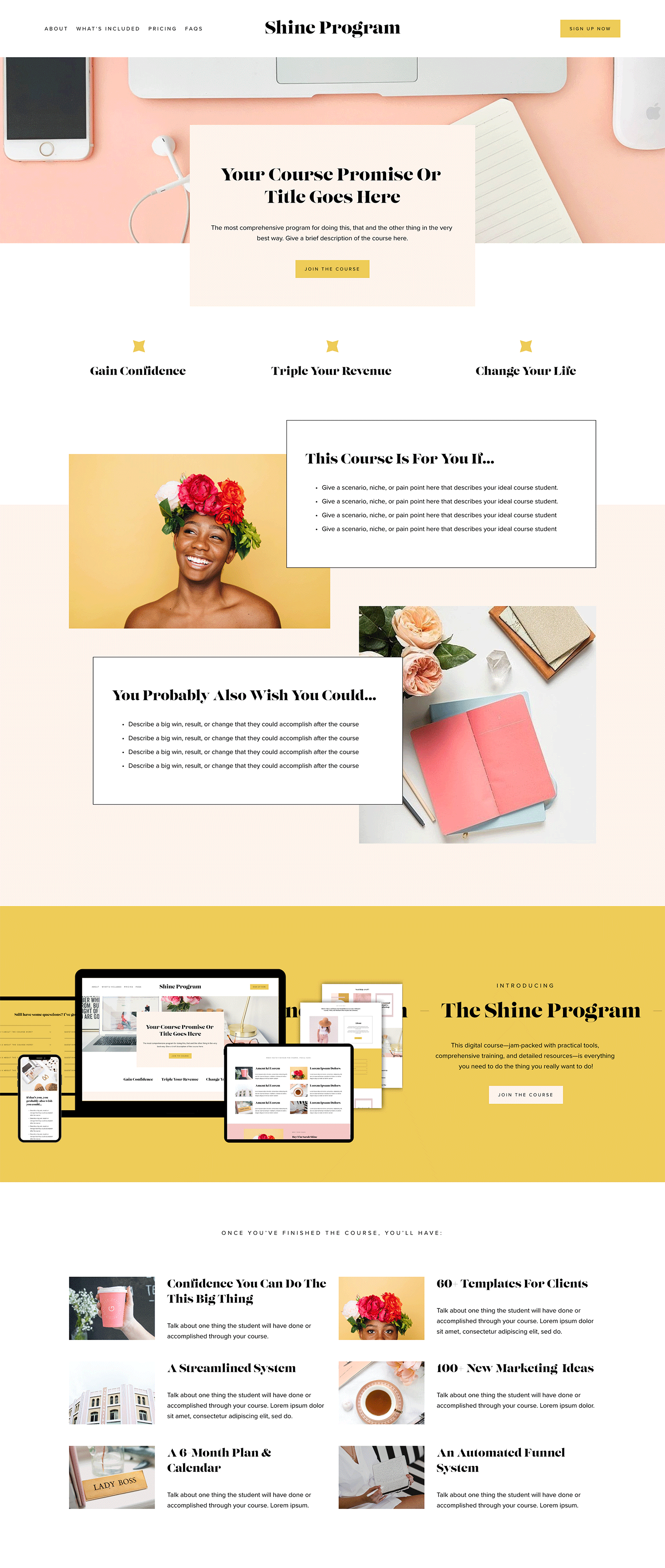
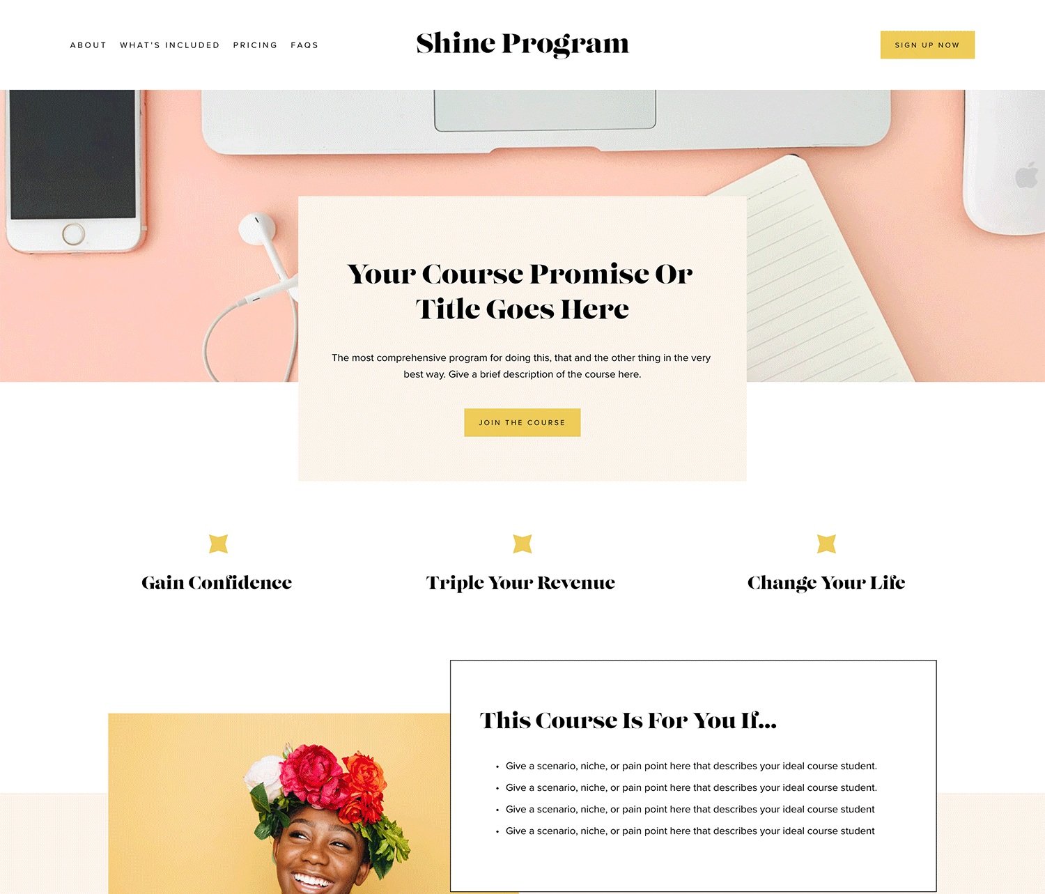
Another one-paged course website coming up is the Shine Program. Shine Program revolves around the course you are trying to sell and combines aesthetics, functionality, and strategic placement to create a converting website. One thing is the strategic placement of the CTA button; wherever your visitors look, there is a button enticing them to enroll. Beyond this, it comes with a sneak peek of the course and a great marketing strategy. You can include a 2-minute video of the course to let students know the value-packed lessons they stand to watch. Also, it has many testimonial sections that convince the doubting Thomases that your course is worth the hype. Lastly, you get to feature your instagram reel on the course page if you want to. This is perfect if students want to check your business socials out.
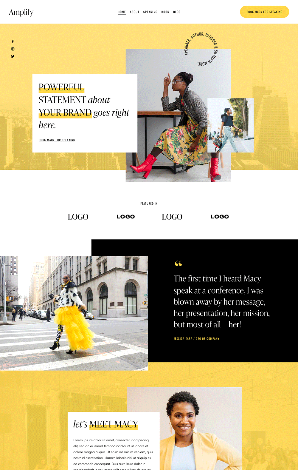
Amplify - Squarespace 7.1 Fluid Engine Template
If you like bustling and vibrant colors, then Amplify is for you. This template is not playing it safe; it is bold and daring. Amplify is a vibrant and professional course page that excites the eyes with beautiful colors and a clean background. Irrespective of the vibrant color, the website looks beautiful and professional. It was created with sales in mind, so every section and layout were strategically arranged to complete the buying process. Amplify has a book page where you can talk about your book(s) or courses if you will soon be a publisher. Also, you’ll find the speaking page fascinating if you are a coach. The speaking page allows you to include videos and keynote speeches of past events, giving clients a reassuring pat that you are more than capable. There is a blog page if you want to share your wealth of wisdom and an About page to talk about your unique self and experience.
Jada - Squarespace 7.1 Fluid Engine Template
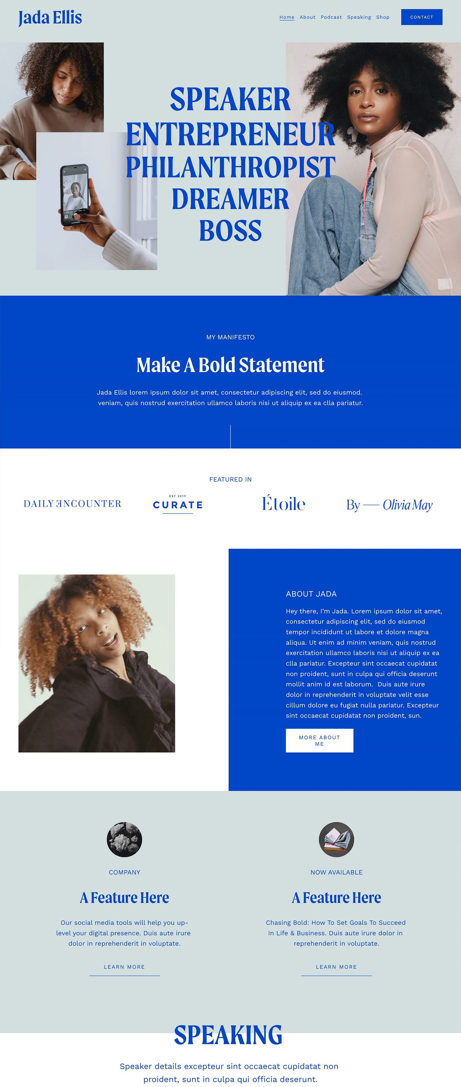
Jada is a bold course creator website that is not afraid to shine. Its blue color scheme establishes trust, stability, and credibility. The choice of fonts also gives it a professional but luxurious look. Jada is a perfect template if you want your visitors to perceive your brand as a business they can trust. It comes with useful pages such as the speaking page where you can highlight your past speaking events while adding the keynotes and videos of you in action. The Podcast page is perfect for hosting podcasts if you have one. It can also be converted to a course page if you don’t need a podcast. There is a shop page for selling products of any kind and then an about page to talk more about yourself and your unique experience.
Rose - Squarespace 7.1 Fluid Engine Template
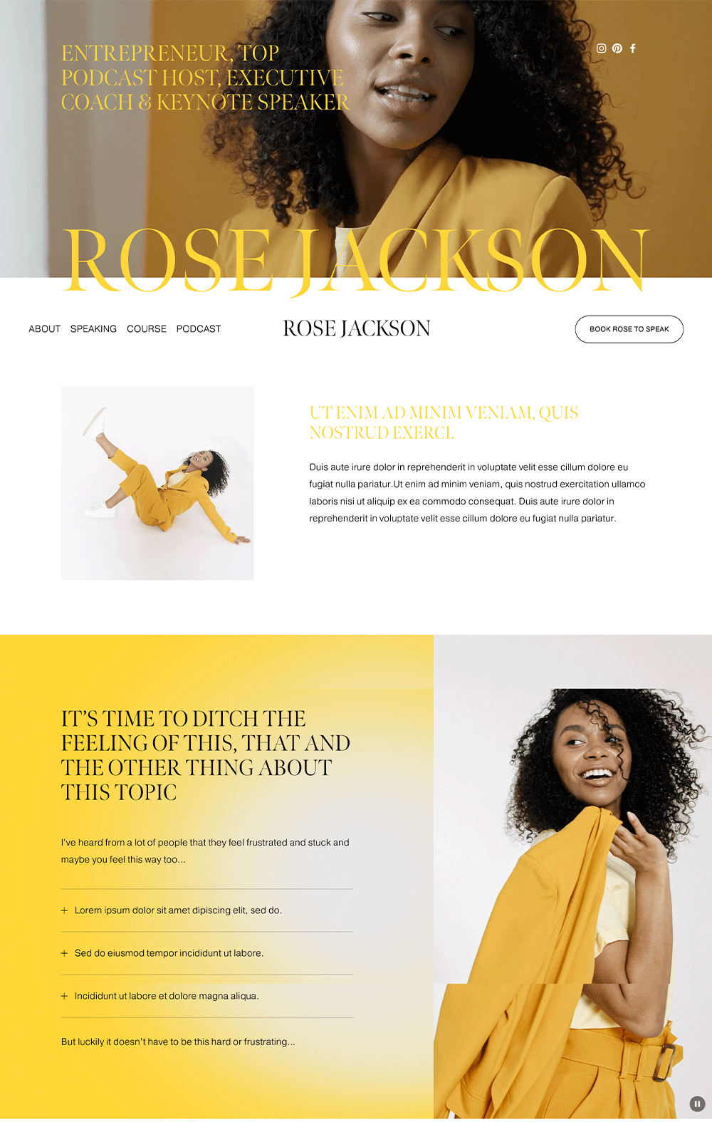
Rose Jack is a breath of freshness and uniqueness. Its choice of bold colors makes it look unbeatable, and the choice of legible fonts gives it a sense of cleanliness. Rose has a great storytelling layout as its homepage, and it takes your visitors through an unforgettable experience. Each section was designed with conversion in mind, therefore, it doesn’t take long before visitors start taking action. Rose comes with promising pages that are perfect for coaches and course creators. You can highlight your past experiences, offer freebies, host your courses, and build a professional online presence. If you want a bold yet professional website, then you should try out Rose!
Club Collection - Squarespace 7.1 Fluid Engine Template
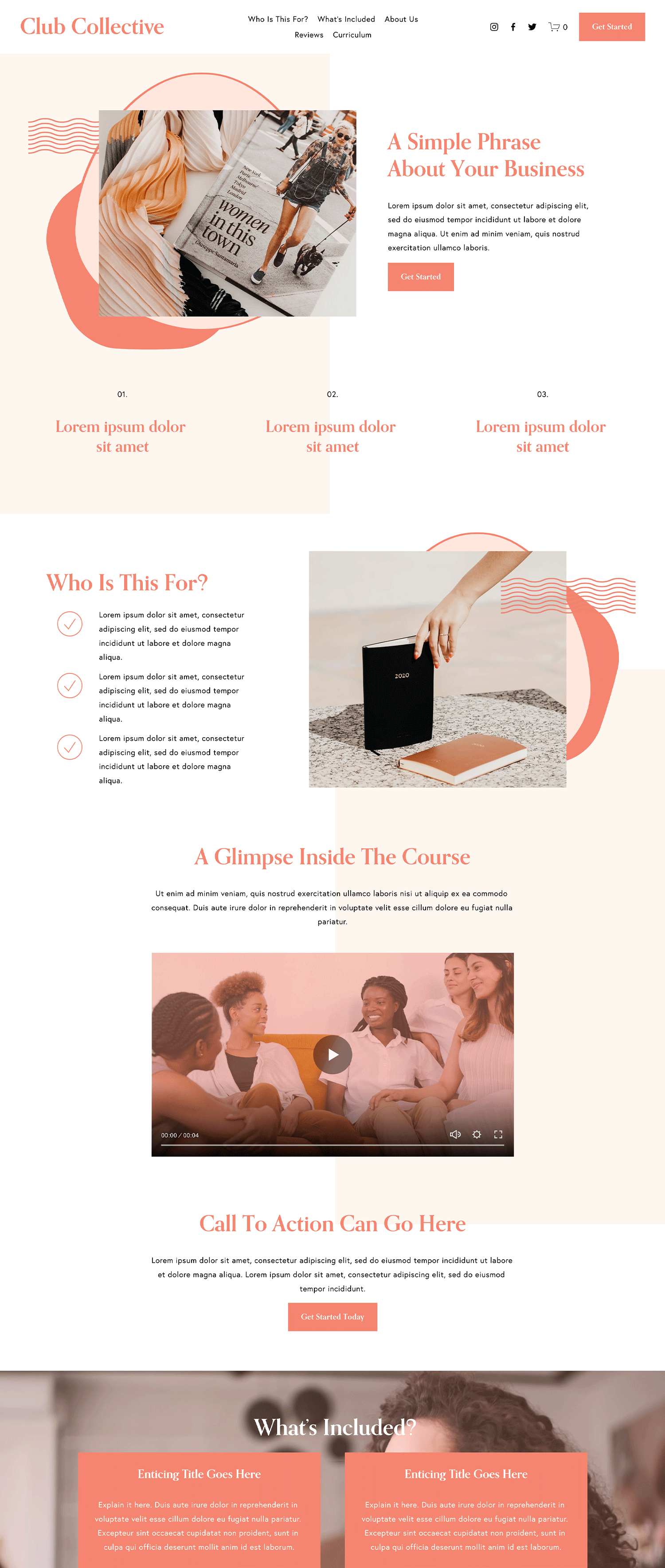
If you want a friendly and interesting website that looks professional, check out Club Collection. Club Collection features quirky elements and vibrant colors, giving it a fun yet modern look. It is a one-page website designed for online courses, and it takes your visitors through your course, highlighting its importance and benefits. You get sections such as reviews/testimonials, pricing plans, frequently asked questions, a freebie for email list growth, and the curriculum of your course. This is a perfect template if you want an interesting yet professional website for your course sales.
Ava Grand - Squarespace 7.1 Fluid Engine Template
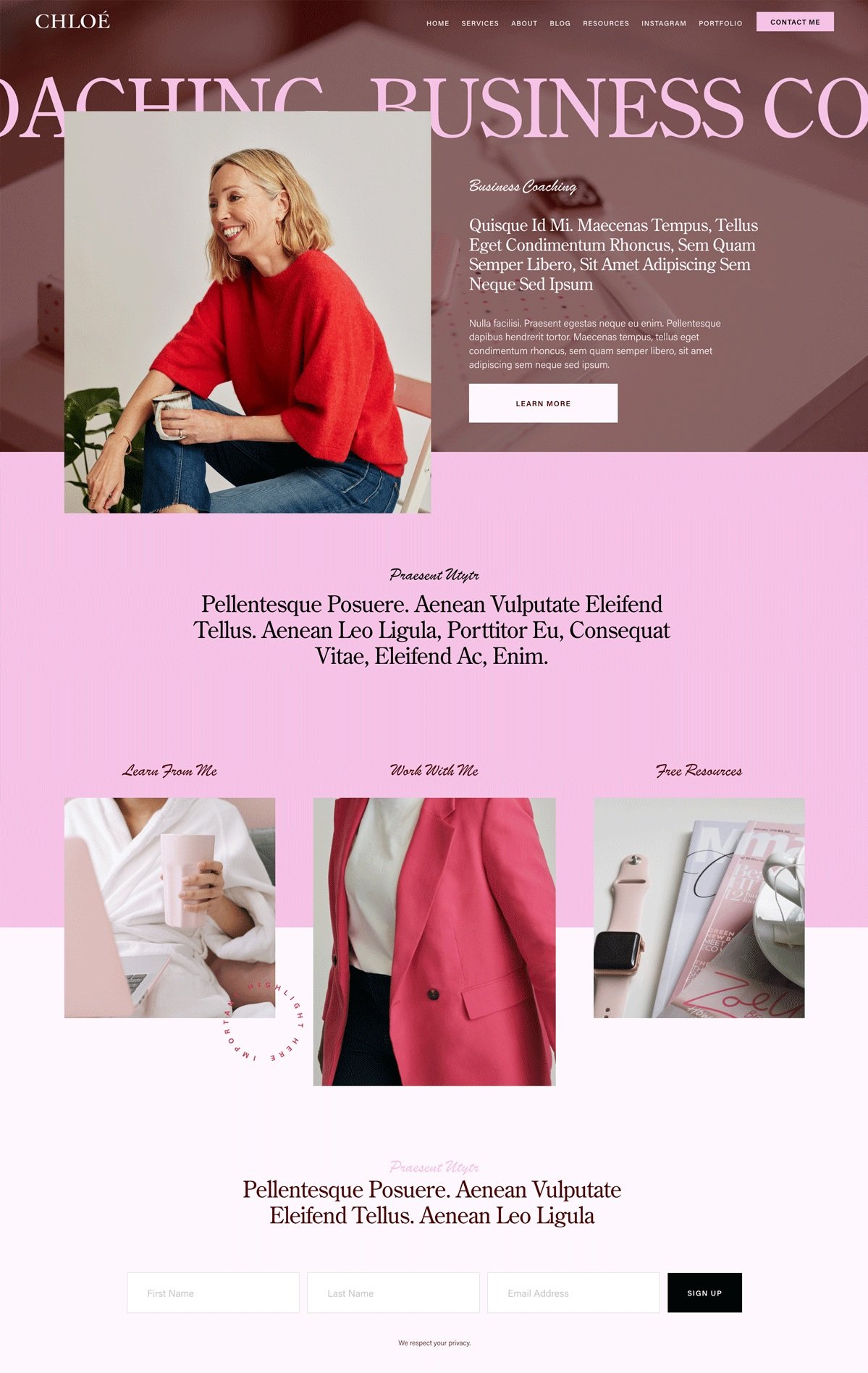
Ava Grand shows your creativity and uniqueness with its standout template. Ava Grand is a modern yet fun website template perfect for coaches, brand managers, and course creators. Its combination of pastel colors keeps everything cool and neutral. Even though some design elements are in the background, it maintains a minimalist and clean look. Ava Grand has a free resources page that can serve as your blog. So, if you want to take their content game to the next level, you’ll find this fascinating. There is also a contact and about page where visitors can contact or learn more about you. Ava Gran is simple, classy, and sophisticated. Give it a try!
Verano - Squarespace 7.1 Fluid Engine Template
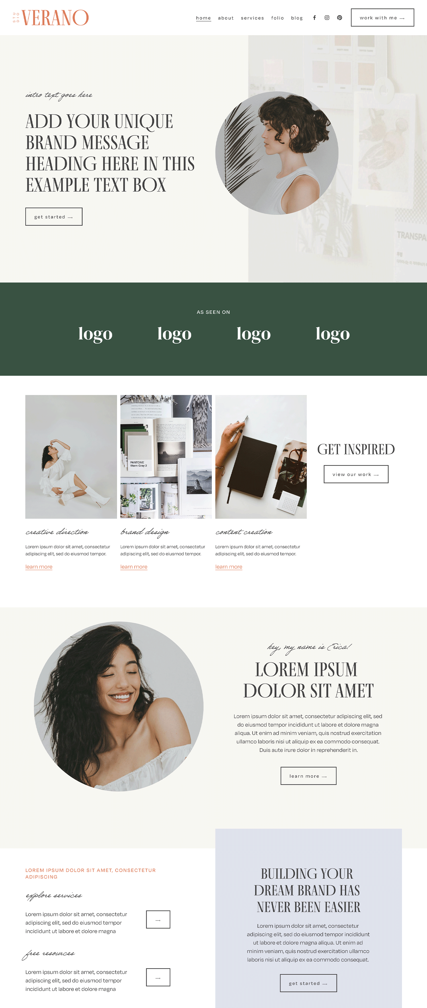
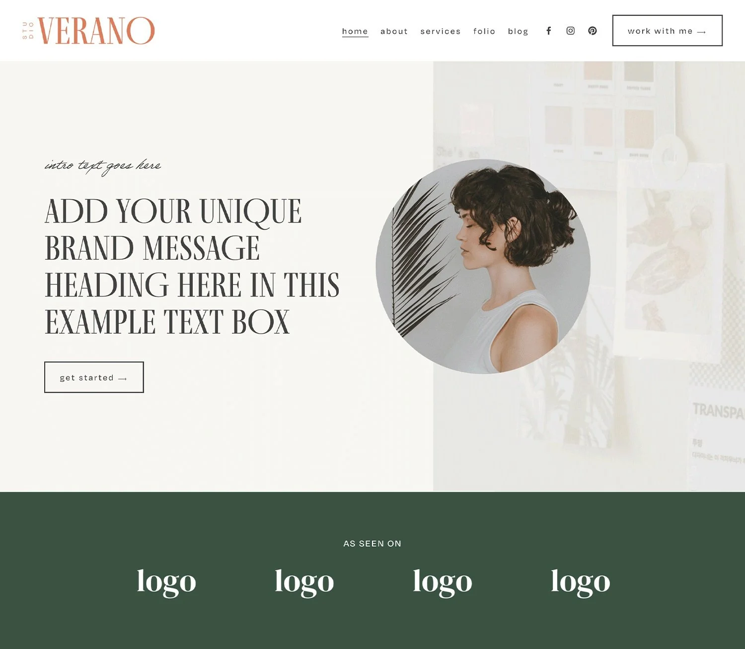
Last but not the least is Verano- A modern font that is modern and sophisticated. Verano doesn’t have to try too hard to look Good. However, beyond its wonderful aesthetics, Verano has a converting layout and pages that cater to your business needs as a course creator. You have a beautiful service page highlighting your expertise and a portfolio page that can showcase your past works and serve as a testimonial page. If you don’t want these two, you can convert it to your course page and host your courses. Last but not least is its blog and about page, where you can share more of your wisdom and tell a story about yourself.
Purchase your Squarespace Templates Now!
We’ve provided you with the best Squarespace templates for online courses, and there are still many more on our Template Shop. These templates were built with conversion and relationship building in mind, therefore, you don’t have anything to worry about. Also, each template was designed by professional Squarespace designers with ample knowledge; you can be assured that each design is modern and professional.
Wouldn’t you want to set up your websites in a few days without having to learn about web design or pay thousands of dollars to a developer? If yes! Then purchase a template today and build your website in days!
