
35+ Best Adobe fonts pairings for your next project
Adobe fonts have been one of the best go-to places to get the best fonts for various projects. Its versatile collection of fonts makes it most designers' number one place. In this post, we will be looking at the best Adobe font pairings for your design projects.
Your choice of font pairings can determine how the overall look of your project will turn out. And if you are starting out, it can be a daunting task to match two fonts together. To eliminate this worry, I have come up with the best adobe font pairings you can use for your next design project.
To access adobe fonts for free and get unlimited access, you will need to be subscribed to the Adobe Creative Cloud plan, which allows you access to Adobe software. Once you do this, you get access to the adobe fonts library, which instantly makes designing better! The best part is that these fonts are commercial fonts, so you won't have to worry about dealing with licenses, etc.
Without further ado, let's check them out!

Map Roman is an elegant serif font that instantly takes your breath away. It is a titling uppercase font that simultaneously fits headlines and brands that want to look luxurious and simple. A more subtle, elegant font creates a stunning look when paired with AlgaAlga.
These two font pairings come in different widths, but the bigger, the better for Map Roman, and sticking with AlgaAlga regular or light style will get the job done.

Quiverleaf CF sans serif font is simply stunning. I chose Quiverlea as the headline font because of its simple yet stunning nature. Quiverleaf succeeded in looking simple with no distraction, but its strokes give it that elegant flare. Quiverleaf CF comes in five different weights; however, going for the Extra bold weight will make Quiverleaf fit perfectly as the headline font.
Tenon light shines as the body text font with its simple, geometric design that makes it fit into the tinniest sizes. This font pairing is stunning and a great font for your next design.

Swear display font is a versatile font that can fit into almost everything. It comes in three styles and 18 weights. Its clean strokes that feature a bit of drama give it that professional look. Swear Display font can pass for legal businesses and still do well for luxurious brands when you use the italics style.
Noka, on the other hand, was designed to be clean, simple, and legible. Its legibility makes it perfect for paragraph and body text font.

Silver Display comes in looking stunning and elegant all the way. The serif-like strokes give it that classy and elegant look. Silver Display will pass well as your headline font for your next project. This font also stays versatile by coming in different font packs for your use. The silver display semibold font is a great choice for headlines.
Filson Pro doesn't need to do too much to make its presence known. Its simplicity and legibility make it perfect for body text font. Filson Pro is great for content-heavy websites or bloggers. I will highly recommend this font pairing as your next design choice.
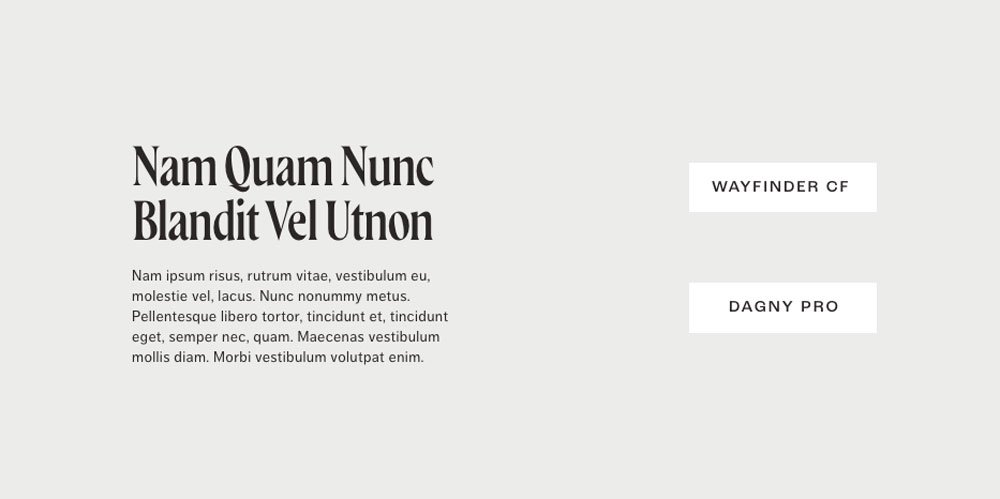
Want a strong and bold font that instantly dominates? Then you should try Wayfinder. This font was created to be bold; even its thin weight is bold. Wayfinder comes into any design with authority and elegance. The subtle stroke designs also give it that cool look. Wayfinder was destined to be a heading font.
How else can you balance a bold and dominating font out except with a more subtle, clean, and simple font? That is where Dagny Pro comes in. The sans serif version makes it suitable for body copy text and gives it that simple but clean look.

Fino sans is another worthy headline font that keeps things simple. The only dramatic swashes you will see are the Q letter. I love that the Fino Sans alternating thin and thick strokes give it dynamism, making it versatile for different designs. Fino Sans comes in different weights, and the one you go for is totally up to the type of design project you have on hand.
Mostra Nuova keeps everything simple and clean with its strokes. Its uniform strokes give it stability and trustworthiness, making it perfect for paragraph font. These two fonts are one of the best adobe font pairings for versatile projects.

Campaign combines professionalism and dynamism like a pro. It keeps things simple but spices things up occasionally with some dramatic strokes. I mean, look at the letters 'K' and 'Z.' Campaign is a great font for headings; going for the medium or regular font is a great choice. However, there are bolder options depending on your project's goals.
Le Monde Journal Std, a serif font, does a great job of fitting perfectly as a body text font. The clean strokes make it suitable for any font size.
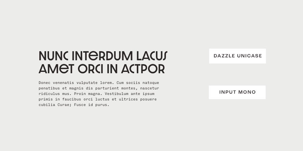
Dazzle Unicase is a tight-set font that keeps it simple and professional. The lower cases fit the capital x-height and stay consistent. Dazzle Unicase is definitely a font created for headings. The tight space gives it that cohesive and professional look. Dazzle Unicase will fit perfectly for standard businesses that want to keep things professional all through
As you may have guessed, Input Mono Sans is so versatile that it comes in 56 fonts to choose from! This font is perfect for paragraphs because of its simple nature. However, Input Mono is versatile enough to fit into different arrays of projects.

Tangier is a stylish font suitable for luxurious projects, branding, and advertisement. Its slanted strokes and dramatic swashes give it that luxurious and elegant look. Tangier is your go-to font if you are looking for a unique and stylish font for your headings. It comes in various weights to choose from
Interstate light balances out the stylishness by maintaining its cleanliness and legibility. In addition, the strokes are fully adaptable to small sizes and can pass for the body font. So, if you are looking for a legible font that goes perfectly with Tangier, look no further!

Kepler has 168 fonts, ranging in different styles and weights. Kepler Std did well with the serif-like character, making it suitable for headings. Its versatility also makes it perfect for different projects, ranging from content heavy to branding projects. Kepler std bold or semibold is a great choice for your heading font.
Long-form text needs to be visible and clean enough for anyone to read; that is why Nuvo Pro stayed out from distractions. This font comes with simple, uniform strokes and ten different fonts. I will recommend Nuvo Pro regular for your paragraph text.

Bookmania is a beautiful font that fits into any heading. Whether you want to keep things simple or add a bit of drama to them, Bookmania is ready for any design. It comes with loads of alternates and weights to spice up your designs.
You get a stunning font pairing when bookmania is combined with interstate light. The simplicity of interstate light adds a breath of freshness and legibility to the overall look of your design. These two adobe fonts are a great choice for your next design project.

Your heading can never go wrong with this adobe font. Anisette is an art deco font with sharp edges that soften as it gets bolder. This serious font gives your design a professional and business-like look. It comes in eight styles, making it suitable for varieties of designs.
Dusk Regular compliments the Anisette Std font because of its legible and clean nature. These two font pairings are definitely a good one for your next project.

Le Monde Journal Std is versatile and can pass for a heading and paragraph font. It only depends on the weight you use and how you combine both fonts. The Le Monde Journal Std Demi will make the perfect heading weight for your design.
Filson Pro, on the other hand, complements Le Monde Journal with its simple nature. You can write long text without the text looking clumsy. Each word stands out with Filson Pro.

Niagara reminds you of the past century's print days. Its sharp strokes and vintage look make it suitable for press-like websites. In addition, Niagara is a tight-spaced font that maintains a classic look. This adobe font will definitely be great for vintage-themed designs.
To ease out the vintage look, Bressay comes in. Bressay is a more contemporary adobe font with soft curves and clean strokes. Every single letter in Bressay flows seamlessly, creating a stunning look. Bressay is perfect for body text and can adapt even to the smallest sizes.

Lust Script font instantly turns any design into a stylish masterpiece with beautiful script letters. Although it is a script font, Lust still maintains its legibility making it suitable for headings. Lust comes in different weights and styles that you can choose from. If you are looking for a stylish font for your headlines, try out Lust.
Depot New is a sans serif font with varying styles and weights. These weights and styles fit into different projects them. However, I will like to recommend the Depot New Condensed Light for your body text.

P22 Macknac gives that clean and contemporary look. This adobe font is suitable for headings and comes in varying weights and styles. The P22 Mackinac Pro bold will go perfectly for headings, which is a good consideration for your project. However, nothing stops you from using other bold weights for your headings.
Arboria is another contemporary, clean font that can fit into your paragraph font. It stays clear from any distracting additions and rather sticks to simplicity. Arboria also comes in different weights and styles, so you are free to experiment with any until you get the perfect style for your project.

The interlinking swashes that move from one letter to another give Gautreax an endless and seamless flow. It is just like a river that keeps flowing. Gautreazx is a script font that gives your design an organic and easy flow. The stylish font is suitable for establishing a form of luxury and elegance in your designs. Due to its script type, Gautreax is suitable for the heading font.
Depot New rather stick to the simple side of the spectrum. It is clean, legible, and simple, making it an ideal adobe font for body copy.

If you are looking for a simple headline font for your design, you should go for Dagny Pro. Unlike other heading fonts, Dagny Pro keeps everything simple and legible. Its simplicity makes it pass for both heading and body font. However, if you go for the bold size of Dagny Pro, you will get a perfect and bold heading for your design.
To balance it out, you still need Dagny Pro. However, in this case, you will go for the Dagny Pro light or Dagny Pro regular for the body text font.

You can never run out of weight with Brother 1816. Although the name sounds as if the font will be a vintage font, it is the exact opposite. Brother 1816 features a contemporary touch that makes it pass from modern designs. For example, the Brother 1816 medium and bold are perfect for heading fonts.
The best way to balance this contemporary font is to use a serif font as your body font. Although bookmania also falls under the contemporary spectrum, it has a serious and professional look because of its serif characteristics. These two adobe fonts will make a great font pairing for your project.
related article: 16 Best Squarespace Font Combinations For Your Business
Alverata maintains its elegance and sophistication while remaining simple. Alverata is the type of font that makes every word look elegant and unique. Using alverata for your heading font is a great choice if you want to keep things simple while remaining elegant.
Baker Signet BT Regular balances everything out and creates a wholesome look for your design. The simplicity and cleanliness of each letter make it suitable for any size and gives your design a clean look.

Freightbig Pro is a serif font suitable for heading fonts. The font stays between professionalism and elegance, giving it versatile use. You can use Freightbig Pro for different designs, including branding and technological website. This font gives a classic vibe that is irresistible.
Supria Sans, on the other hand, is so versatile that it can pass for both heading and body font. However, combining it will Freighbig Pro as the body font is perfect. Going for the Supria sans condensed light or condensed regular is ideal for the body text.
related article: 40 Best Luxury Fonts To Spice Up Your Brand
Bebas Kai comes in 40 weights, making it versatile for different projects. To make it perfect for a heading font, go for bolder weights. That way, each word can stand out, and you can establish a visual hierarchy on your website.
Interstate is a body font that can function in different sizes because of its uniform and clean strokes. When combined with Bebas kai, it creates a perfect symphony.

New Spirit gives a fresh breath to designs. Its modern design introduces a relatable feeling. For the best effect, go for the bolder weights. New Spirit is perfect for many designs, so you have nothing to worry about.
As you may have guessed, Houss Round wide is adaptable and legible for long-form text. In addition, it comes in different weights and styles for your projects. These two adobe fonts create a clean, professional font pairing for your projects.
related article: 47 Best Art Deco Fonts For Any Creative Projects

related article: 26 Canva Font Pairings For Your Next Design
27. Soap & Noka

related article: 45+ Best Geometric Fonts To Use In Your Designs

related article: 25 Luxury Fonts For Logos To Spice Up Your Branding

related article: 50+ Best Spooky Fonts For A Scary Halloween Design
33. Noka & Sabon

related article: 51+ Best Sports Font For Graphic Design, Branding, And Logo Design

related article: 41+ Groovy Font For Your Next DesignBest Adobe fonts pairings for your next project
We've gone through 35 font pairings for your next project! Of course, I am sure you would have found one or two pairs that caught your attention. Once you are subscribed to the creative cloud plan, you can use adobe fonts for free.
However, there are more fonts you can check out. As a designer, you need fonts that match your project's theme. Sometimes you will need luxury fonts, and other times a spooky font is all you need. So, I have also taken care of that and have compiled different font types you may need ranging from Boho fonts to Masculine fonts.