16 Best Squarespace Font Combinations for Your Business (2024)
Fonts, without an iota of doubt, has a major role to play in your business. It determines how people perceive your brand and whether they can trust you. If you have been told that fonts do not matter as color and content does, I am here to let you know they’ve given you the wrong perception. Getting the right Squarespace font combination can make a major difference in your branding. That is why getting the right font pairing for your business is what we will be looking at today.
I will walk you through the best 14 Squarespace font combinations for your business, no matter your business niche. But before then, let me address some common questions people do have.
Looking for a unique website design for your business? Explore our Squarespace Web Design packages for a stunning website. Need to enhance your site's visibility? Our Squarespace SEO services are here to assist you. Curious about our work? Take a look at our Squarespace website designer portfolio for some inspiration!
How do I choose a font for my Squarespace Website?
Choosing a font isn’t rocket science as some put it. Though we will discuss extensively on the best fonts to use in the latter part of this article, here are three things you must watch out for when choosing a font.
Legibility:
It is one thing to communicate to people, it is another thing for your information to be readable. In as much as stylish fonts can beautify your website, it is best to stick to a font that is readable yet beautiful.
Stick with 2-3 fonts:
You may feel one way to beautify your website is using different ‘stylish’ fonts but in the real sense, it does not. It further makes the website looks inconsistent and messy. Make sure you stick to 2 to 3 fonts, and if you still feel like beautifying your website with more fonts, use different styles and weights of the chosen fonts. It is best to keep it simple and readable
Keep your target audience in mind
Is your business targeted at serious-minded people or do you want people to instantly feel excited when they land on your website?
Typography is one of the ways to achieve your branding goals. It is important to go with a font that matches your brand’s personality.
The first letter communicates love and passion while the second letter looks like it was written by a psychotic person that is not taking no for an answer.
Related Article: How To Add Custom Font To Squarespace Websitehow to change fonts in squarespace?
If you want to change the font that comes with your website template, it is easy to do.
Step 1: First, tap any page that you want to edit. Click the edit or pencil icon Click the paintbrush icon. It would bring out the site styles
Step 2: Click on fonts It would take you to the font information page If you want to change your Heading, paragraph or buttons, go to Global Text styles and click on the style you would like to change
Step 4: Click on the font family to change the font or browse for other fonts. When you find your preferred font, select it and voila!
Your font is successfully upadated
Squarespace font combinations for any business
Here are 14 selected font pairings from google fonts and adobe’s type kit, that are also available within your Squarespace 7.0 or Squarespace 7.1 account
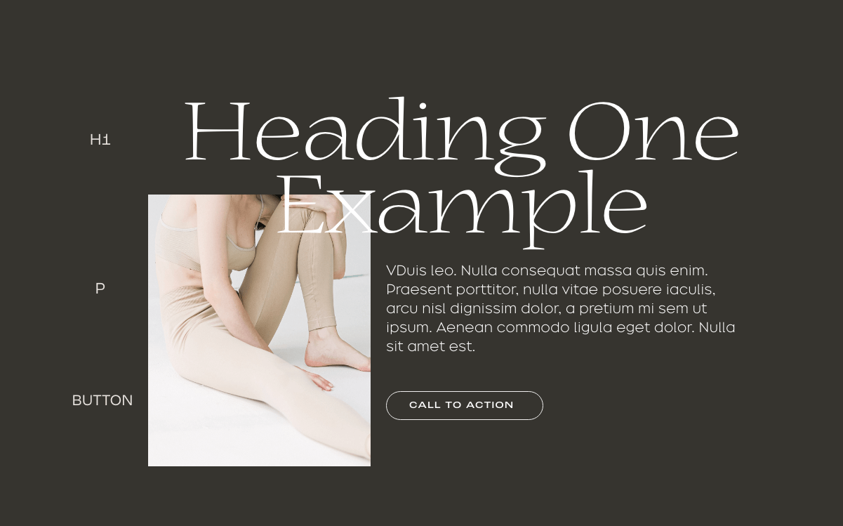
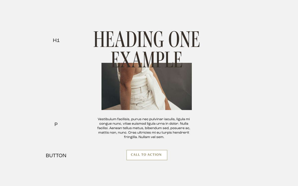
1.Mostra Nuova & Proxima nova ( font combination )
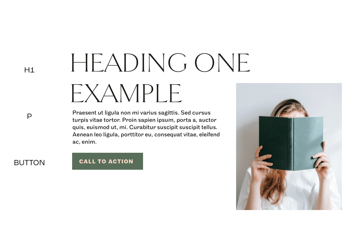
H1(title): Mostra Nuovaparagraph:Proxima NovaButton: Mostra NuovaIf you are looking for simplicity at its peak, this is the font pairing to go with. This clean font pairing gives a minimalistic touch to your brand. Mostra Nuova has a geometrical appearance to it signifying perfection. It comes in nine different weights which allows you to play around with the font. It further amplifies its simplicity and perfection when paired with Proxima nova as the body text font. Proxima Nova also comes in eight different weights and styles. If you want your website to be remembered as clean, simple yet authoritative in its field, this is a font to go with. Best for editorial websites, content-heavy businesses
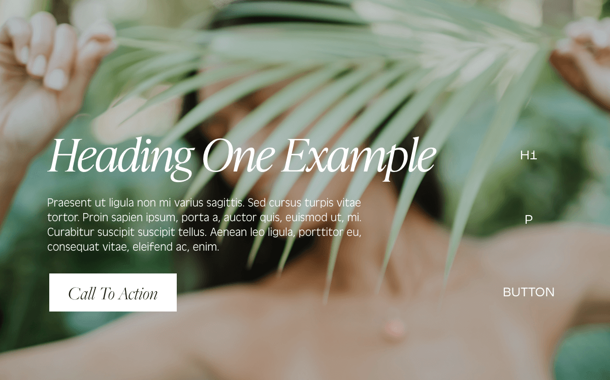
2. Prestige Elite Std and Zeltung Pro ( font combination )
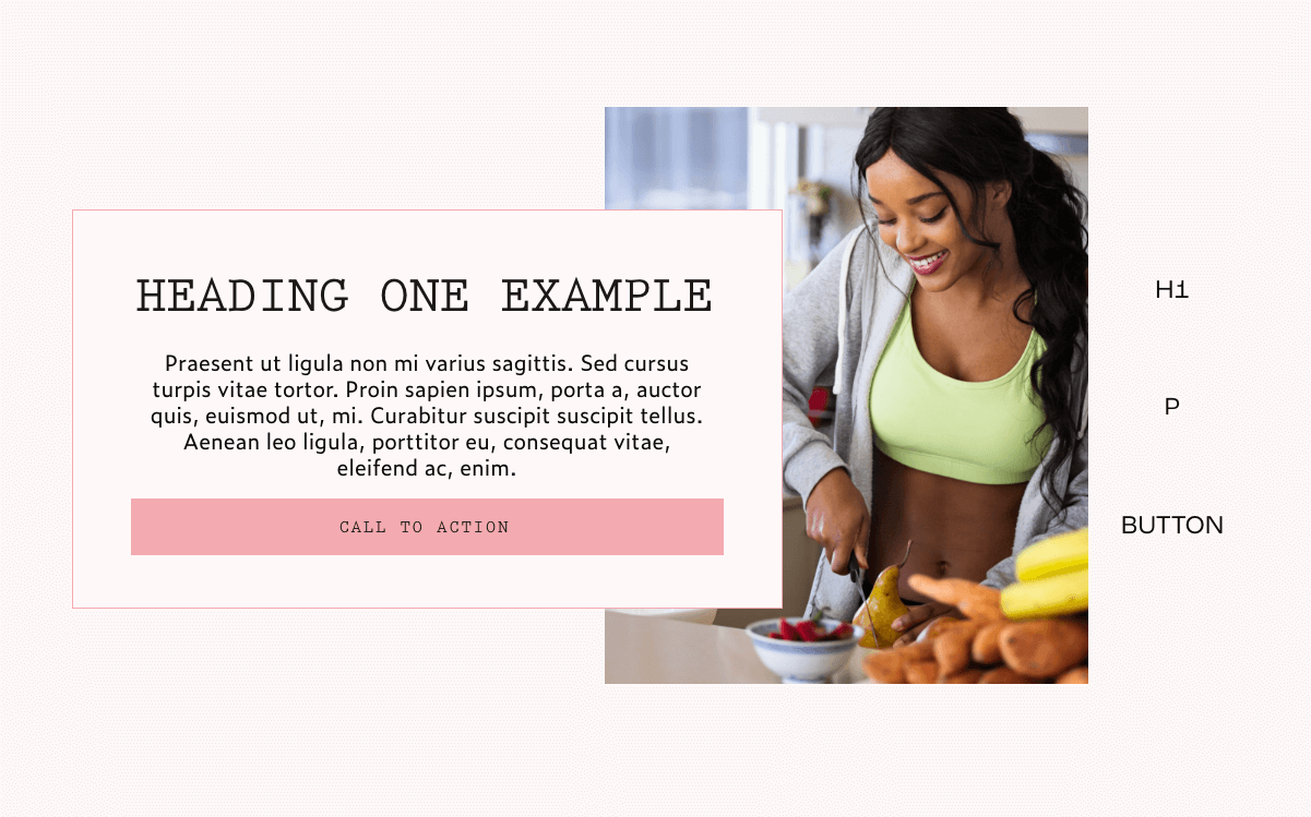
H1(title): Prestige Elite Stdparagraph: Zeitung ProButton: Prestige Elite StdOne thing I love about prestige elite std font is that it takes you centuries back to when print was prominent. It gives you a classy and authoritative vibe. If you want your business to give out that bygone days’ vibe, this is the right font combination for you. It supports over 51 languages, therefore if you are considering translation as an option in your business, this is a great font to use. Not only that, it renders mathematical symbols, financial charts in a beautiful way. It is well balanced out with Zeltung Pro.
Zeitung Pro brings in the modern look thereby giving the overall classy but modern feeling to your users. It comes in 32 weights and styles. If you own an antique store or your business deals a lot with financial charts, tables and diagrams. This combination is what you should settle for.
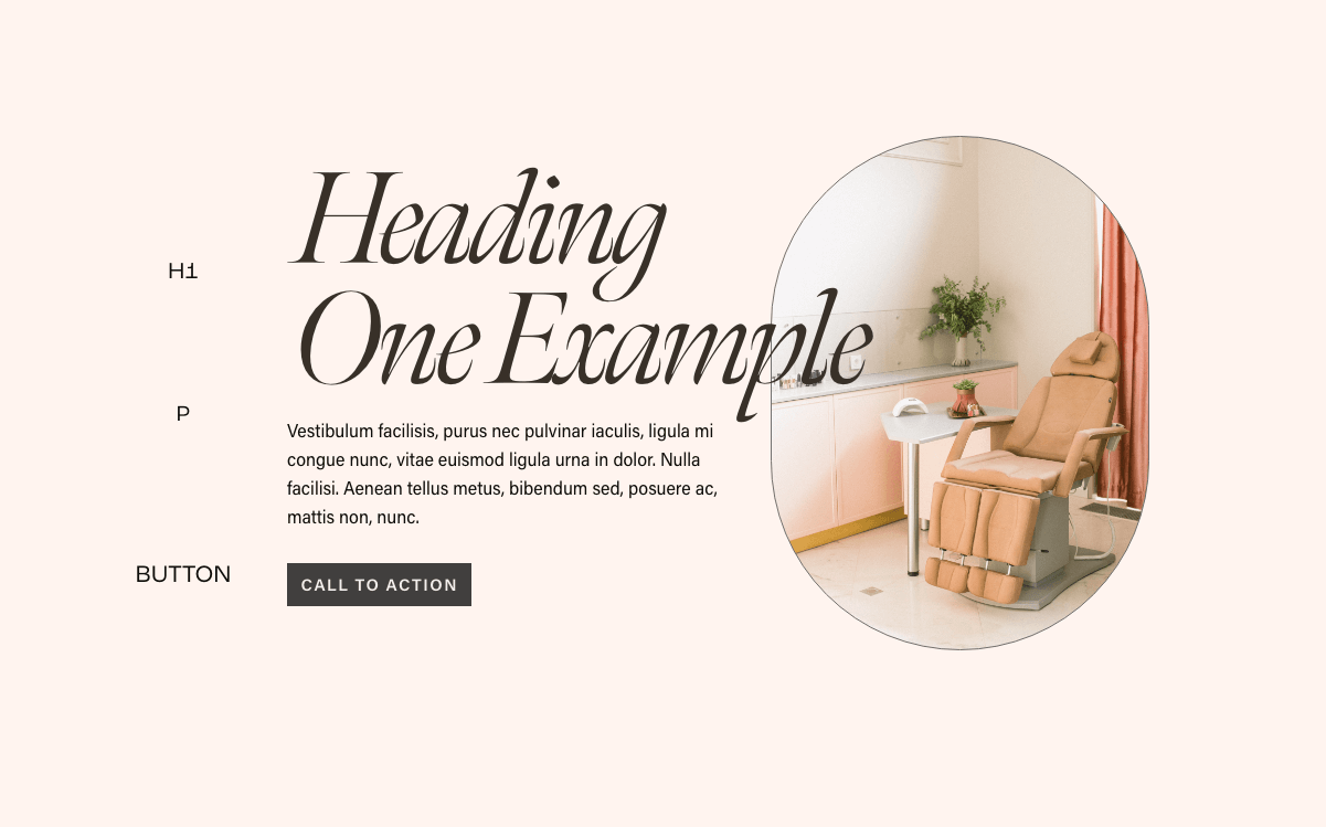
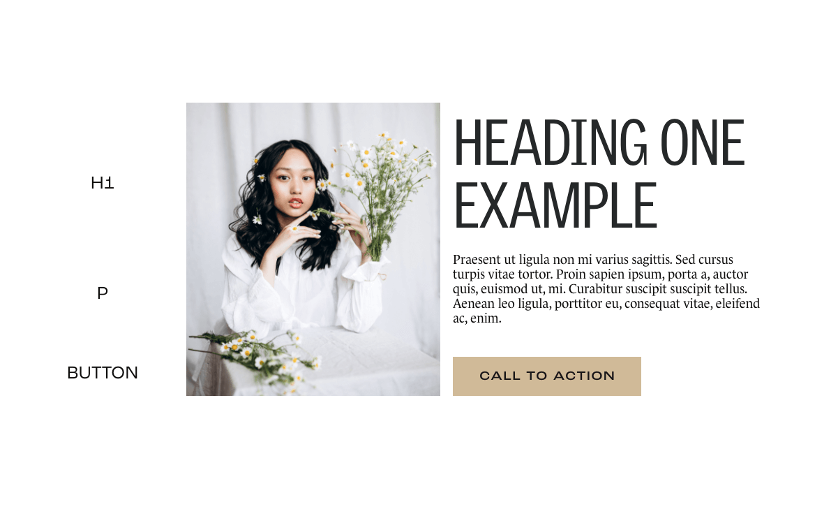
3.Sloop, Gills Sans Nova & Mostra Nuova ( font combination )
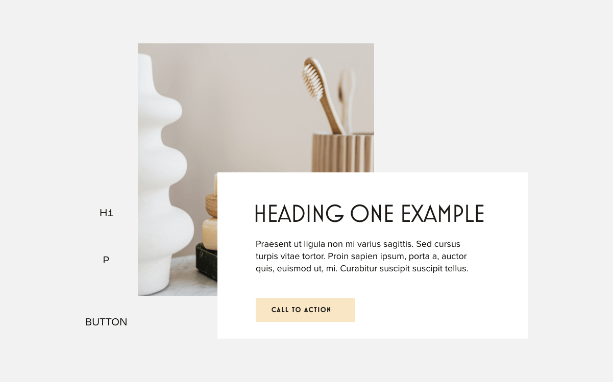
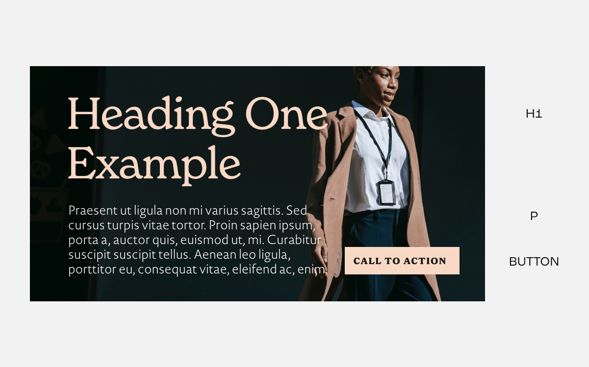
H1(title): Sloopparagraph: Gill Sans NovaButton: Mostra NuovaWant an elegant, feminine font pairing? This Squarespace font combination got you! Sloop passes your brand across as creative, elegant and female-friendly. It makes your visitor feel a burst of creativity due to its handwritten nature. While the font looks great, it is advisable to choose a legible script font just like sloop and stick to making it a Heading font. It comes in three weights. Gill Sans Nova complements Sloop with its simple and legible nature. It has varieties of styles you can choose from. Gill Sans Nova also works great for Heading as well. Now, combining it with Mostra Nuova as the button text makes users want to take action. This Squarespace font pairing is a go-to font for wedding related businesses, Garden Centers etc.
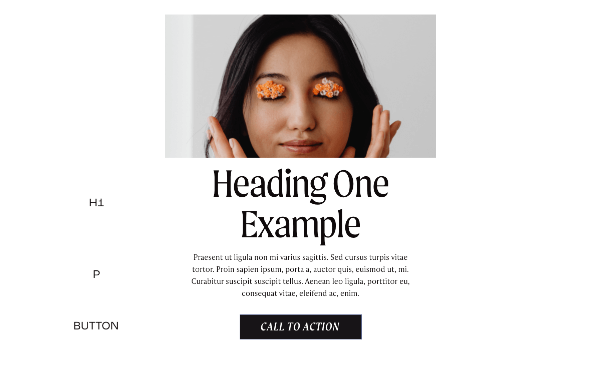
4.HWT Roman Extended Lightface & Forma DJR Micro ( font combination )
H1(title): HWT Roman Extended paragraph: Forma DJR MicroButton: Forma DJR MicroOne thing I love about HWT Roman Extended Lightface is the emotional connection it establishes with your users. It has a way of making people fall in love with it. Not only that, it comes across as trustworthy and authoritative. Combining it with Forma DJR Micro as the body text font passes a ‘you can trust us’ message across to your user. If you are looking to build a brand that wants users to feel safe and prioritized while communicating your authoritativeness in your business niche, then this is the font combination to use. This Squarespace font combination can be used for Restaurants, Home Décor and oil essentials businesses. Trust me, this font combination never disappoints.
5. Goldenbook & Maple
H1(title): Goldenbookparagraph: MapleButton: MapleGoldenbook promotes a feeling of trust. It makes your brand feel trustworthy, respectable and established. Goldenbooks comes in six different weights therefore you can make it bolder or thinner based on your preferences. The Maple font adds a bold feeling to the look making the overall font combination more trustworthy. It comes in four weights. This font combination is best used for news websites, law firms, financial-related businesses and even healthcare firms
6. New Spirit & Novel Sans Pro.
H1(title): New Spiritparagraph: Novel Sans ProButton: New SpiritAre you looking for a font combination that gives a compassionate and lovely feeling to whoever comes across it? You’ve hit the jackpot! New Spirit is an adobe font that comes in eleven weights and leaves customers with a lasting impression. Novel Sans Pro is known for its simplicity and great legibility. It has 11 styles you can choose from. When you combine these two fonts, it produces a compassionate, easy to approach feeling to your customers. I recommend these fonts for gift shops and coaching websites.
7. Forma DJR Micro & Josefin Slab
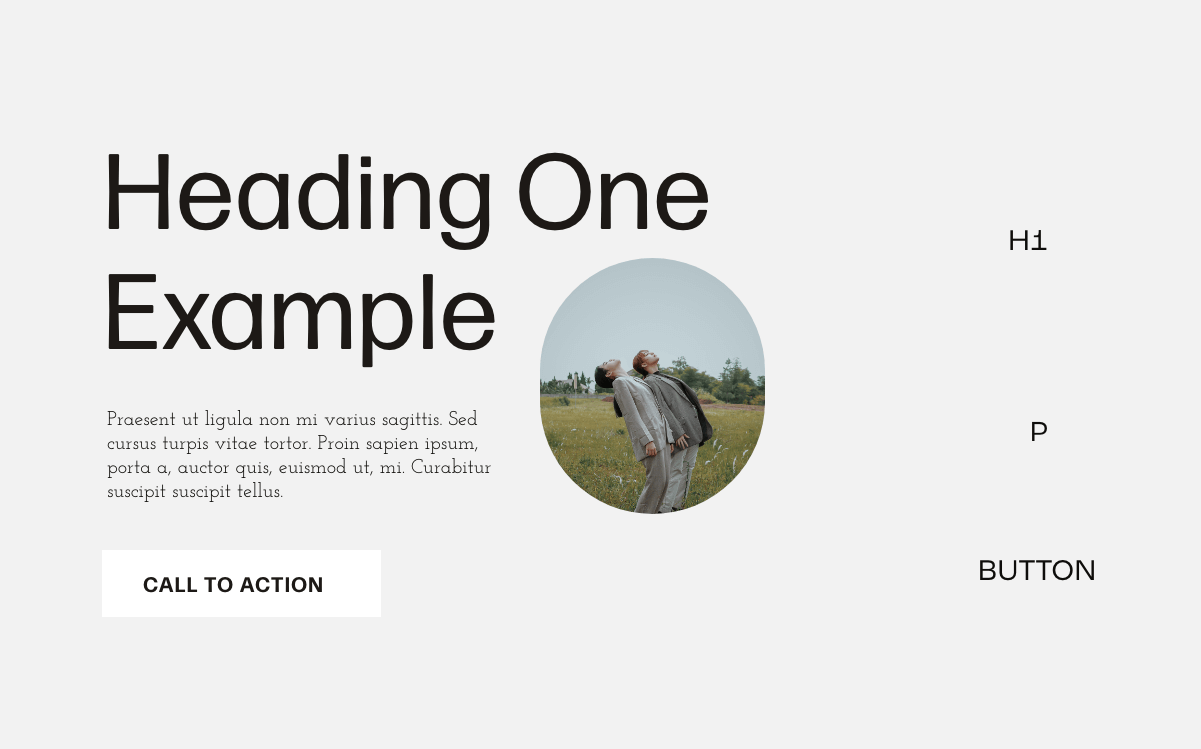
H1(title): Forma DJR Microparagraph: Josefin SlabButton: Forma DJR BannerWant everyone to instantly relate to your brand and feel comfortable without feeling like an outcast? Search no further. You’ve found the right font combination. Forma DJR Micro is an adobe font that has a regular vibe to it. Its clean and legible style makes it great for both headlines and body text. Josefin Slab is a google font that reminds me of serenity every time I come across it. It comes in different weights and styles. When combined with Forma DJR Banner as the button text, it can make a bold statement. This can also pass for a minimalistic font pairing, if you like keeping things simple or your goal is to create a minimalist website, you definitely should consider this font. If your business involves communicating to a great mass of people such as marketing and sales, online stores, restaurants. This is the font combination you should use.
8. FreightDispCmp Pro, Lora & Meno Banner
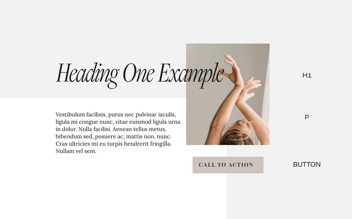
H1(title): FreightDispCmp Proparagraph: LoraButton: Meno BannerThis is another font combination that creates a memorable experience for your users. FreightDispCmp is a script adobe font looks elegant and can make anyone remember its stylish nature. I love how Lora, a google font, has a memorable and flowy appearance because of its brushed curves. It is highly readable and it is best used in regular 500 or medium 600. Meno Banner, which is the tertiary font comes in 6 different weights and makes a bold statement to users. Using it as a call to action button is never a mistake. This font combination works well for feminine businesses and design studios
9. Nueva Std Extended, Broadacre & Roc Grostesk Extended
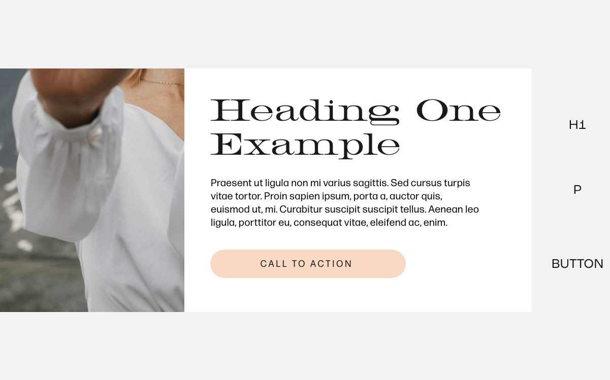
H1(title): Nueva Std Extendedparagraph: brodacreButton: Meno BannerWant that modern yet classy font? Nueva Std Extended will give you that vibe. Proudly from the family of Adobe fonts, it gives a sophisticated look to your website. It is best used for headings but works great for the body as well. It has 18 different styles that you can choose from. It works magic when combined with broadacre font. Broadacre font has this curvy, luxurious feeling to it that gives you the urge to keep reading. Broadacre fonts beautifully play with weight, it thickens the side of each letter and leaves the other side thin giving a unique emphasis to the text. But going with Broadacre light 0 in the example above will turn out great. If you want to nail the classy look, combine it with Roc Grotesk as the tertiary font. The inspiration that brought about this font is a unique one, it was inspired by an American wood type from the 19th century. It comes in 45 styles and nine weights. Trust me, you will find one that suits you. It is best used to make a bold statement to your users that pressing that button is the right thing to do.
The whole combination gives a modern-classy yet luxurious vibes to readers. I would recommend this combination for luxury and retail businesses
10. Meno Banner Italic & Acumin Pro
H1(title): Meno Banner Italicparagraph: Acumin ProButton: Acumin ProMeno Banner italics is a script font that allows the eyes to drown in its thoughtful details. It has an enigma feeling to it making you want to find out where it would lead you. When combined with Acumin Pro, another adobe font that comes in 90 styles, it works magic. I will consider using this for a spa or gift shop.
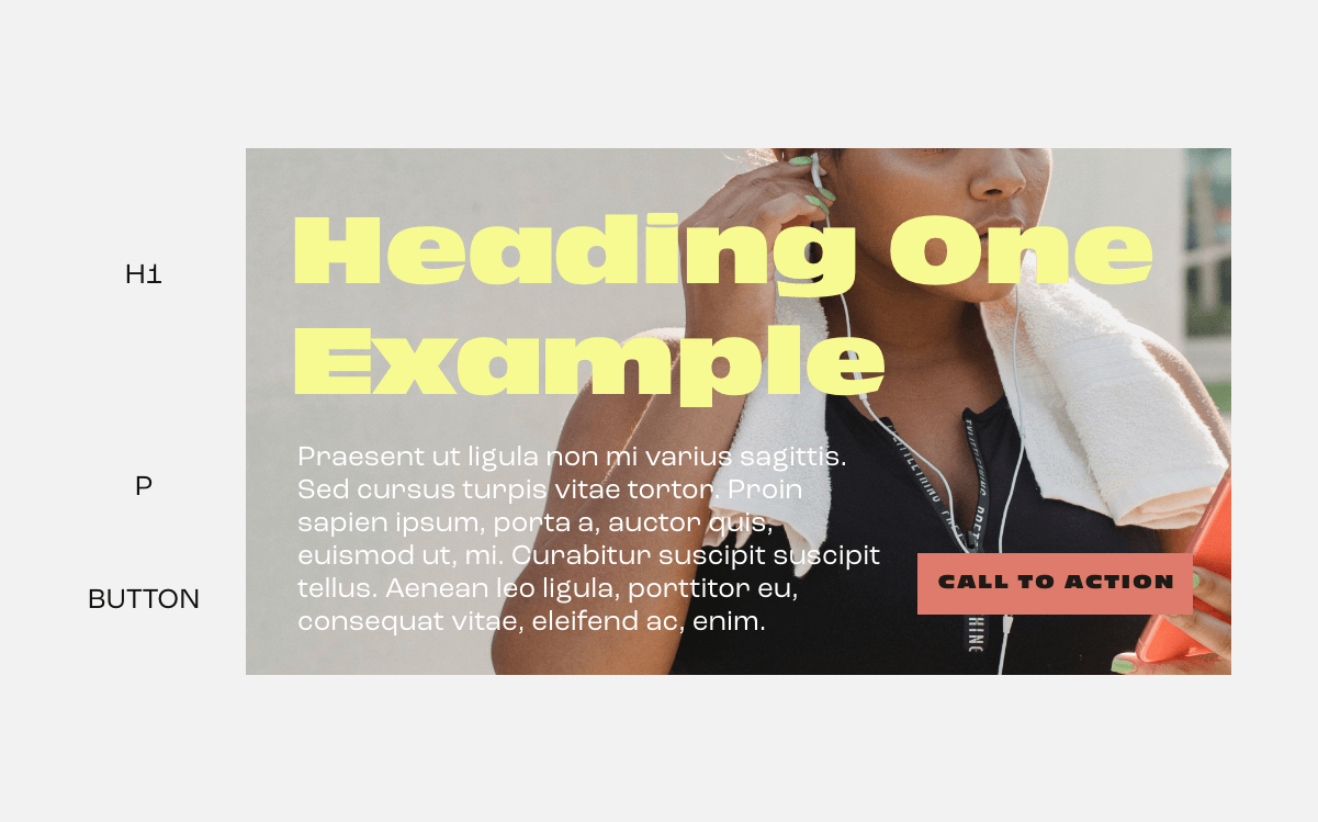
11. Antique Olive Nord D and Roc Grostesk
H1(title): Antique Olive Nord Dparagraph: Roc GroteskButton: Antique Olive Nord DThis is the perfect font combination to communicate boldness and ruggedness. It makes an ‘I am not here to joke’ statement. The antique olive Nord d font is good for headlines because it can pass the message across and leave it hanging in the reader’s memory for a while. When combined with Roc Grotesk, another rugged font, it oozes a feeling of extreme boldness.
I would recommend this font combination for fitness and constructions brands.
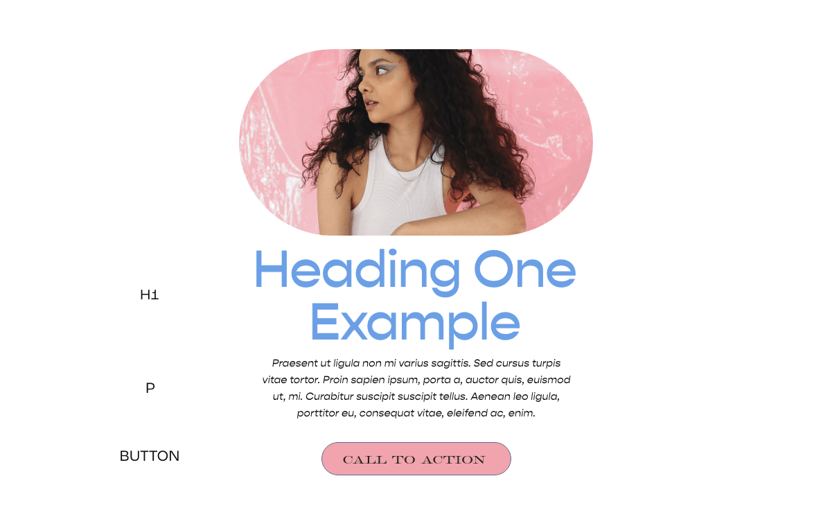
12. Gopher, Gopher Italic & HWT Roman Extended Lightface
H1(title): Gopherparagraph: Gopher italicButton: HWT Roman Extended I love this font. It comes across as a rulebreaker, not following the norms or bounded by the status quo. It gives your brand out as innovative, intuitive and creative. It was created using the reverse contrast, that is the horizontal strokes are thicker than the vertical strokes You can crown the look by using Gopher with one of its styles, Gopher Italics. There is no better way to make a statement that you are ready to break through the norm. HTW Romans Extended Lightface used as the tertiary text is just great! This font combination works best for tech-related businesses. This could also work great if your target audience is young, gen-z tech products and much more.
13. Mencken STD Head Narrow, Roc Grostesk & Freightneo Pro
H1(title): Mencken Std Head Narrowparagraph: Roc GroteskButton: FreightNeo ProAnother font brought to you by Adobe fonts. Mencken Std comes in 27 styles creating a variety of options to choose from. This is another font that communicates trust to users. It can be used for both heading and body text but preferably heading because of its simple nature. It comes out better when paired with Roc Grotesk, another adobe font with a great reputation The tertiary text which is freightneo pro is suitable for call to action button. It promotes a friendly feeling giving the font combination a boost. In my own opinion, this font pairing goes with almost any kind of business, it would be great especially for feminine businesses.
14. IvyPresto Headline, Antique Olive cond & FreightBig Pro
H1(title): IvyPresto Headlineparagraph: Antique Olive CondButton: FreightBig Pro ItalicThis is one of the latest fonts on the list, the modern nature of IvyPresto Headline is undeniable. It gives you a contemporary feeling with its perfectly drawn curves. It comes in five weights. It is best combined with antique olive condensed which gives a finishing touch to the font combination and gives your brand a state of the art look. Using FreightBig Pro as a call to action text is a great option as well.
This font pairing is great for make-up stores, design websites and home décor.
15. Griffith Gothic Condensed, Le Monde Journal Std & Roc Grostesk.
H1(title): Griffith Gothic Condparagraph: Le Monde Journal StdButton: Roc GroteskWhere are my minimalists in the house? This font combination is considered as a minimalist font combination. It portrays simplicity at its peak. Griffith Gothic Condensed goes straight to the point, and communicate its vibe effectively. Not only that, it leaves the room for creativity by coming in 18 styles. Le Monde Journal was designed with readability in mind. It was first intended for newspaper use, no wonder it has an aura of aesthetic beauty and it comes in four different weights. It works great for paragraphs. To crown your minimalist website, opt in for Roc Grostesk as the call to action button. I would love this font for Magazines, Newsletter or content-heavy businesses.
16. Moret, IvyPresto and Moret Regular Oblique
H1(title): Moretparagraph: IvyPresto TextButton: Moret Regular Oblique I am always excited about this font combination. I do not intend to hype but Moret gives a warm feeling when your eyes rest on it. It skillfully blends modern, classy and fun together. I wonder if the Moret brand was inspired by this font. Another advantage to this font is that it works well for both heading and paragraph text. It comes in 5 weights and two styles It is no coincidence that Moret was paired with IvyPresto. Like I said earlier, IvyPresto is one of the latest font and portrays everything modern. It comes in 5 weights as well. Moret Regular Oblique can be used as the call to action text. If you want your brand to be perceived as modern and current, I highly recommend this font. The font combination can withstand any type of business niche.
Related article: How To Create A Squarespace Landing Page. ( Easy Video Tutorial )Squarespace font combinations for any business
There you have it! 16 best Squarespace font combinations for your business. I am sure you must have found a font pairing that suits your brand. Remember, your font is one of the ways you communicate your values to your customers.
If you still believe you need a professional Squarespace Web Designer to handle your website because you want it to be the best in your business niche Feel free to Book a Consultation
Does Squarespace have google fonts?
The short answer is, yes it does. Squarespace has over 600 google fonts that you can choose from. Though they do not offer the whole list, there are beautiful fonts available on Squarespace. If there is a google font you want to use but can’t find on Squarespace, do not panic. Squarespace provides an option to add google fonts directly from the google font site.
How do I add multiple fonts to Squarespace?
You can use multiple fonts on your website but I will strongly advise you to stick to two or three fonts. Fonts are a delicate tool to express your brand. Using too many fonts not only put out your business as inconsistent, but also makes the website look messy. And once your website loses its uniformity, it is hard to keep your users focused on the message you are trying to pass.
Also, it is worthy to note that too many fonts slow down your website speed because each font used has to be downloaded and processed by the browser which may take longer. Longer loading time can discourage users from visiting your website. Instead of using too many fonts, you can play with the weight and style, that is, making it bold, thin, light, italics and so on
What fonts are available on Squarespace?
Squarespace provides google fonts and adobe’s type kit. Squarespace provides around 1000 adobe’s type kit fonts and 600 google fonts which give you a variety of options. Not only that, they made it easy for everyone by grouping these fonts into serif, san serif and mixed. Talk about a website that makes users their ultimate priority. In Squarespace, popular fonts like open sans, Lato, Roboto, Advent, Abril fatface and so on are available. With Squarespace, there is a font for your brand.
more squarespace & canva tips




![How to Change a Template Squarespace 7.1 : Without Starting Over [Step-by-Step Guide]](https://images.squarespace-cdn.com/content/v1/612d59e1be002022b69bab38/1744304519753-FDIKSTXKCHW464Q4QGIP/This+could+be+your+portfolio%2C+brining+clients+your+way..png)
![Best Squarespace Templates for Health and Wellness [2025]](https://images.squarespace-cdn.com/content/v1/612d59e1be002022b69bab38/1743717624024-J8MNT9IDV4B27VDED68R/wellness%2BSquarespace%2B7.1%2BSales%2BPage%2BTemplate%2Bfor%2Bcoach%2Band%2Bcourses.%2BSquarespace%2Blanding%2Bpage-1.png)
![Best Squarespace Templates for Service Businesses [2025]](https://images.squarespace-cdn.com/content/v1/612d59e1be002022b69bab38/1743711418781-X8NRYMX6RZ9B02RQ7YKU/wellness%2BSquarespace%2B7.1%2BSales%2BPage%2BTemplate%2Bfor%2Bcoach%2Band%2Bcourses.png)

![Best Squarespace Templates for Interior Designers [2025]](https://images.squarespace-cdn.com/content/v1/612d59e1be002022b69bab38/1663978532636-SWN8DCC1EQSSK6PU65KE/How+To+Remove+The+Background+From+An+Image+Using+Canva+%281000+x+1500+px%29+%282%29.jpg)
![Best Squarespace Templates For Photographers [2025]](https://images.squarespace-cdn.com/content/v1/612d59e1be002022b69bab38/1712102182209-W4COD4U5SLTMNJOU5413/shop+Best+Squarespace+website+Templates%3D-6.jpg)
