31+ Podcast Website Examples to Inspire Your Own [2024]
Are you looking for podcast website examples where you can draw inspiration? We've curated the best podcast website examples that will inspire you to create your website and guide you on the dos and don'ts of podcast websites.
Building the right website for your podcast is as important as the quality of your podcasts. The right podcast website template should have essential features that a podcast website needs, such as episode pages, audio player, RSS feed, and other necessary features to make listening easy for your audience. You will find the best podcast website examples in this article, so stay tuned.
Looking for a unique website design for your business? Explore our Squarespace Web Design packages for a stunning website. Need to enhance your site's visibility? Our Squarespace SEO services are here to assist you. Curious about our work? Take a look at our Squarespace website designer portfolio for some inspiration!
Best Podcasting Hosting Websites for your Podcast Episodes
Finding the right podcast hosting platforms for your podcast is important for your podcasting career. The right podcast host equips you with everything you need to run a successful podcast, from listing your podcast on top podcast directories to an intuitive episode page. Here are the four podcast hosting websites.
The best Podcast Website Examples
Wix: Wix is a great podcast website builder that provides you with every feature you need to thrive in your podcasting career
Podbean: This is a one-stop-shop for podcasters looking to monetize and grow their podcasts.
Buzzsprout: With over 100 000 users, Buzzsprout comes with every necessary tool to host a successful, thriving podcast
Rss.Com: RSS.com makes podcasting easy with its intuitive interface, top podcast directories, and monetization features
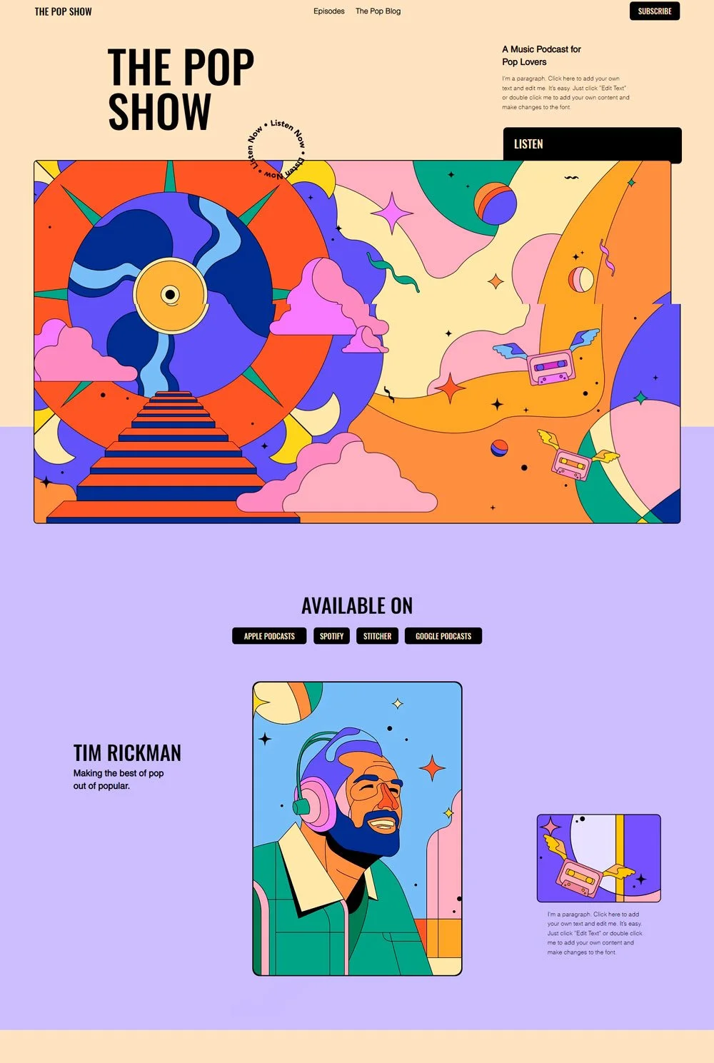
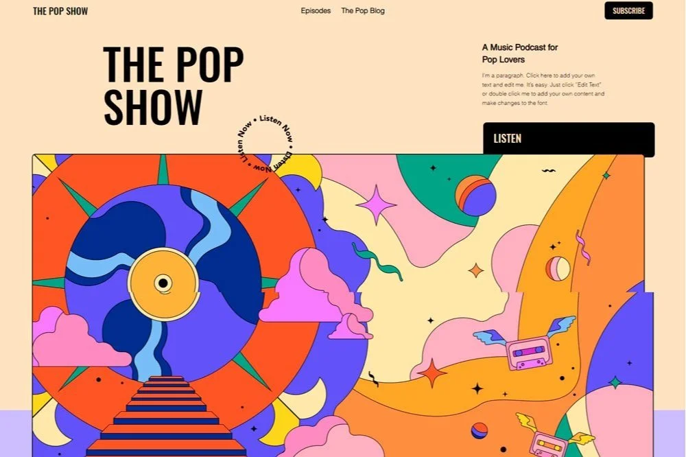
The pop show podcast website opens up with an amazing splash of color and pop-like animations that takes the whole website layout to a different level. The podcast website design will light up your mood. We also love that this website lists the top podcast directories like apple podcasts, google podcasts, Spotify, and other directories. Doing this will allow visitors to choose their preferred podcast player.
What we like
The podcast page's host, title, and description can be seen at first glance, which is an empathetic consideration for new visitors.
The podcast website comes with an episode page where all the podcast episodes are listed.
The podcast episodes are listed directly after the website introduction, which is a great design.
The Subscribe button at the very top of every page makes it easy for visitors to subscribe.
The social media links are obvious.
What we don't like
There is no share button in the podcast audio player.
Overall, Pop Show is a good podcast website example to give you the inspiration you need.
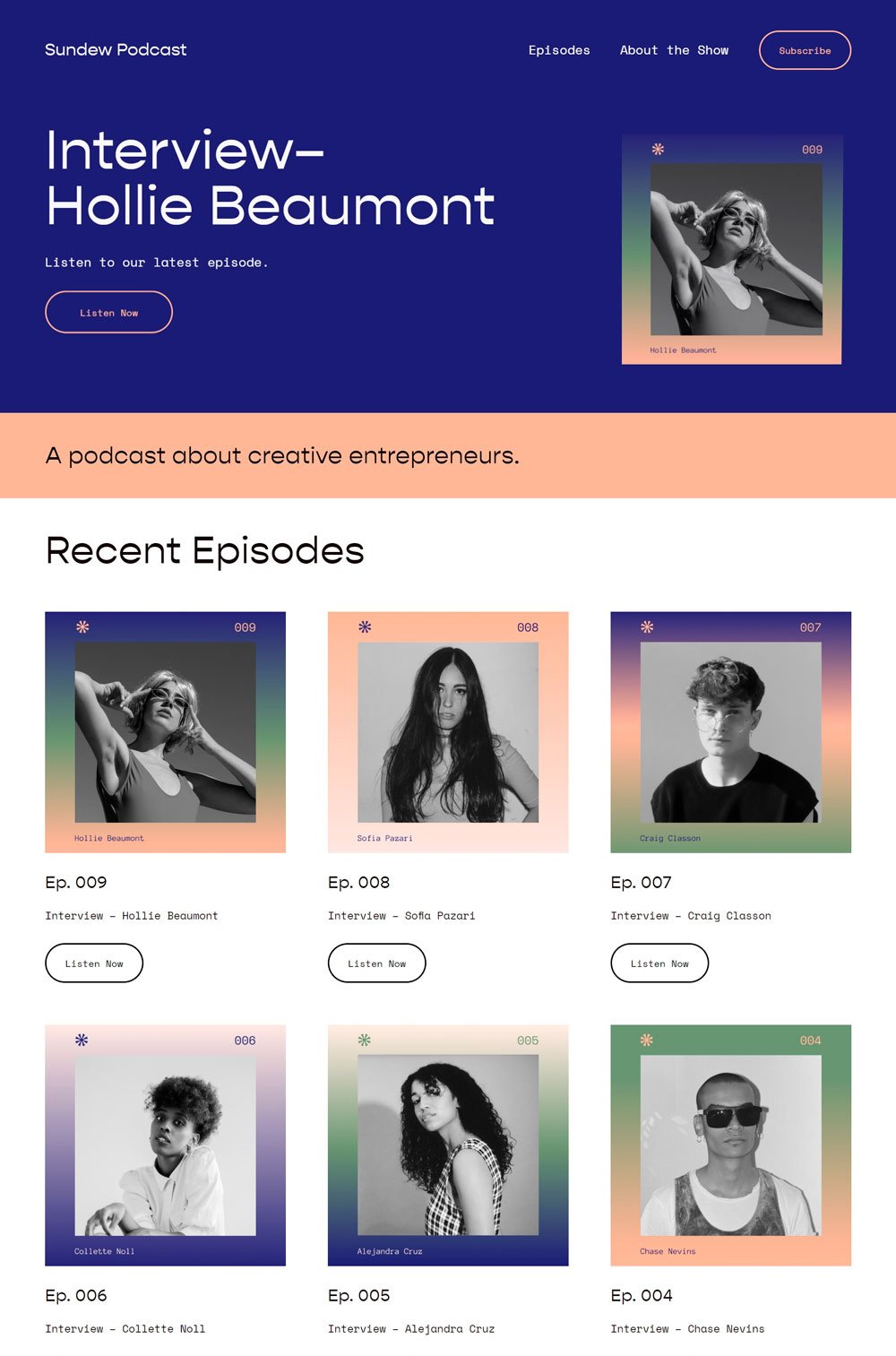
Sundew's home page kept things simple and focused on the important website content, which is particularly helpful in avoiding distracting website visitors from your podcasts. In addition, we love the color scheme and how it was maintained throughout the website.
What we like
The website kept the introduction short and featured a big 'listen now' button at first glance
The episodes were listed immediately after the introduction, which is a good feature
The email subscribe section can be found on the home page.
You can switch between the next and the previous episode without leaving the current episode page.
There is a lot of space for episode description, which is a great feature to allow your listeners to have a foretaste.
What Can Be Improved
The audio player is too basic. For example, it doesn't have any share button or fast-forward button.
But, overall, Sundew did a fantastic job!
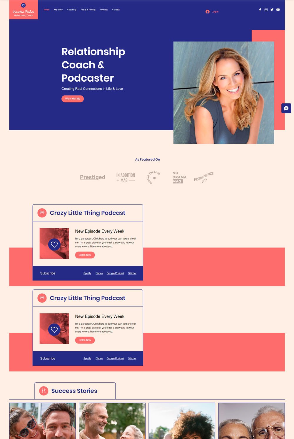
Sandra Fisher does more than a podcast website. It is a coaching website, but you will love that the podcast and services are offered on the same platform. We will be focusing on the podcast page, and there are a lot of helpful lessons to learn from there.
What we like
There is a search button that allows users to easily navigate through the multiple podcasts.
A recent episode appears first, and there is the latest episode tag on the episode
The time duration of each episode is displayed before clicking the episode
The audio player comes with all the necessary features
What Can Be Improved
There are no subscribe links until you stroll to the end of the page. Unfortunately, many visitors will not have that patience, and the podcast website may lose a lot of loyal subscribers.
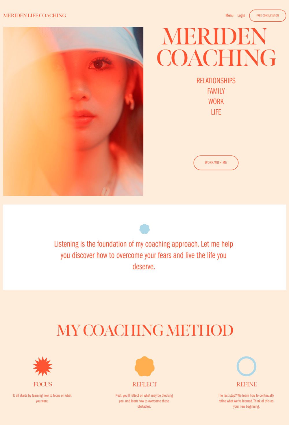
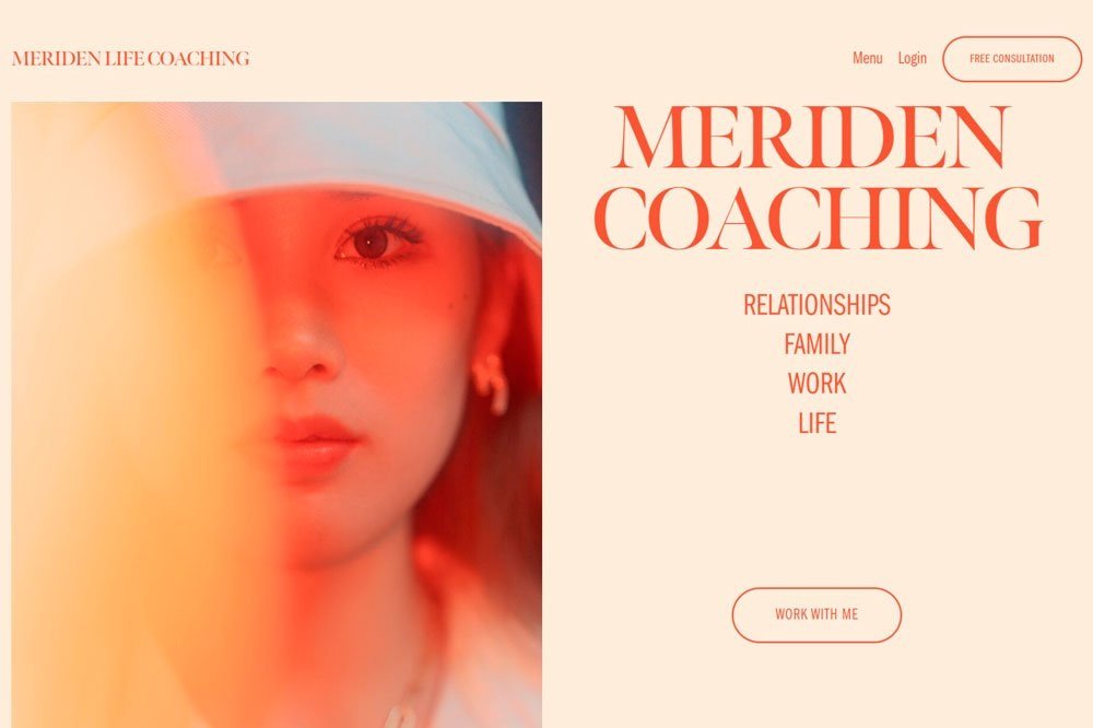
related article: 31+ Best Bakery Websites Inspiration & TemplatesThe Meriden Coaching website is aesthetically pleasing, and the variation of colors is remarkable. However, we will consider that it is a coaching website and not a complete podcast website and overlook that there is no podcast menu until you get to the end of the page.
What we like
The way the podcasts have varying sizes and arrangement is appealing
The images growing larger when you hover over it is an excellent effect to add
Detailed episode description, which is good for getting an overview of what the website is about
What Can be improved
Too much description for a podcast website.
The audio player is basic
No podcast RSS feed or top podcast download directories link.
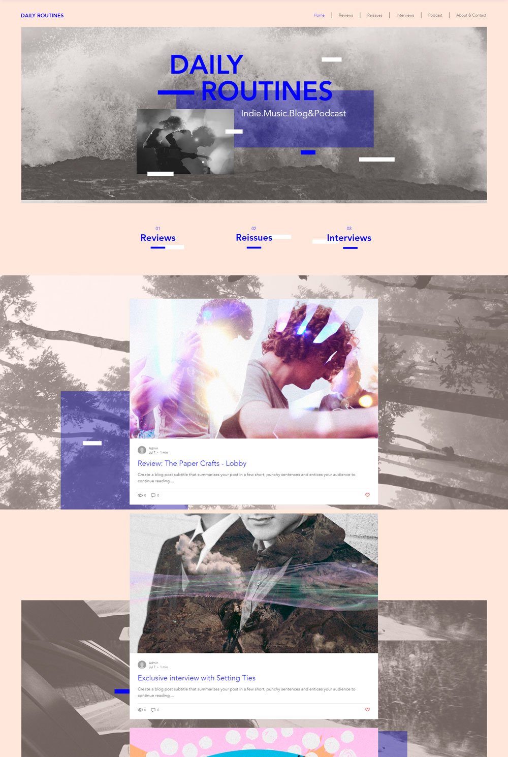
related article: 51+ General Contractor Websites (Plus Templates!)If you are looking for a minimalist podcast website example, then Daily Routines can serve as that inspiration. We appreciate how the web designer used clean elements, simple fonts, and solid background colors to create a stunning yet simple website. Going to the podcast page.
What we like
The detailed podcast player
Search feature where you can find your favorite podcast
The time duration is displayed on each podcast
What can be improved
There was no robust subscribe button for new visitors, although it included a mailing list section at the end of the page.
The podcast description is short and won't be able to convey a lot of meaning.
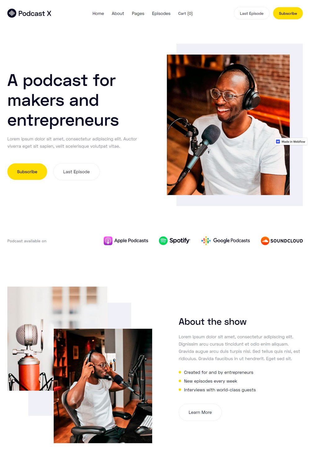
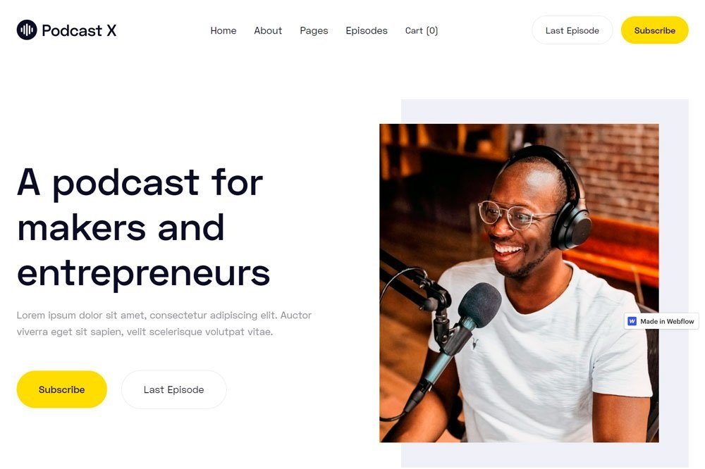
related article: 28 Best Health Coach Websites (Plus Templates!)This is one of the great podcast website examples regarding minimalism and functionality. Whoever designed this podcast website knew what they were doing. Starting comes with crucial pages that many podcast websites neglect, and they keep the colors simple so that the website will pass across the primary information. Podcast X is an amazing podcast example.
What we like
Comes with intuitive pages like Episode and Cart page.
To subscribe, and last episode buttons were placed at the top of the website, which is suitable for website visitors.
Top directories like google podcasts and apple podcasts were represented with logos and text.
The latest episodes were listed first on the homepage
There are single episode pages for all the episodes
There is a read transcript feature that allows those impaired or struggles with various accents to enjoy the podcast
Speakers' social media links are attached at the end of the episode page
What can be improved
The website could have added a search feature or categories
An episode archive will do some good
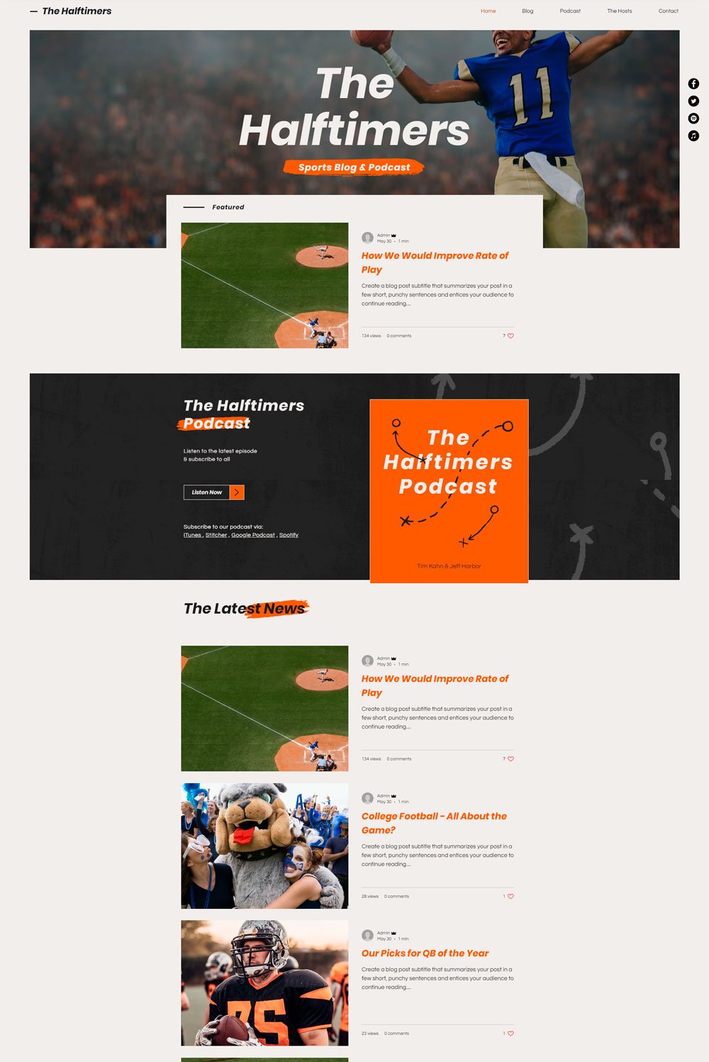
The Halftime did a great job by first giving a short and precise description of what they are about. After that, their dedicated podcast page is simple and straight to the point. As a result, Halftime makes an excellent podcast website example for your inspiration.
What we like
The fixed social media links at the side of the podcast website page
Simple description
Comprehensive podcast player with a download feature.
What can be improved
The homepage only contained one podcast. We understand they have a blog section, but there were more blogs than podcast episodes on the home page.
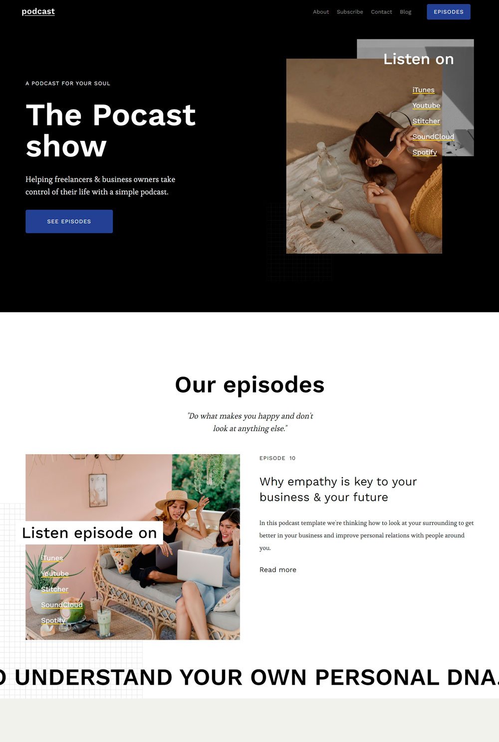
related article: 21+ Best Squarespace Portfolio Templates To Show Off Your WorkA clean podcast website that stays away from distractions has a way of appealing to visitors. The podcast Show achieved that like a pro. The See Episode button below the website's introduction is a great one.
What we like
We love how the yellow lines broaden around important elements when you hover over a link or button.
The guest profile and transcript on each episode page are also a great one
Visitors can view their YouTube videos directly on their site without leaving the site, which is a great one.
The story title for each episode is super bold.
What can be improved
There is no subscribe button whatsoever on any of the pages. This can be detrimental to your podcast growth.
There is no previous or next link to other podcasts on the page, which is a big No.
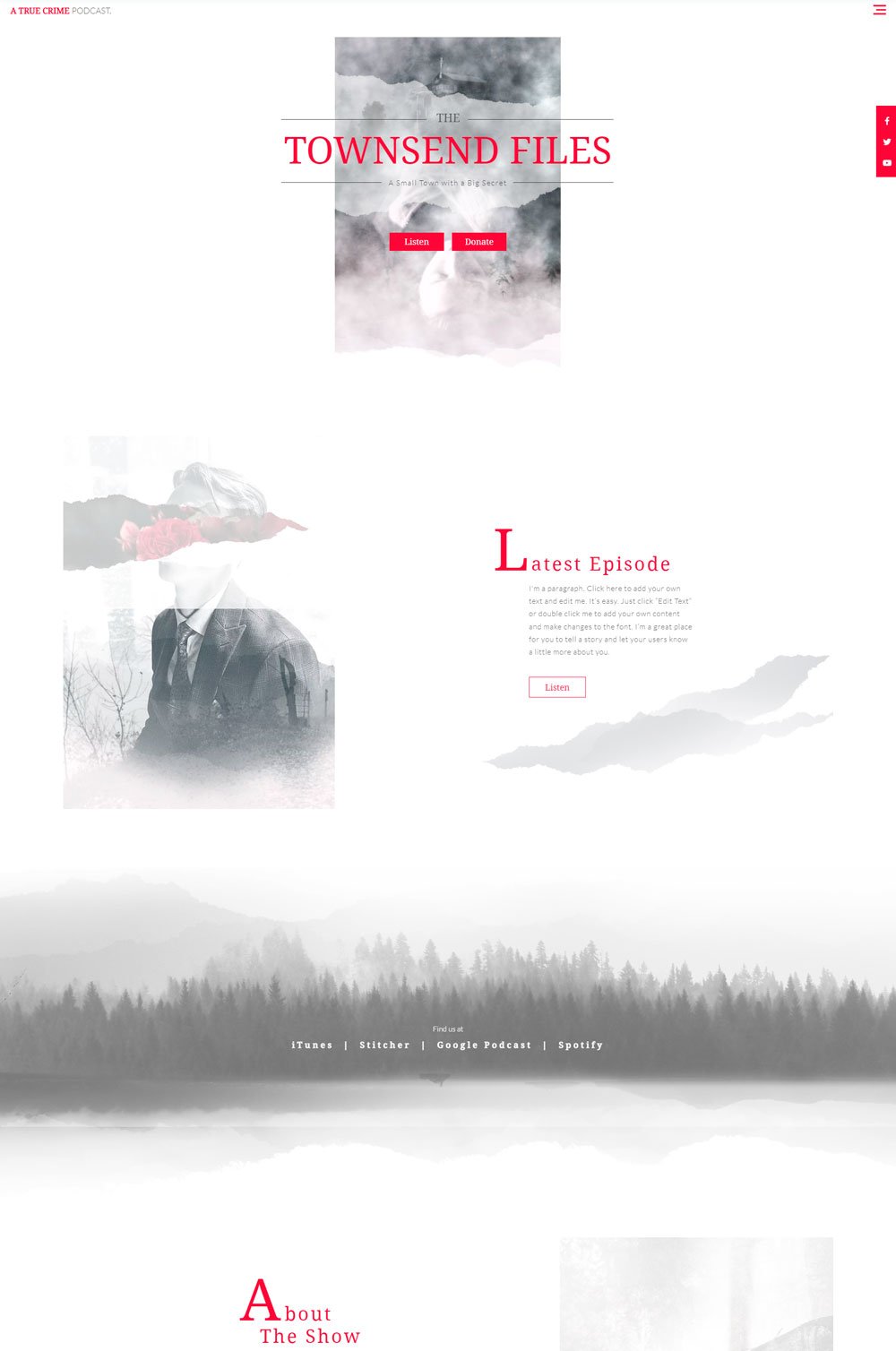
related article: 21+ Best Squarespace Blog Templates In 2022 (Free & Premium)The Townsend files is a crimes podcast, and it did an excellent job setting the mood on its landing page. We love the choice of colors, which portrayed a dark podcast-themed website.
What we like
The color choice is perfect for the podcast niche.
About the show section is concise and straight to the point
The fixed social media mini bar at the side of the page.
What can be improved
The landing page featured only one episode.
It is a podcast website, and we expect the homepage to have multiple episodes.
There are no subscribe links until you get to the end of the page.
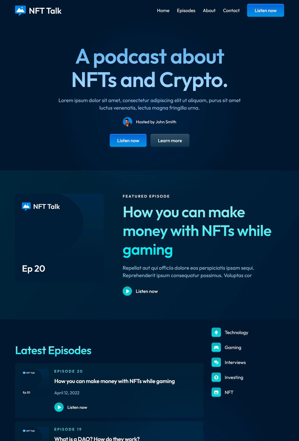
The NFT Talk website did a great job in the choice of colors to portray a relatively cool yet stylish podcast website. We love the two CTA buttons immediately after the host description. Also, it features all the directories on the home page.
What we like
We like the cool-themed web design and the matching background of the images.
We love the categories designed to be a floating bar at the side of the page. Doing this is intuitive and convenient for those scrolling through the podcast.
The dedicated page for contact and inquiries
What can be improved
There is no podcast player. You need to go to any of the directories before you can listen to the podcast, which is quite inconvenient
For reasons unknown to us, there are no social media links
No, subscribe link as well.
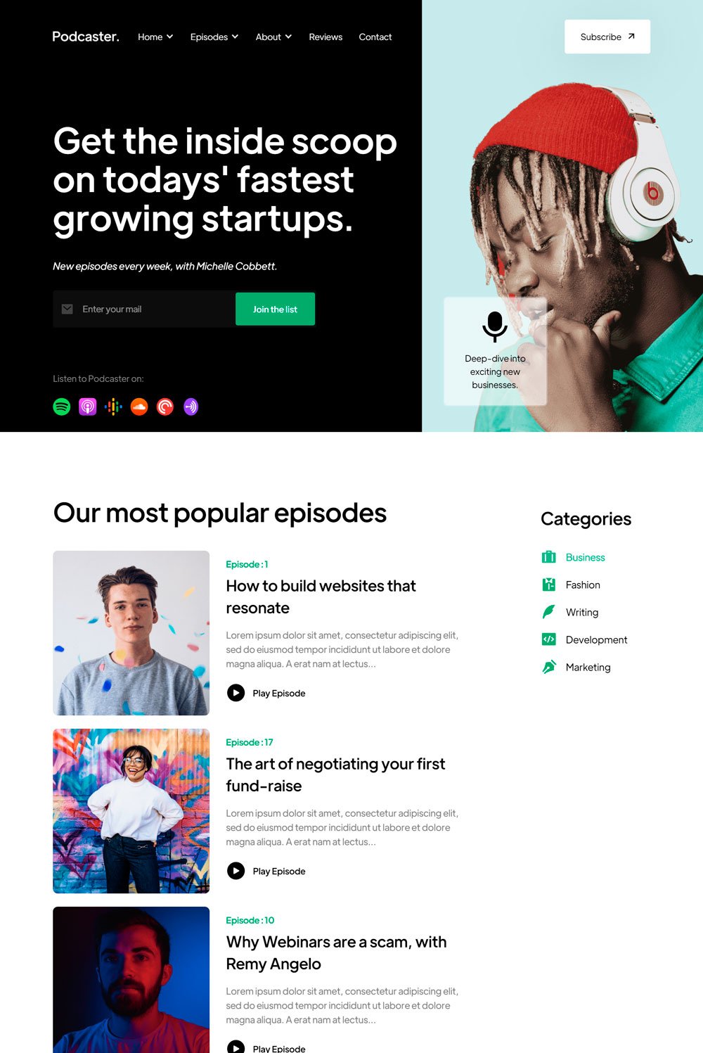
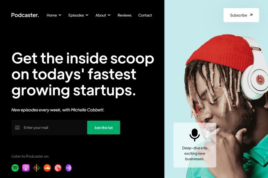
related article: 41+ Best Squarespace Plugins For Your WebsiteWe love the superb animation this great podcast website example uses. It also comes with a sidebar category that is a reasonable consideration for new and loyal listeners interested in a specific topic. One subtle feature that may go unnoticeable is that little copy that tells visitors that episodes are listed weekly. Another thing is the testimonials on the homepage. A lot of podcast websites overlook this.
What we like
The Join list button directly under the copy (although it could have been bigger)
The podcast series on the homepage
The editor's pick feature is a great way to start listening to podcasts directly from the homepage.
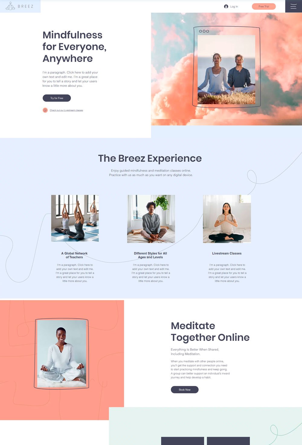
related article: 26+ Best Squarespace Templates For PhotographersWe love this fabulous website because of its dynamic interface that adds a breath of freshness; no wonder it is a mindfulness website. Although this is not a complete podcast website, its inspiring branding design is something to emulate
What we like
There are clear call-to-action buttons everywhere on the website
The Schedule page comes with categories to help visitors navigate through the site
What can be improved
The hamburger menu is creative but can be overlooked, making it hard to find the pages at first glance.
13. Podcast website: Carter Wills Jr.
Carter Will Jr. is focused on music, but there are a lot of lessons to be drawn from this well-designed website.
What we like
The playlist integrated on the homepage is thoughtful because visitors can start listening to music as they scroll through the website.
Social media icons are displayed and fixed on the side.
What can be improved
You can't access the subscribe section until you get to the end of the page.
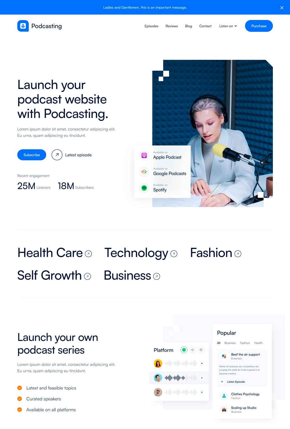
I love the way podcasting divided its homepage to have the maximum impact. Apart from the Subscribe and Latest Episode CTA buttons, podcasting uses numerical evidence to convince even the skeptical visitor that their podcasts are worth listening to. Also, highlighting people's podcast apps is a great addition.
What we like
The categories on the main page and the latest episode collection are on the downside of the page.
The subscription plan is excellent for podcast websites with business features.
A read transcript button beside the play episode takes them directly to the transcript with just a few clicks.
The review page is a thoughtful feature to establish their credibility.
What can be improved
While the show note is comprehensive, it can be too long for a podcast episode.
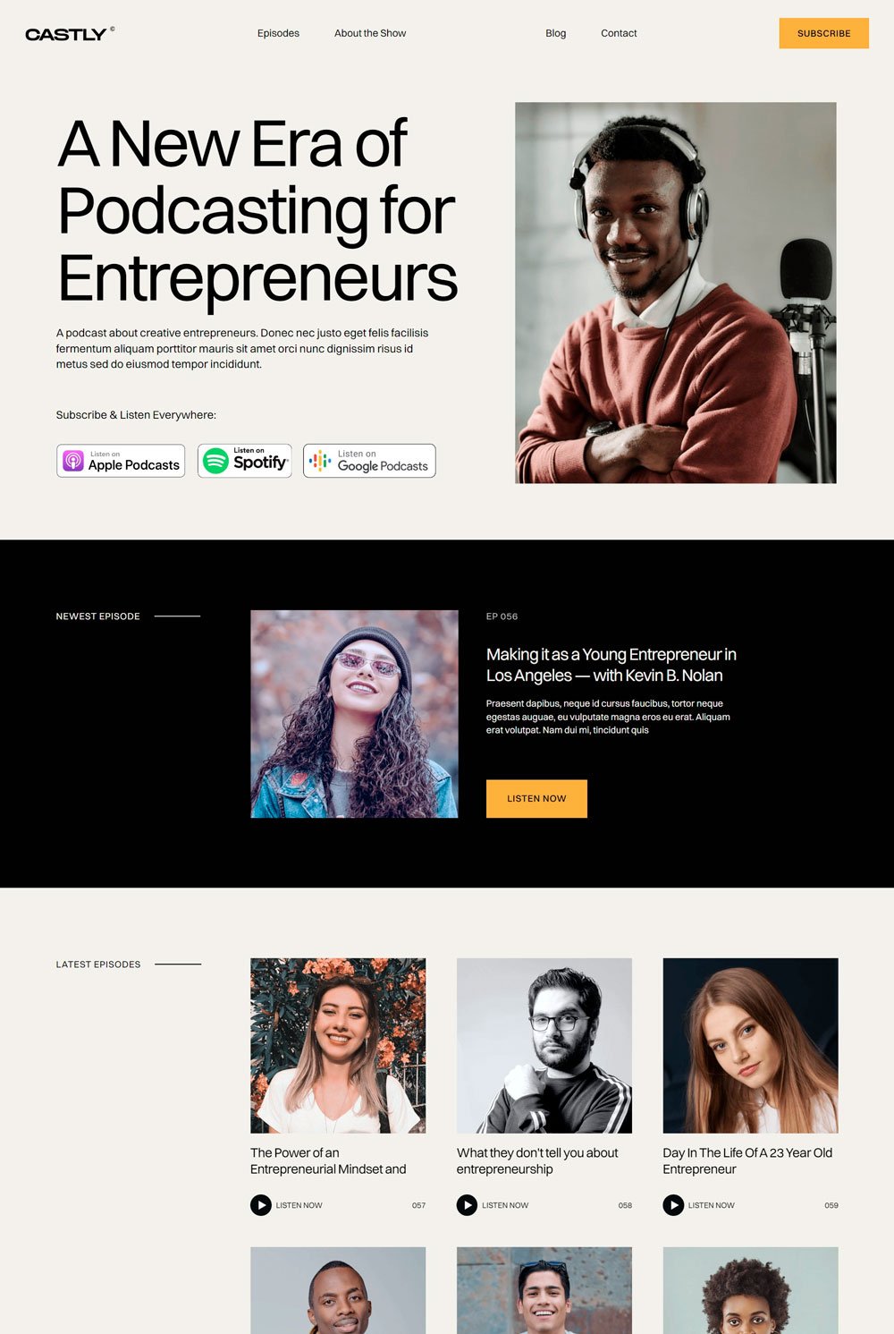
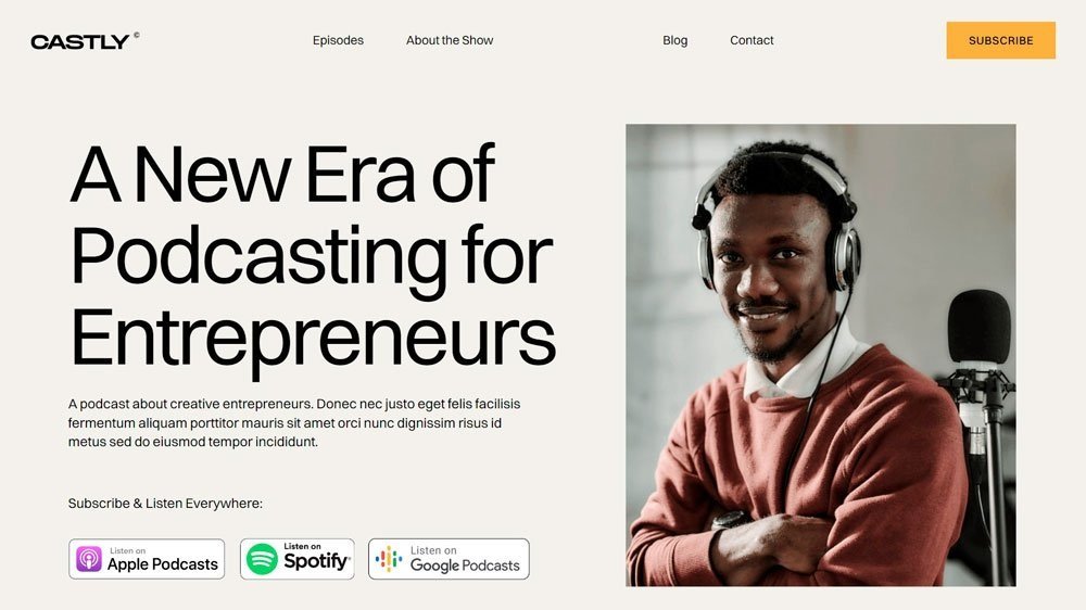
related article: Stunning Squarespace Real Estate TemplateCastle uses a clear, concise color scheme and images to keep a minimalist look, which is commendable. We also love the neutral color scheme that was maintained throughout the website.
What we like
It is clean and straightforward.
The newest and latest episode is displayed directly on the homepage.
The cool animation when you hover over each episode is a great one.
What can be improved
There is no podcast episode player except you listen through other directories
Each episode page is choked with other episodes, which can be distracting for listeners
There is no show note or transcript.
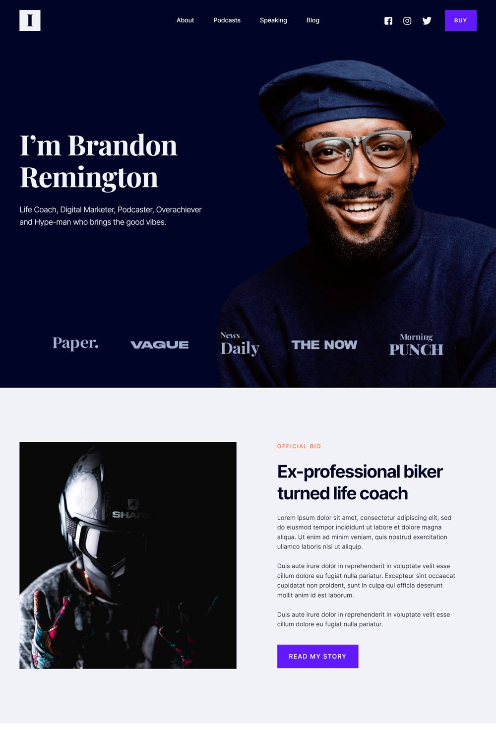
This is an excellent inspiration for a podcast website looking to offer more than just podcasts in the near future. Impact features different services such as books and a place where interested clients can book you to speak on their shows or webinars.
What we like
We love the intuitive pages that come with it, such as the speaking and the book and course section at the down part of the homepage.
The high contrasting color of the button makes them easy to notice
The show note at each end of an episode page is thoughtful.
Other episodes are represented by images that are better than the next and previous buttons.
What can be improved
There is no audio player on the website. The website must direct you to Spotify before listening to any episodes.
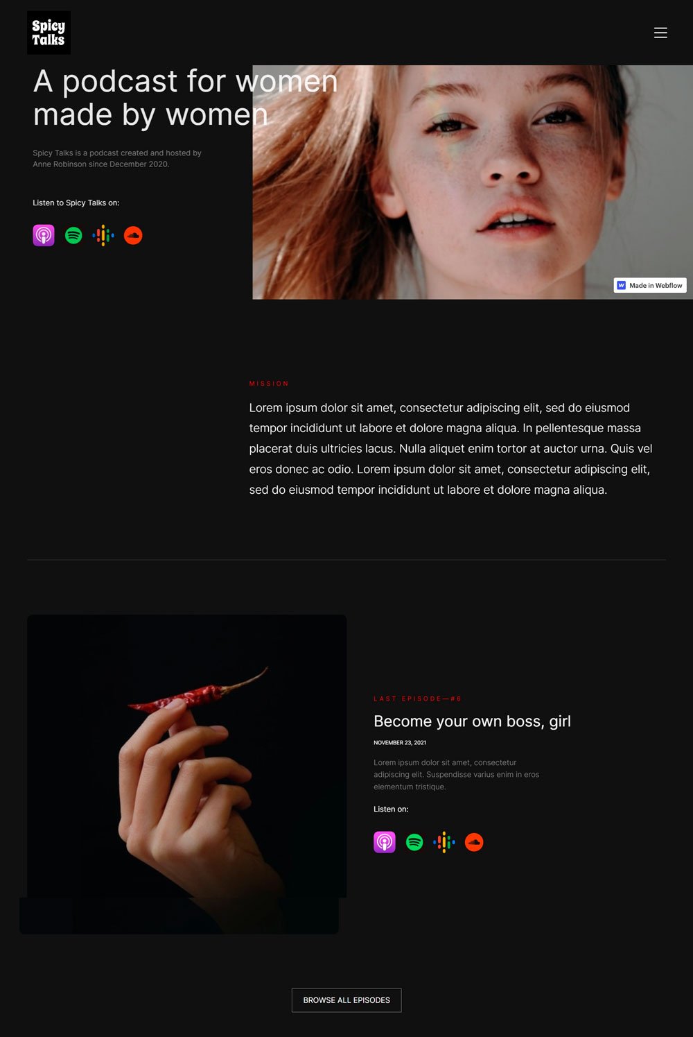
Spicy talks keep things simple with their black background and little use of images, which is great for focusing on important information.
What we like
Straight-to-the-point interface
Features other directories where you can listen to the podcast
What can be improved
There was no episode featured on the home page, only categories that can be detrimental to new visitors
Sparse use of images to draw visitor's attention
There is no subscribe button on the page.
Each episode page is too basic.
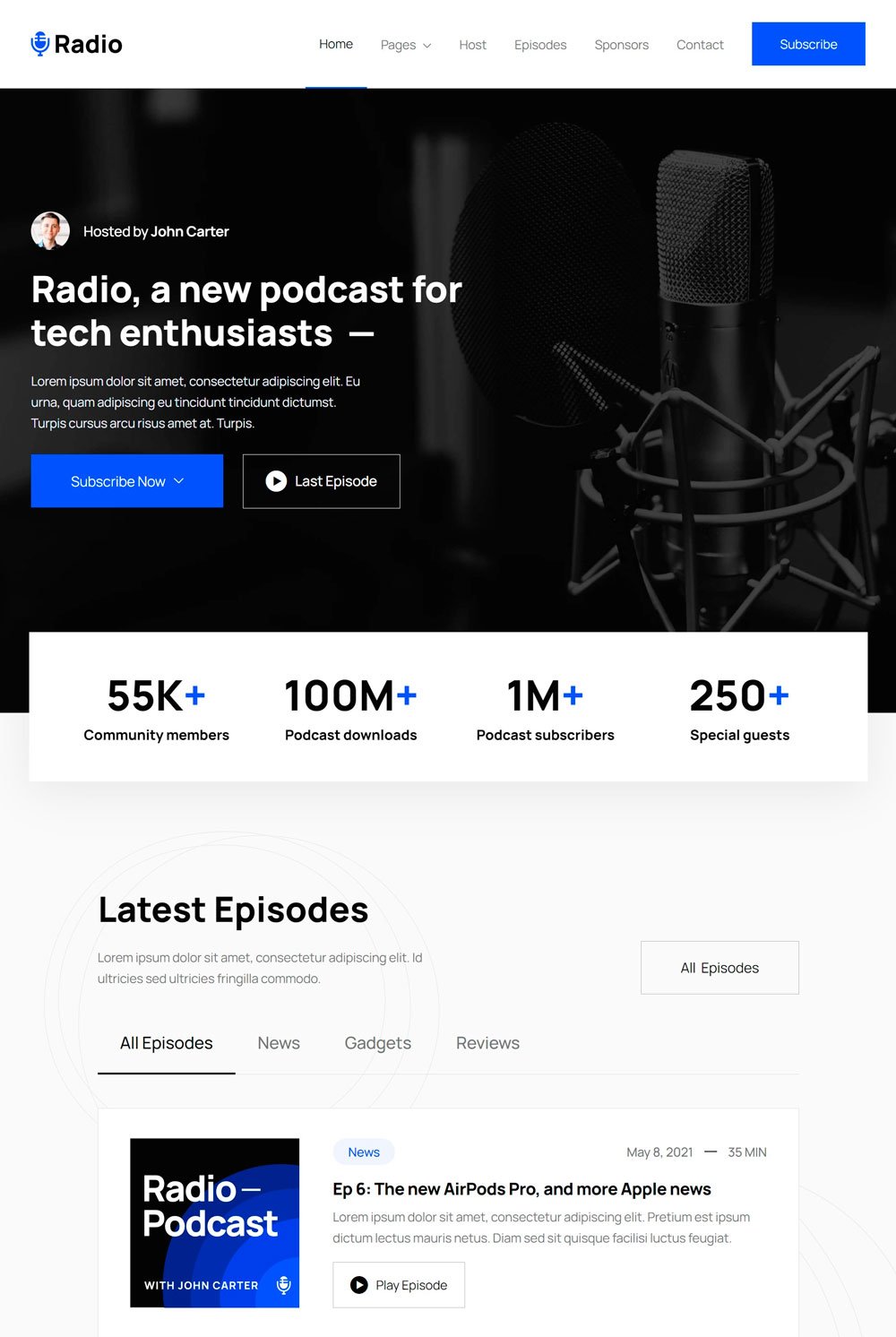
related article: How To Build A Squarespace Website: A Step-By-Step Guide The radio uses animation that makes the user experience smooth and enjoyable. Also, their homepage is intuitive and well organized.
What we like
We love the fact that you can access the episodes from the home page
The subscribe button at the beginning of the page is bold and visible
Also, the last episode button makes it easy for old users to go directly to the latest episode without scrolling through the website
The use of social proof helps convince new visitors
The social media icons are accessible
What can be improved
Each episode has the same image, which can become tiresome. Using different images for different episodes to maintain the dynamism
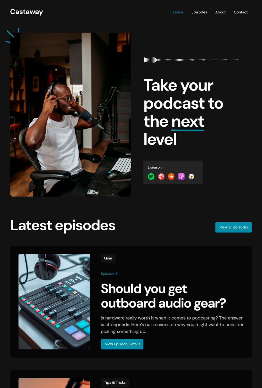
We love simple podcast web design that focuses on the website's purpose, which is what Castaway did. Castaway uses bold letters to focus on important information, reviews to establish their track record, and on-page episodes to allow new visitors to listen to podcasts immediately.
What we like
There is a subscribe link on each episode page.
The episode page is equipped with enough categories
We want to highlight the Recommended button on the episode page, which is great for new visitors.
What can be improved
The subscribed position could have been introduced twice on the homepage.
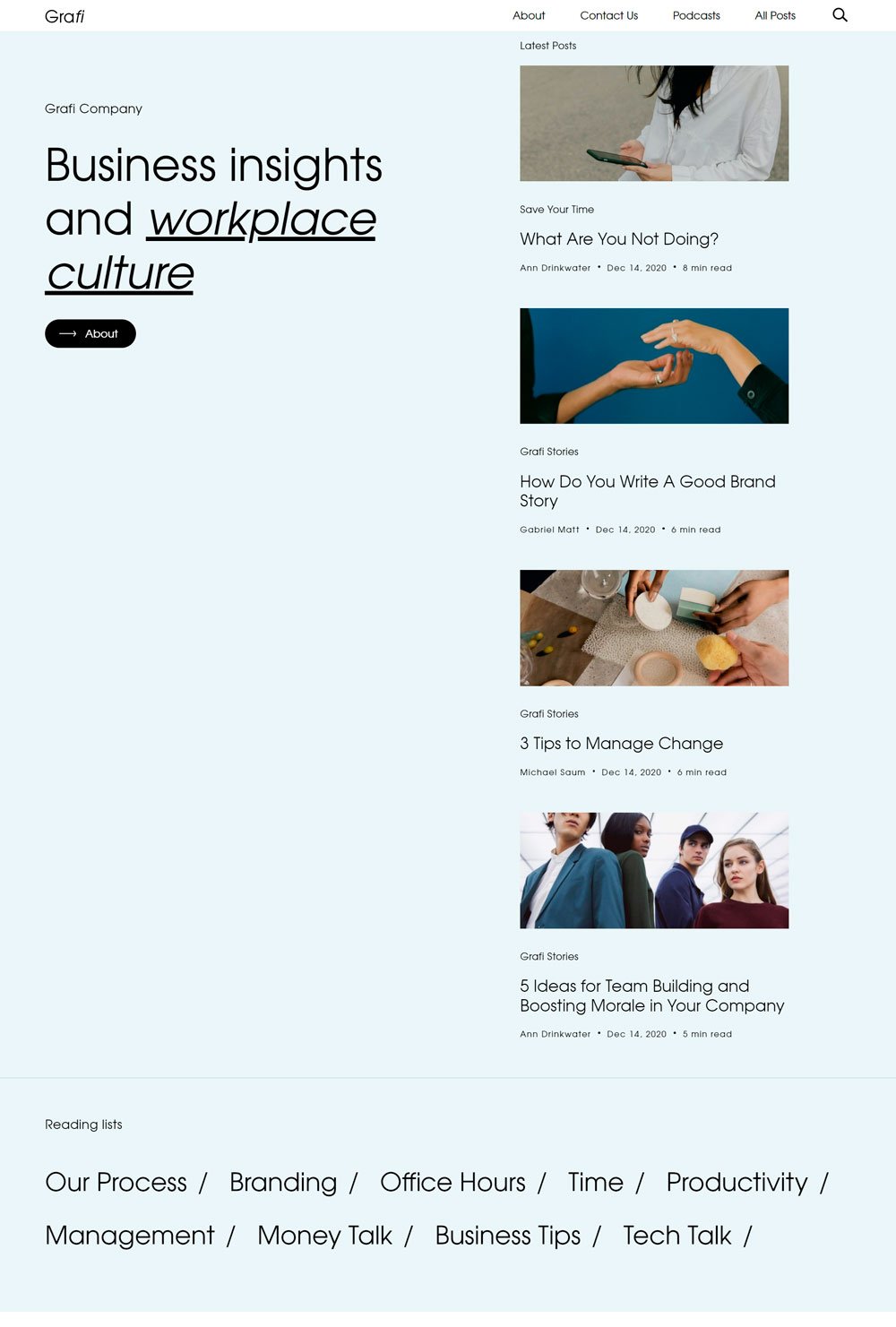
Grafi is a simple interface that uses solid background color and clean fonts. Some may think it is too simple, but it is excellent for individuals looking to design s straightforward, minimalist website.
What we like
The podcast episodes are featured at the side of the page
The podcast web page includes a basic player and a button leading to Spotify. You also get to share the link with your social media followers.
What can be improved
The episode doesn't contain featured images, which makes it less visually appealing
It has a robust about us page.
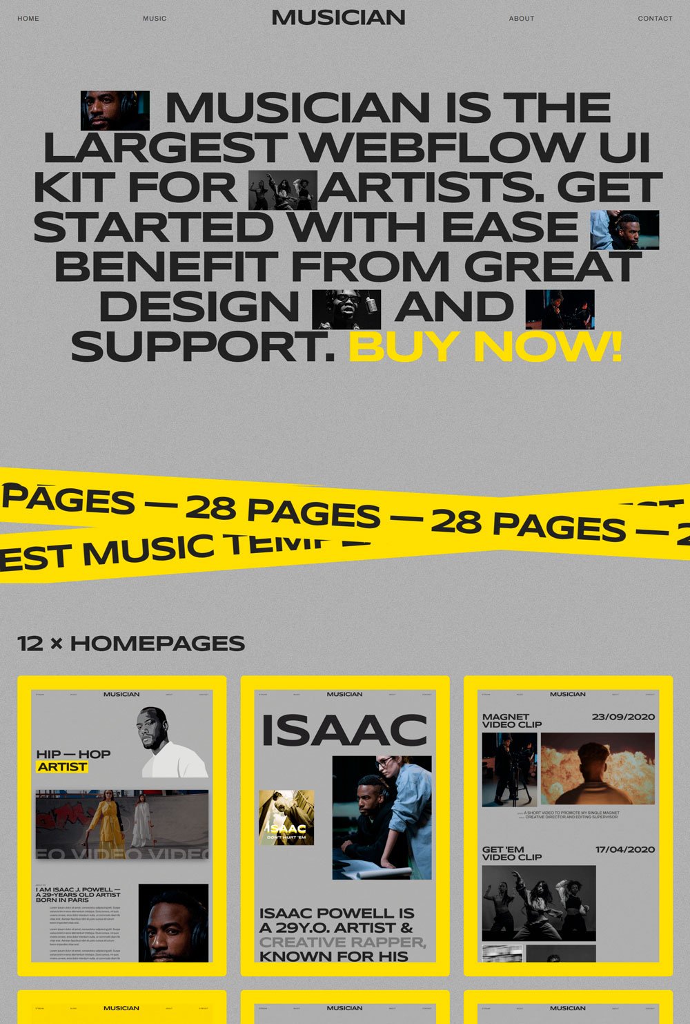
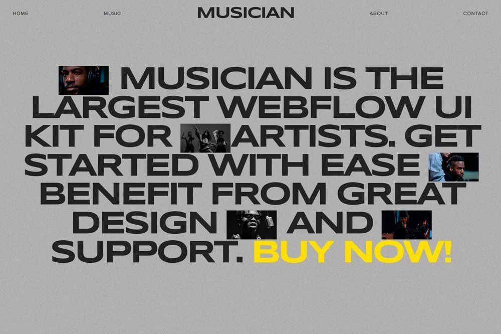
related article: Beauty Salon Website Template For SquarespaceIf you are looking for a unique podcast that doesn't play by the rules, Musician will be a great podcast website example. Although it is dedicated to songs, it also features excellent web design tips that one can learn from
What we like
Although the homepage is unique and creative, it doesn't neglect the important section, the songs.
It is a one-paged website, which is excellent if you want to keep things simple.
This musician template comes with various.
What can be improved
Each section is represented by similar images, which makes it hard to distinguish each section from the others.
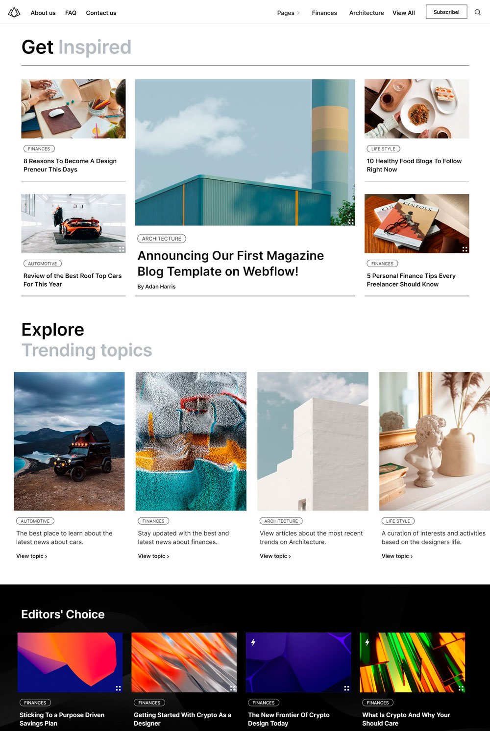
Get Inspired homepage was so thoughtfully designed that it had to make it to our list.
What we like
The editor's pick section is a great thing to incorporate in a podcast website because it gives a new visitor a direction to start from
The popular section allows you to display the most popular episodes amongst your listeners.
The FAQ section is a great place to answer popular questions.
What can be improved
There was no introductory text telling visitors what to expect.
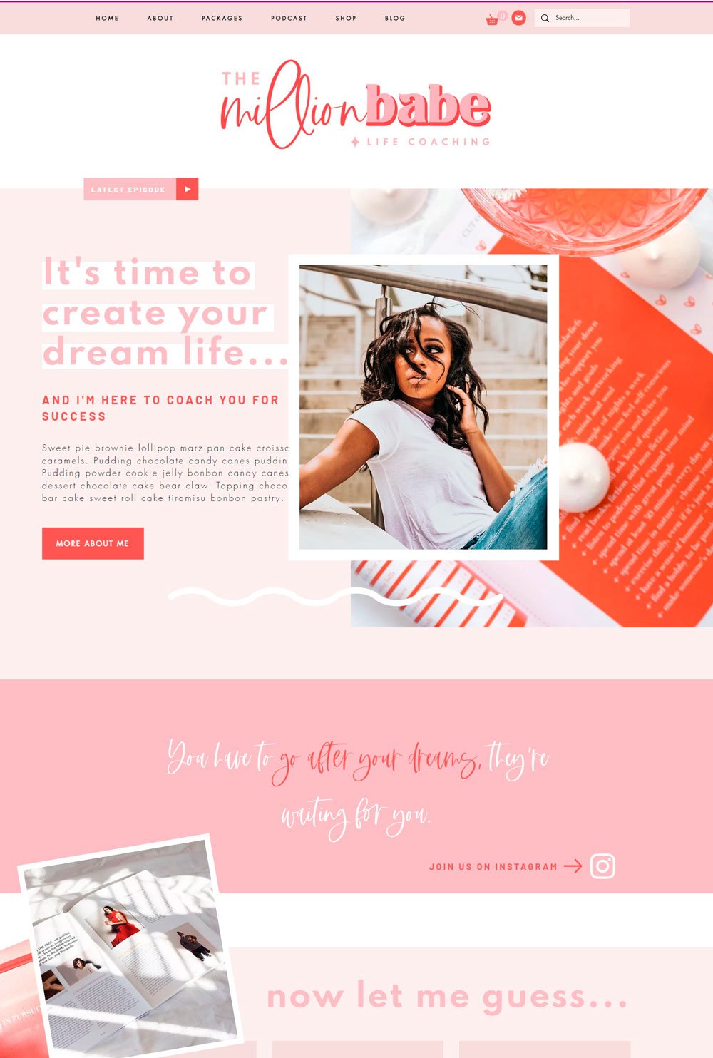
related article: A Complete Guide To Setting Up A Store On SquarespaceLooking to get inspired by a chic, classy podcast website? The Million Babe is a great inspiration if you are looking for a chic, feminine website. Although it is a full-blown website offering other services, we will focus on the podcast page.
What we like
There is the latest episode at the beginning of the page is intuitive
The stats are great for establishing integrity
A player is integrated on the episode page, which means you can listen directly to a podcast without going to the individual episode page.
What can be improved
Thee is no subscribe button
The episode doesn't have individual pages
The social media links are not easily accessible
related article: Square Vs. Squarespace: The Ultimate 2022 Review24. Podcast website: Primrose
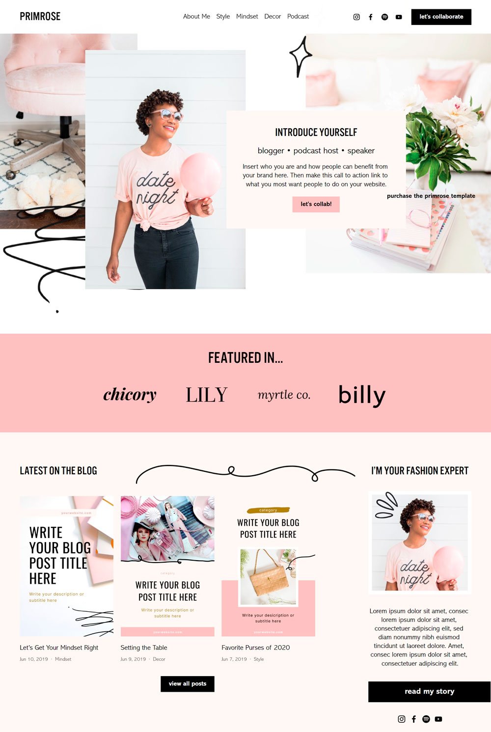
We love the elegant and feminine look of this podcast website. It also comes with enough information about the podcast.
What we like
Top directories are featured at the side of the page
Elegant podcast page
What can be improved
Basic player
Basic episode page; no transcript, no subscribe button.
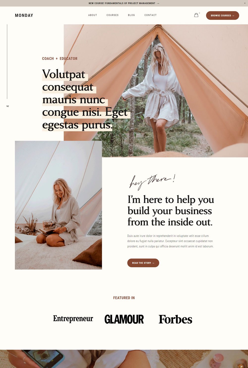
Related article: How To Add Blog Sidebar To Squarespace 7.125. Podcast website: Monday
Although this template doesn't come with a podcast page, the course page is an excellent inspiration for your podcast website.
What we like
The course page includes pictures of each course and a short, detailed description.
The browse courses, which can serve as the subscribe button, are visible and accessible.
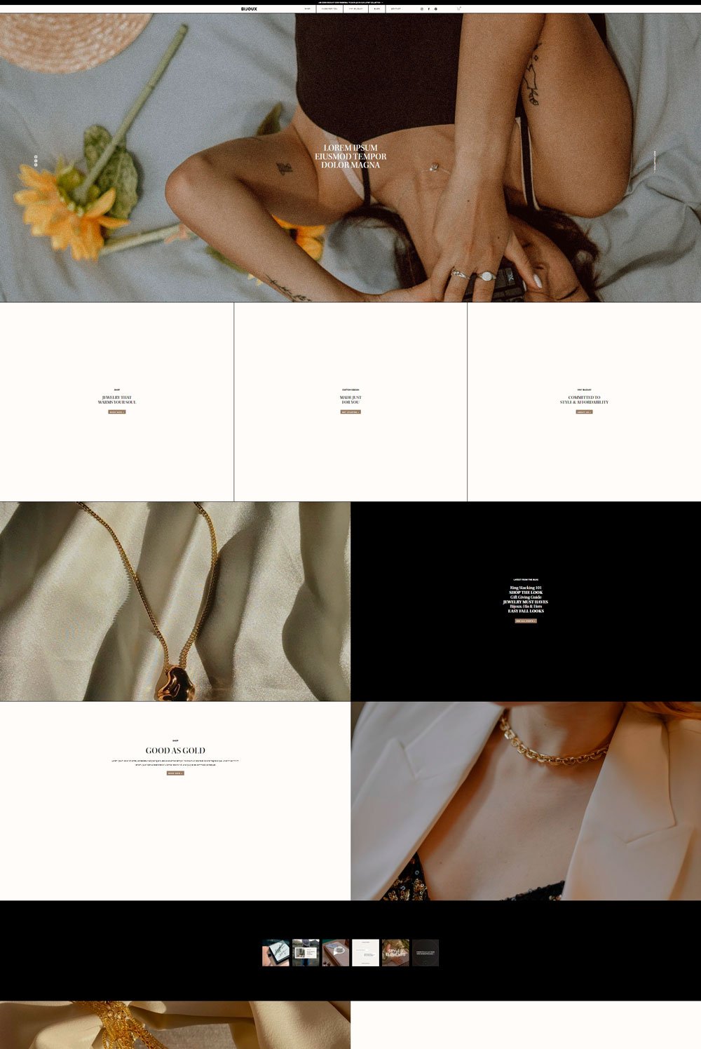
26. Podcast website: Bijoux
Bijoux maintain its elegance and simplicity at the same time. The full-sized images and clear sections make it functional and practical.
What we like
The sliding full-sized images and the text overlay is a stylish way to add elegance and sophistication to a website.
The fixed menu at the top of the page makes it easy for visitors to navigate any page.
What can be improved
The subscribe button is at the end of the page.
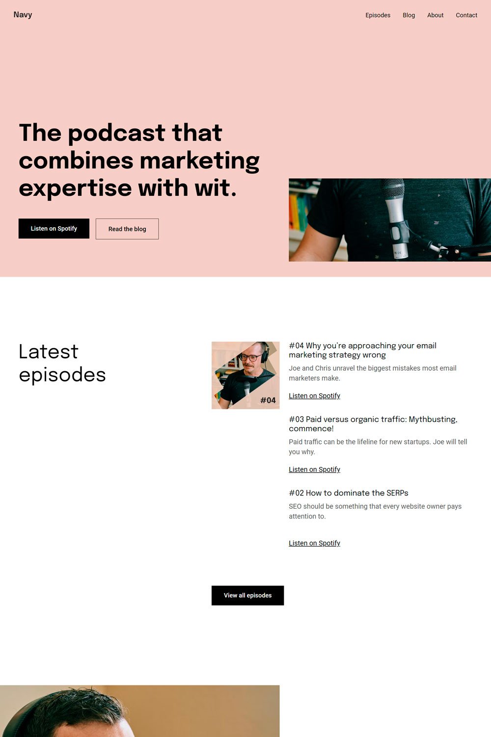
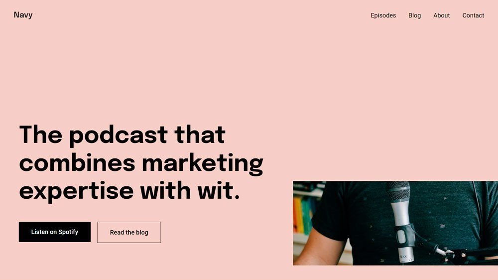
related article: 29+ Premium Squarespace Templates Shop For Any BusinessNavy maintains its clean interface and keeps the home page concise, which is a good attribute for a podcast that wants listeners to have access to the episodes
What we like
We love the clear CTA buttons across the websites.
However, the website keeps the home page short and includes the most important sections.
What can be improved
The only option to listen to the podcast is Spotify, which may restrict visitors unfamiliar with Spotify.
Podcast Website Examples to Inspire Your Own
The episodes contain mainly one image, which can become tedious and disinteresting for readers.
Buiding the right podcast website is necessary to have a booming podcast career. We've highlighted the best hosting services and provided you great podcast website examples. We hope you've gotten enough inspiration from these best podcast websites examples to build a successful podcast
