31+ Best Health coach websites (Plus Templates!)
Building effective Health coaching websites is beyond aesthetics; functionality and conversion must be kept in mind. Your visitor must be able to have a strong first impression of your website in less than one second and decide if you are the best choice in 5 to 10 seconds. Therefore, it is important to ensure that when you are building your health and wellness website, you put design choices into consideration
Fortunately, I've come up with more than twenty best health and wellness websites templates to inspire your own health coaching website. The better part is that they are all templates so you can purchase any if you eventually fall in love with the template!
Whether you are a health coach looking to build your website or a website designer looking for inspiration, there is something to learn. Let's get started!
Looking for a unique website design for your business? Explore our Squarespace Web Design packages for a stunning website. Need to enhance your site's visibility? Our Squarespace SEO services are here to assist you. Curious about our work? Take a look at our Squarespace website designer portfolio for some inspiration!
Best Health Coaching Websites To Take A Look At
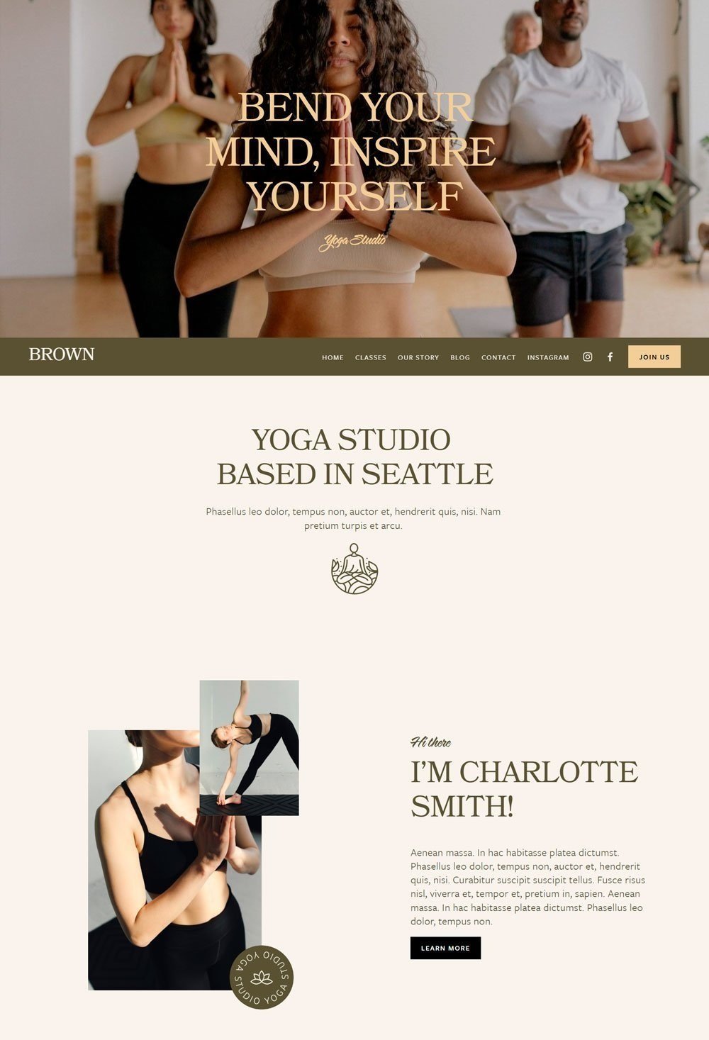
Brown is a Yoga Studio template that features great aesthetics and strategic arrangement of sections on the home page. The perfect sync of the colors and elements makes it a soothing and warm website design.
What We Love
Brown was beautifully designed, and we love how each section on the home page creates a climax until visitors are compelled to take action. Another worthy note is the use of a warm variation of brown colors to create a perfect sync that blends out perfectly. Also, the call-to-action buttons around the home page make it easy for visitors to take action. Overall, this is a health coaching website that you can either draw inspiration from or purchase.
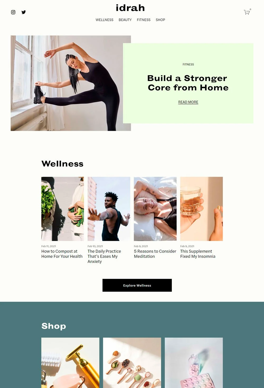
Idrah is a health coaching website focusing on various health and wellness products to bring out the best in clients.
What We Love
We love the mild pastel color that was used throughout the website to create a soothing experience. Avoiding harsh colors on a health coaching website is a great way to make all potential clients feel comfortable. Another thing we love to point out is the shop page. It is simple and categorized to help visitors easily locate what they want. So, if you are looking for health coaching websites that offer products, then this great health and wellness website is a great template and inspiration.
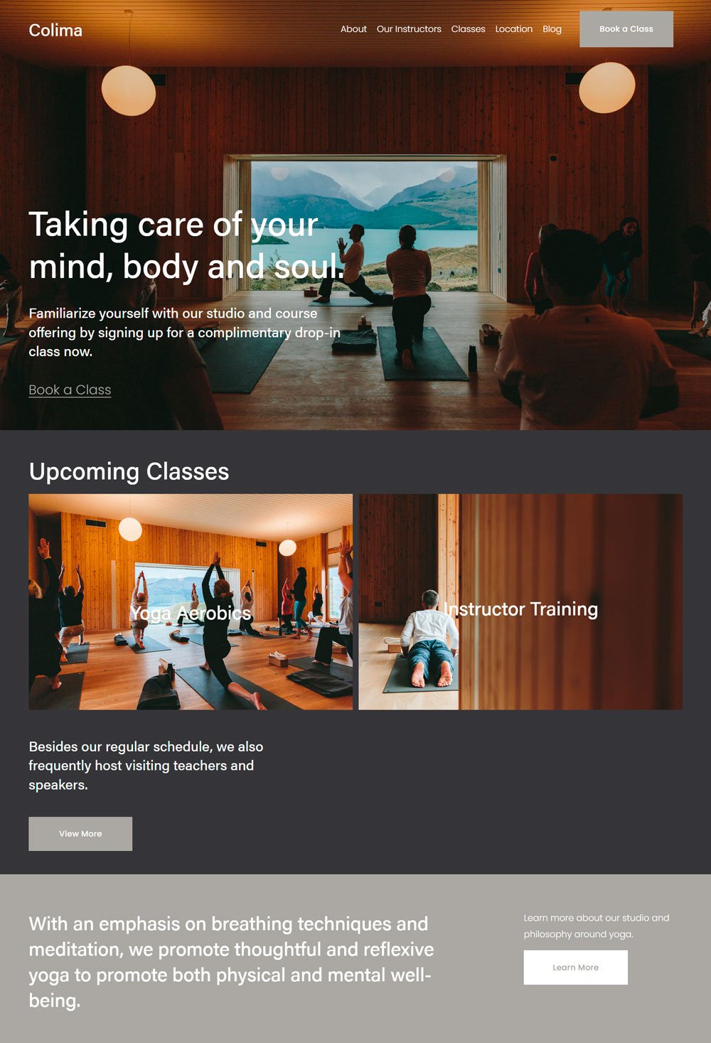
Colima is a health coaching website template with a clean design and lots of explanatory sections
What We Love
The use of visuals is often neglected, but is a good way to give potential clients a foretaste of what to expect. Also, the strategic placement of the Call-to-action buttons reduces the chances of losing new customers. The great newsletter form allows people to subscribe to a weekly newsletter from the website, which is a great way to turn visitors into loyal customers in the long run. Lastly, there was a clear introduction of the health and wellness coach(es). So, if you are looking for a clean website in the health coaching industry, then Colima is one of the best health coaching websites to use or draw inspiration from in the coaching business.
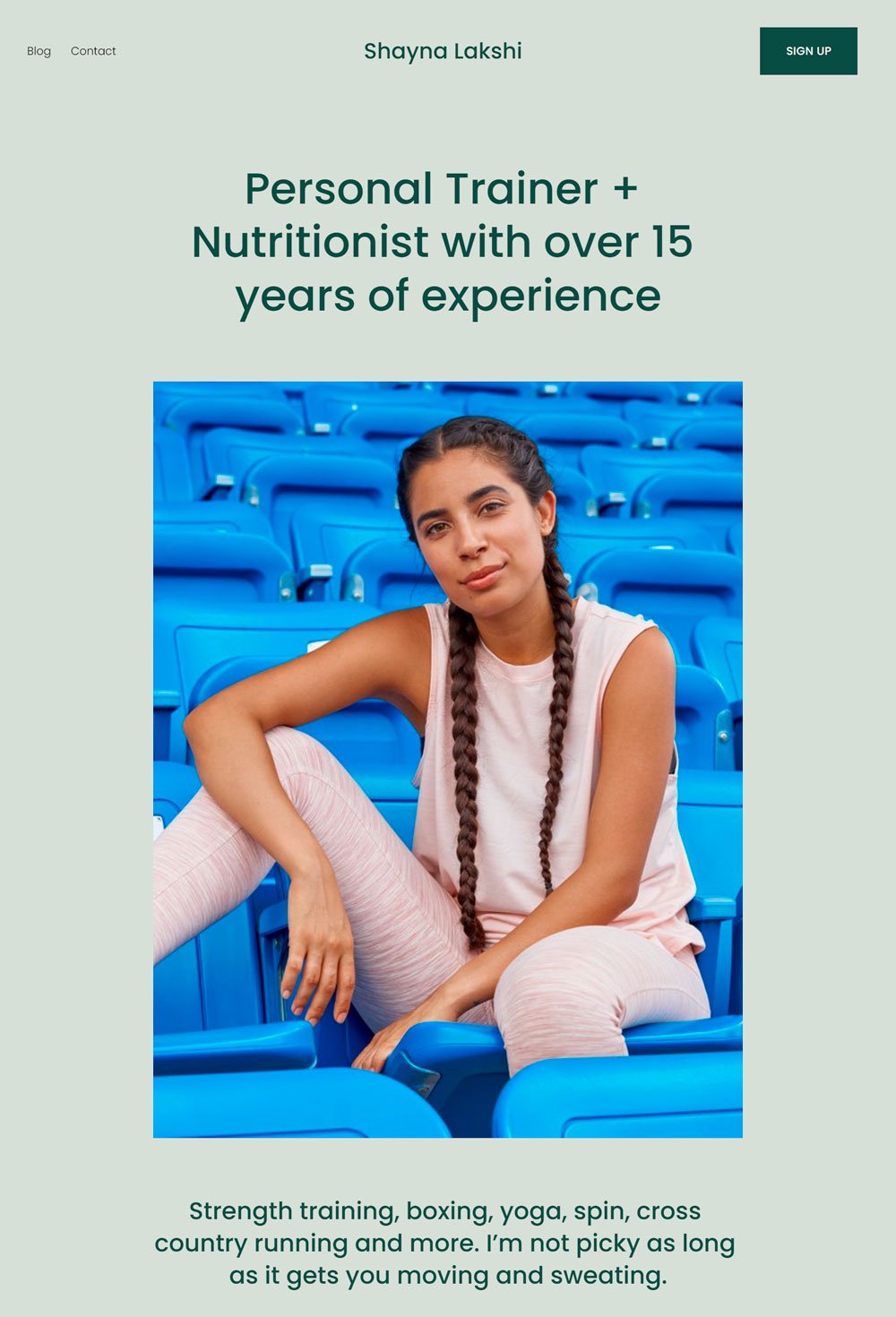
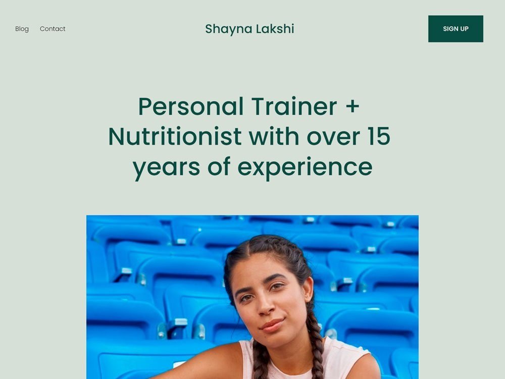
Shayna Lakshi is a personal trainer and health coach, and nutritionist that focuses on the general well-being of her clients
What We Love
This health coaching business website's simplicity and 'straightforwardness' is phenomenal. We love the clear picture of the holistic health coach at the beginning of the website design template and the quick introduction to what you stand to gain, such as healthy recipes, fitness, personal training, etc. In addition, the testimonial and images are also a great addon to further compel visitors to take action. Shayna completes it by sharing free resources in the form of blog posts to build visitors' trust. Shayna Lakshi is a great health coach website, inspiration for health coaches.
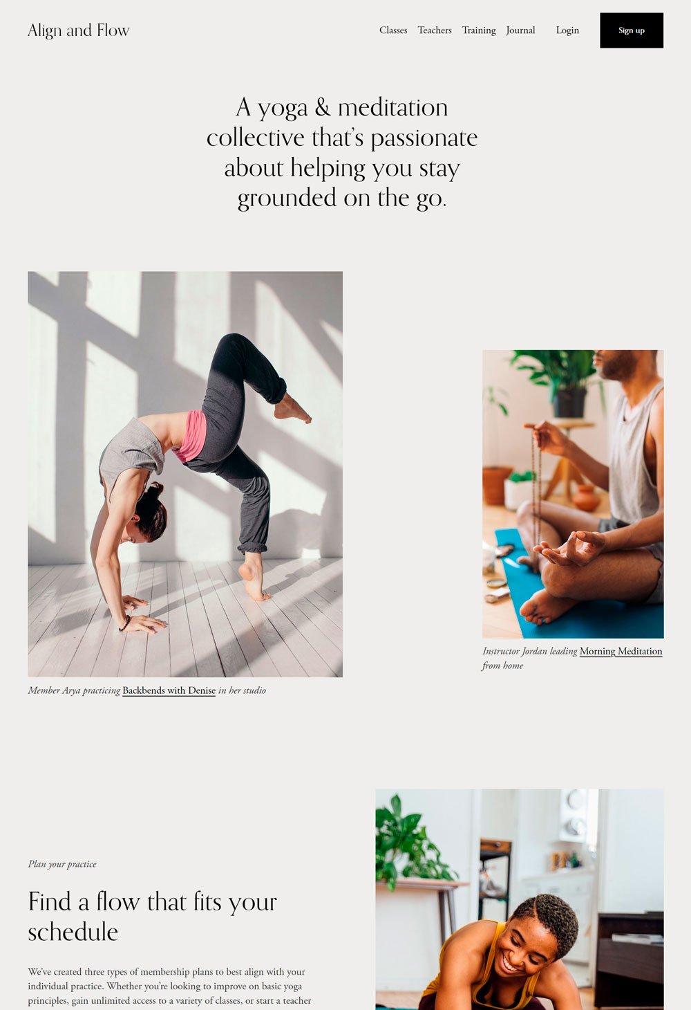
Align and Flow is a meditation and yoga health coaching website that keeps its interfaces clean and simple
What We Love
Apart from its minimalist approach, Align and Flow make the user experience super easy. We love how it highlights the program information (curriculum), which gives potential clients an overview of what to expect. Also, the plans could be seen on the home page without having to go to the service or pricing page, which is another thoughtful consideration for new visitors. Align and Flow also features client testimonials, virtual coaching programs, and health coaches' profiles to ensure that new visitors have adequate information to aid their decision. Overall, Align and Flow is a great inspiration for health coaching websites.
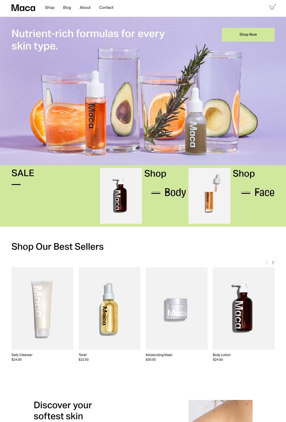
Maca is a wellness business online store that presents its products in a clean, clutter-free manner
What We Love
Online stores are meant to be minimalist as possible so that the products can gain due attention, and Maca nailed that. The abundant white space and strategic copy on the website make it a great template if you are looking to offer wellness products. Also, the contact page is straightforward. However, we believe that including a category or search bar on the shop page will be helpful for visitors in navigating products. Maca is a great wellness store to inspire your next wellness business online store.
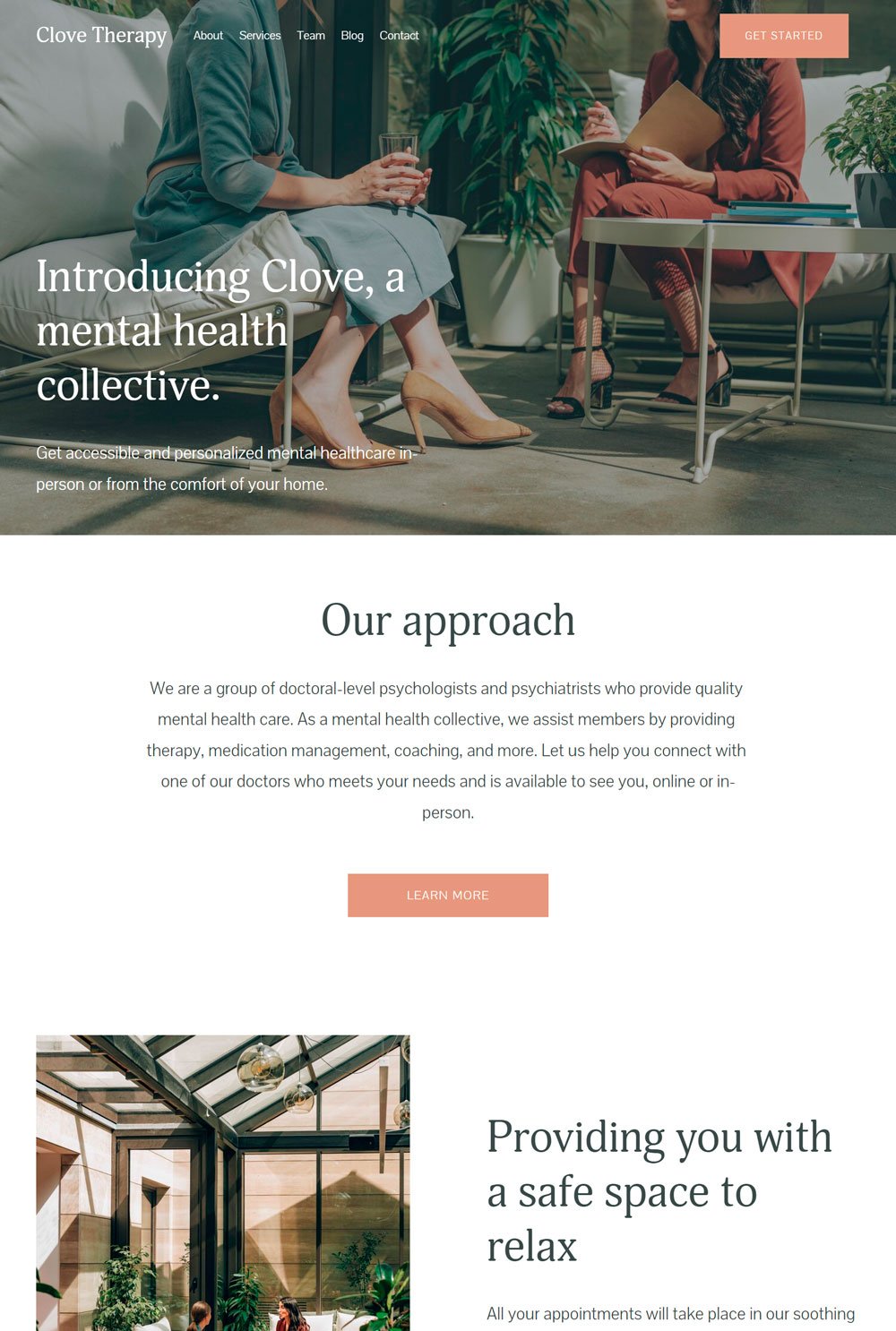
The brown accent color and white background make Clove Therapy peaceful and soothing
What We Love
Although it is a wellness website, Clove Therapy found a way to add a bit of color to it, with brown being the main accent color which actually works. Highlighting their approach and establishing their credibility is a great way to clear all doubts in visitors' minds and also inform uncomfortable visitors about the procedure. Also, the service page provides enough explanation about each service before stating the part, which makes Clove Therapy a professional site worthy of emulation.
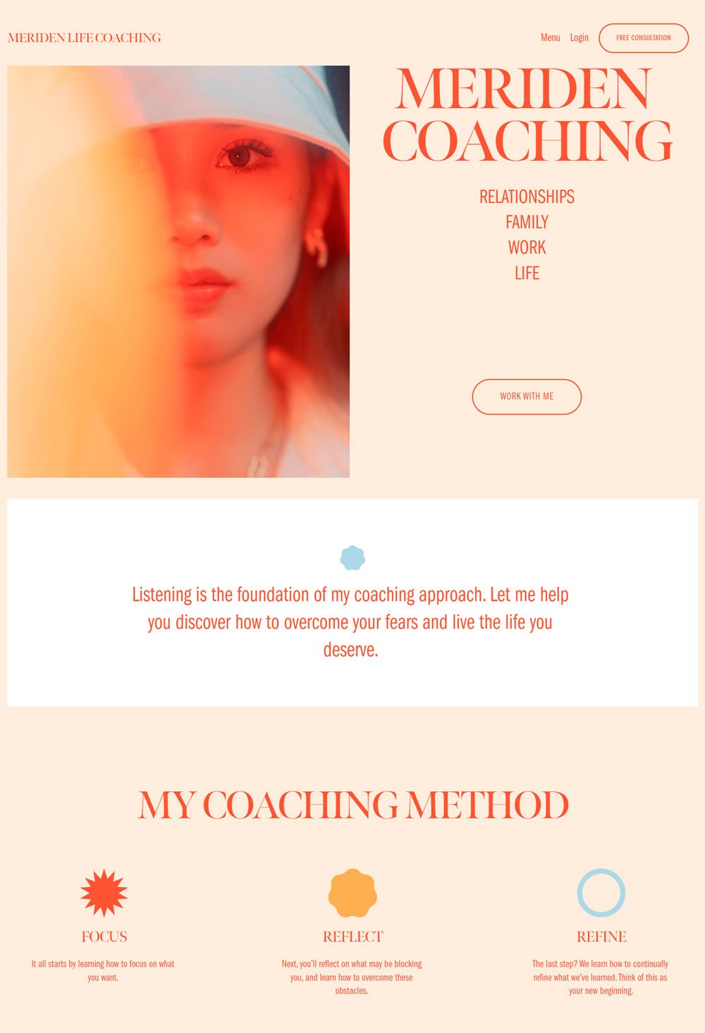
Meriden Life Coaching website combines aesthetics and functionality like a pro. The use of fun colors without getting messed up is remarkable.
What We Love
The orange primary colors make Meriden life coaching stand out from other professional sites. We love the 'what is included' section of the course page that informs visitors on what to expect. The caution on the course page before anyone purchases the course is often neglected, but effective in case of future problems. Also, the work with me page is beautifully designed, and we appreciate the simple yet functional home page. Meriden Life Coaching website is a great inspiration for any coaching business looking to design a visually appealing yet professional website.
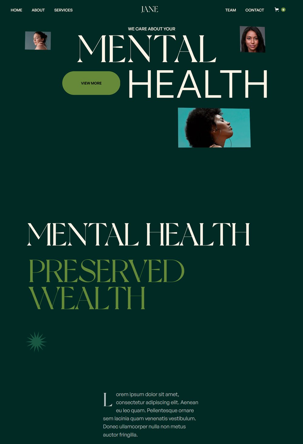
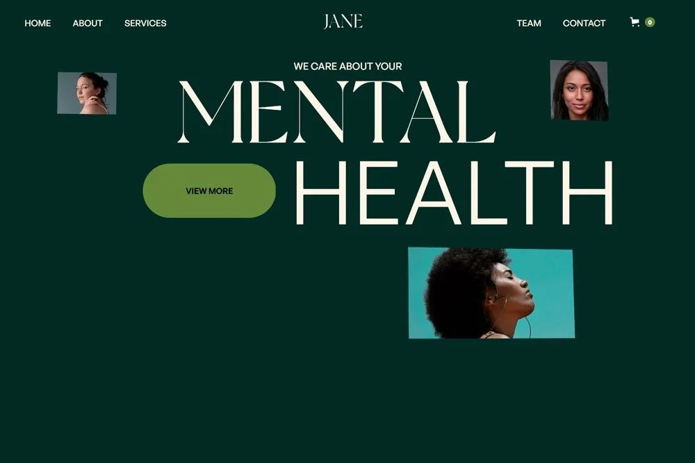
Jane gives that classy and calm vibes with its sans serif fonts and unique arrangement
What We Love
Jane takes a rather different approach from other health and wellness websites, but it still plays out well. The arrangement of text and images makes it stand out from the rest. We love the big call-to-action button just beside the main text and the use of big, bold letters. The use of customer testimonials on the page is also a great way to reinforce customers' decisions. Also, the treatment page is uniquely arranged, and the use of green colors is commendable.
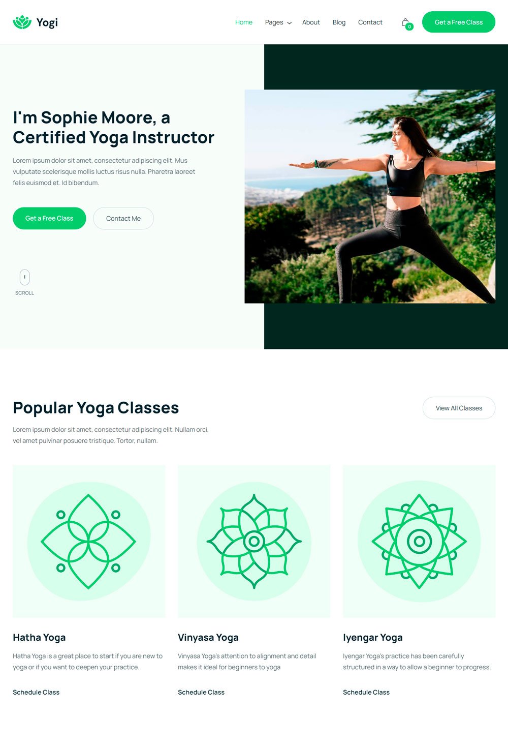
Yogi is a personal wellness coach website that features clear call-to-action buttons and visual elements
What We Love
Yogi features a great color scheme, enough white space, and an explanatory journey. One commendable thing is the generous yet strategic placement of CTA buttons, which is great for conversion. Also, the popular yoga classes' section helps indecisive visitors to settle down with one quickly, and the short intro about the wellness coach gives an insight into the personality to expect. Lastly, it is nice to feature freebies on a website to attract clients further.
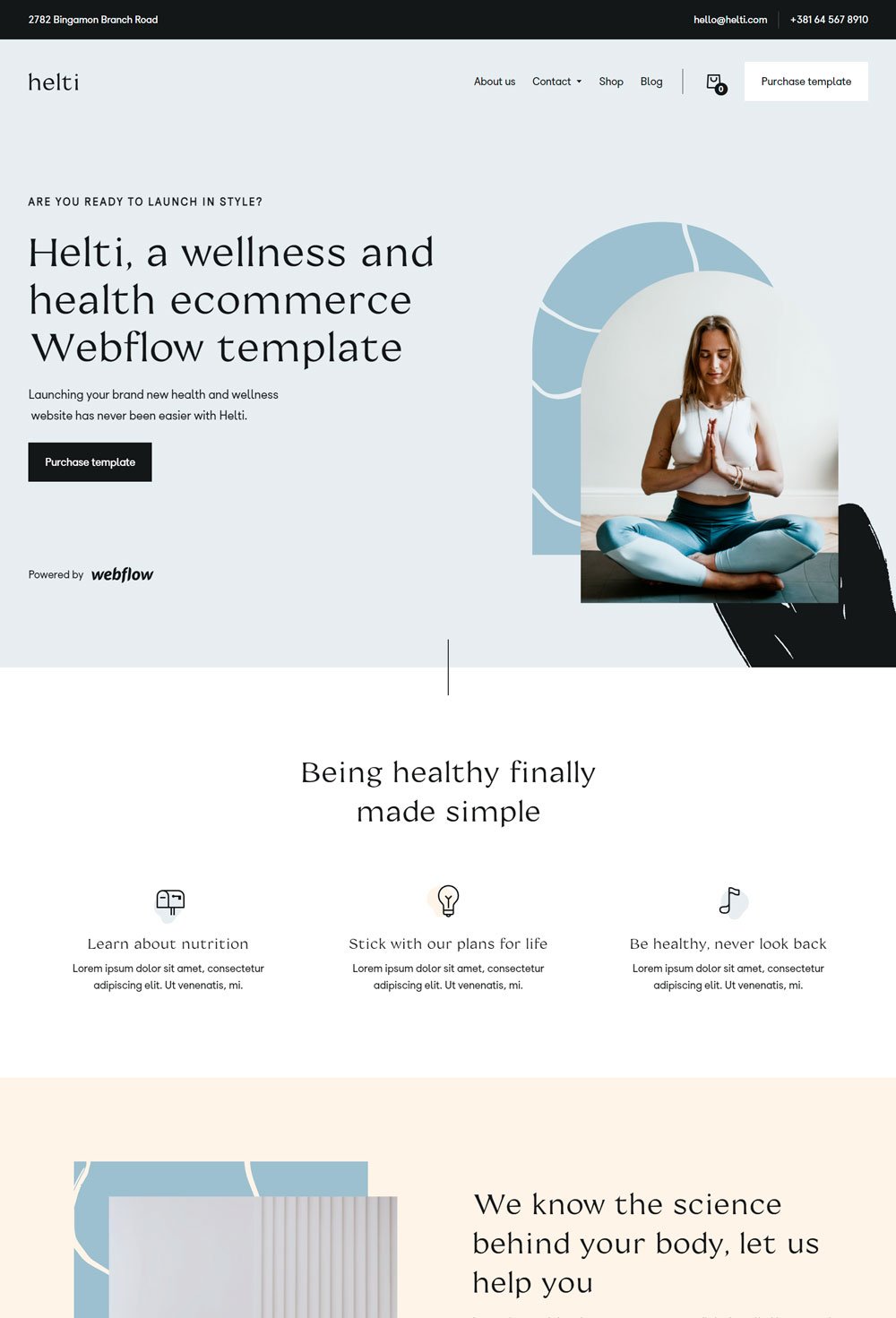
The Helti template is great for wellness coaches or businesses who want to offer products alongside their services.
What We Love
One thing we love about this website is its simplicity and strategic arrangement of the homepage. However, one phenomenal thing that most coach websites neglect is FAQ sections. This template created a section where a health coach can answer frequently asked questions. Also, the shop page comes with a category bar, making categorizing the products easier. Lastly, the new letter form at the end of the page allows the target audience to sign up for newsletters.
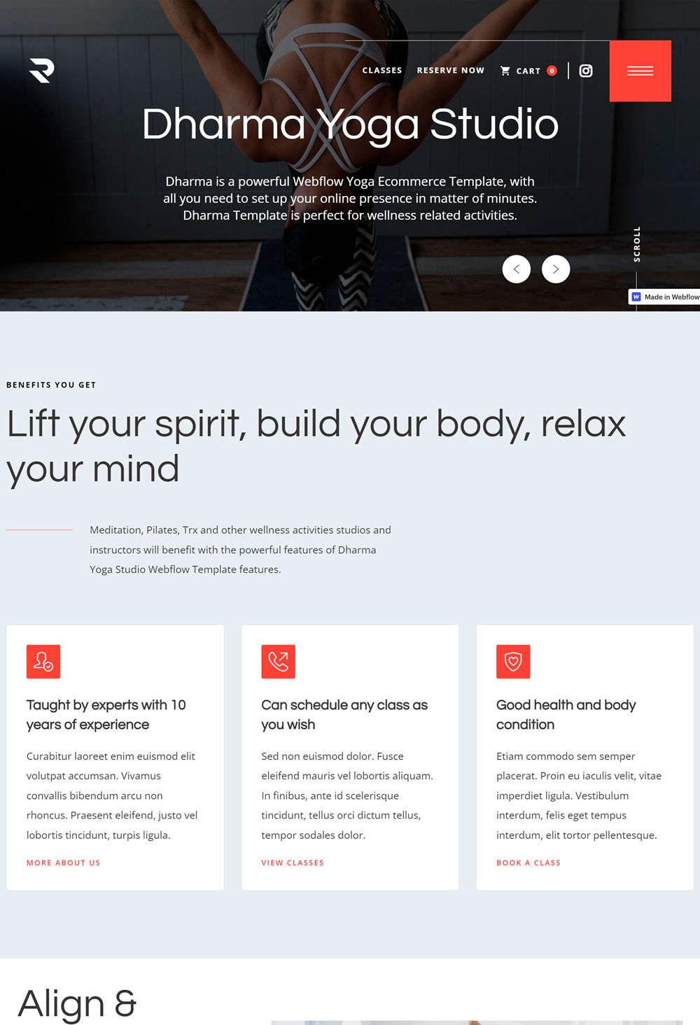
Dharma Yoga Studio created a nice balance between aesthetics and functionality.
What We Love
One thing that catches any visitors' attention is the sliding header image that gives them a sneak peek into what to expect, and then the overlay of the main copy makes it more catchy and attractive for visitors. Next, we will love to highlight the great use of animation around the website, which adds a sleek look. Moving on, the hamburger menu was highlighted to ensure nobody missed it. The Packages and Plans were well-structured to give all the necessary details. Lastly, the monthly membership and single session that have their separate pages may look extra, but it is okay if you have plenty of packages under each section.
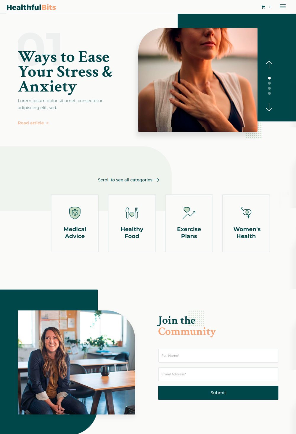
Healthful Bits is mainly a blog and shop website that allows customers to learn and shop at the same time.
What We Love
The Healthful Bits blog makes a different approach from different blogs out there are uses the slideshow to post different trending topics. Also, the newsletter on the second part of the homepage makes it super easy to subscribe to the website, making sense since it is a content-heavy website. In addition, Healthful Bits doe a great job in the categorization of the blog, and the shop page is aesthetically pleasing. Overall, Healthful bits' web design is top-notch and a great inspiration for other sites.
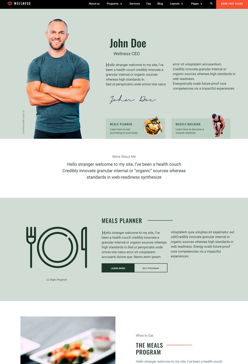
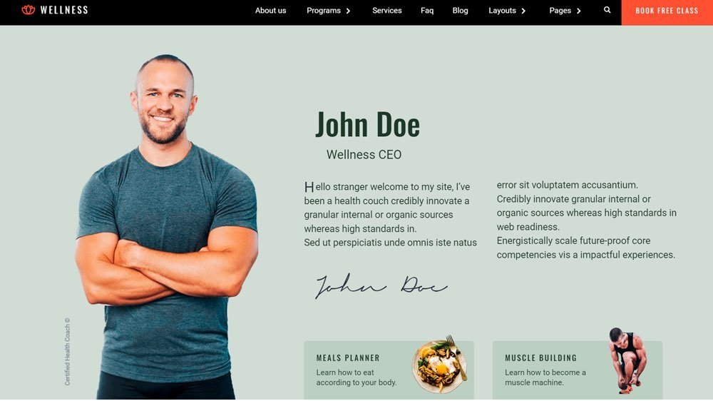
The Wellness Health Coach template does a great job of strategically arranging its homepage.
What We Love
Before we go far, the brief introduction of the health coach is a great way to give visitors insight into who they will be working with. After that, the homepage went straight to what they have to offer, which may look abrupt but is super helpful for cutting the bloats and focusing on what clients will stand to gain. Lastly, the FAQ page and free class are a great addition.
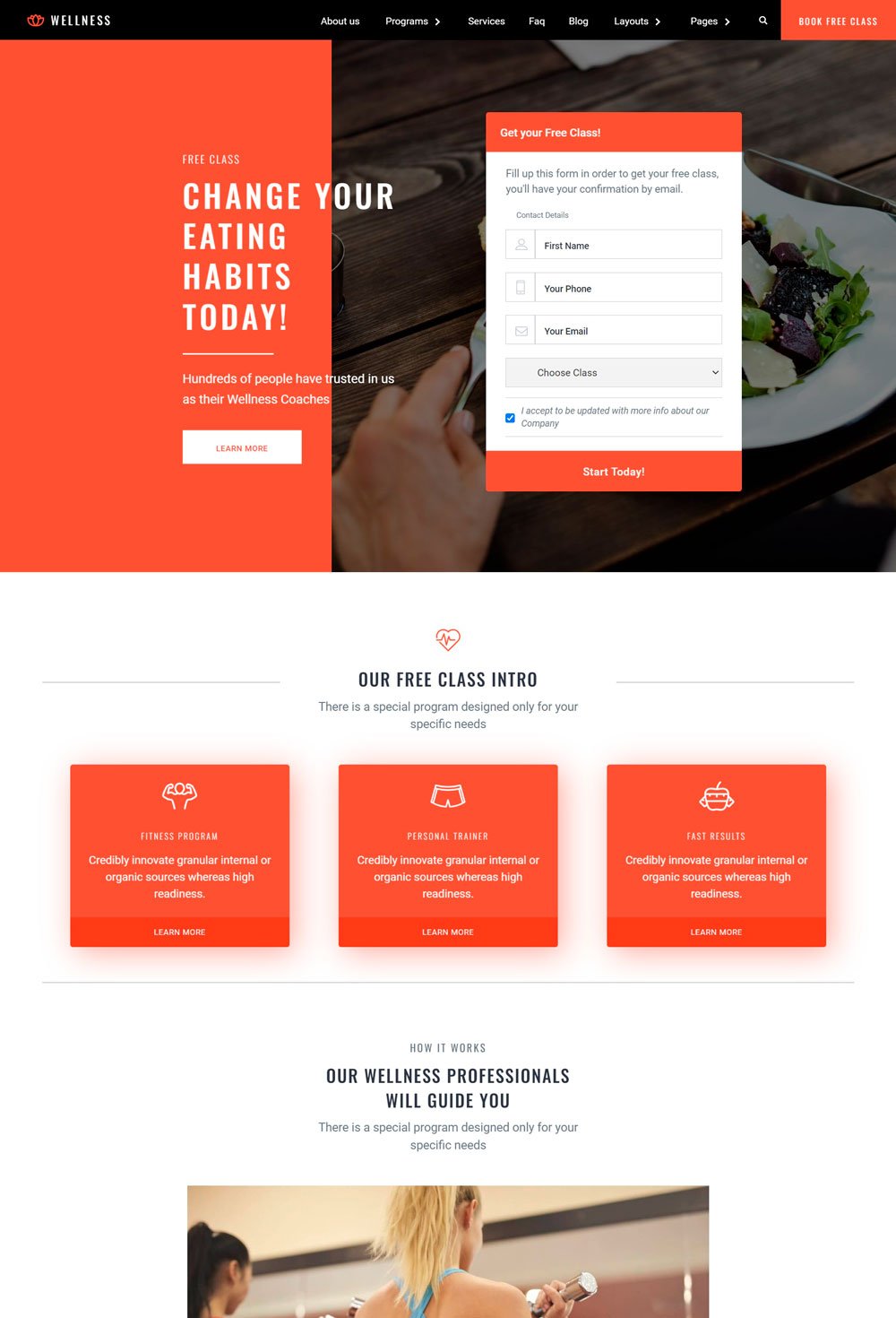
related article: 29+ Premium Squarespace Templates Shop For Any BusinessThe use of free resources and strong client testimonials makes Wellness Coach a trustworthy site.
What We Love
People love free things, and what better way to start a wellness website than a big form telling visitors that they can get a free class, or they need to do is to sign up the moment they land on the page? The video guide and explanation of how the program will go is also a great feature. Lastly, using testimonials and a free e-book form is another great way to show that you want your visitors to benefit from being around on your website.
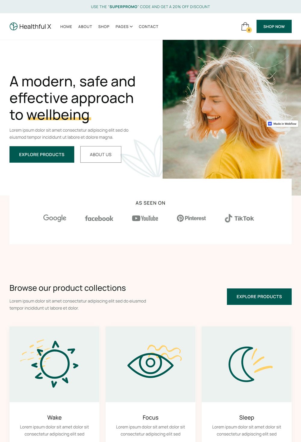
related article: Beauty Salon Website Template For SquarespaceHealthful X offers health and wellness products and does a great job doing it.
What We Love
The use of images and bold copy at the beginning of the homepage is commendable. Also, the CTA button telling visitors what to do is a great converting strategy. Going to the stoppage, the categories make it easy to navigate. In addition, the about page is one of the best out there. It focuses on proof, and each copy supports the fact that they are a trustworthy online store.
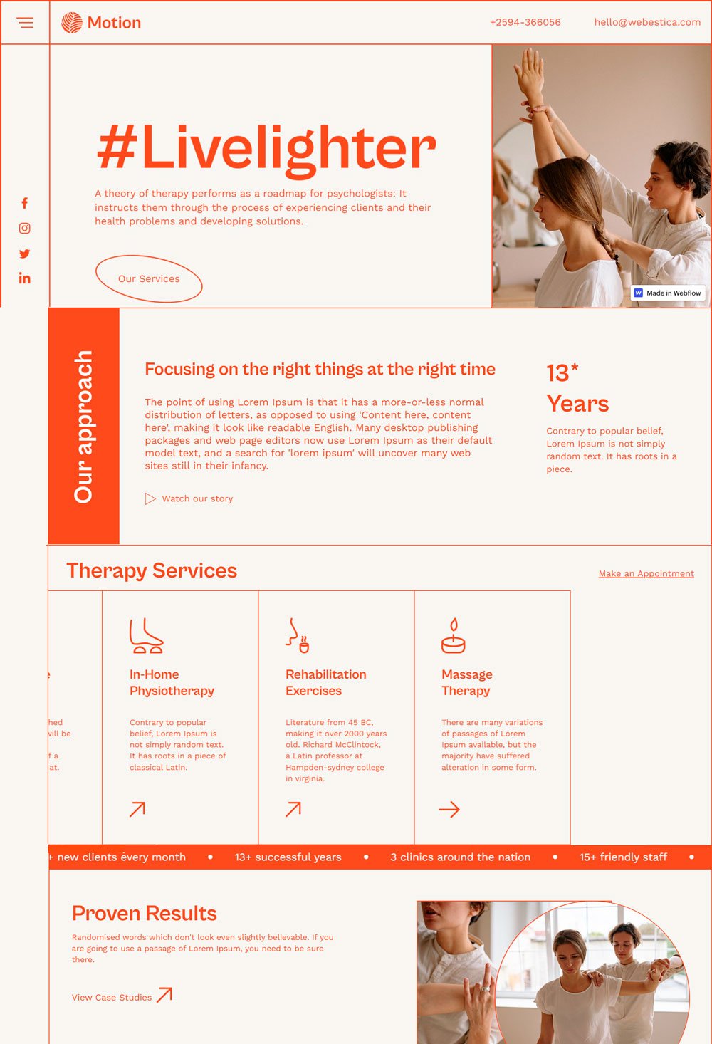
Motion features every important information on the homepage, reducing the stress visitors have to go through.
What We Love
The short animation that shows a person getting a massage/therapy is often neglected, but a great way to show visitors what they will be missing if they don't sign up for your services. Also, the placement of a social media icon at the side of the website guarantees a higher chance of visitors checking the website's social out. In addition, the pricing plan on the homepage is also a thoughtful thing to do. Overall, Motion stands out from other websites because of its choice of color and simple structure.
related article: Stunning Squarespace Real Estate Template18. Koach Website
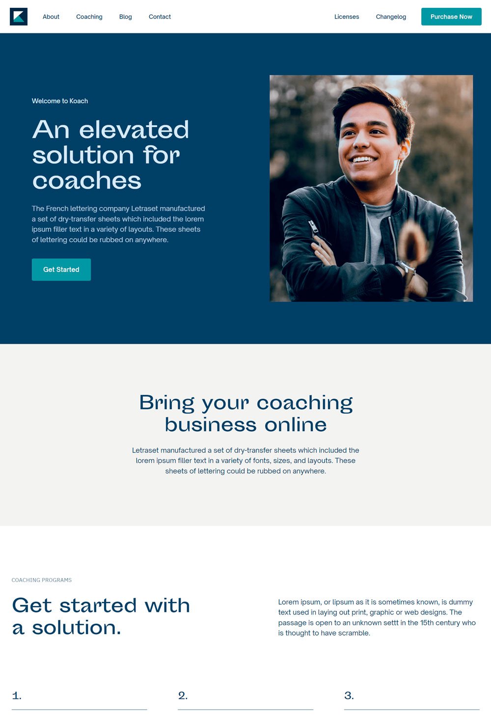
The Koach Coaching template is a professional template that makes building a beautiful website possible
What We Love
The Koach Webflow template is carefully designed for coach websites, health coaches, and other coaching businesses looking for an online presence. Not just any online presence, but one that brings potential customers. The structure and use of quality images (which can be changed later on) give designers the versatility needed to come up with a unique website.
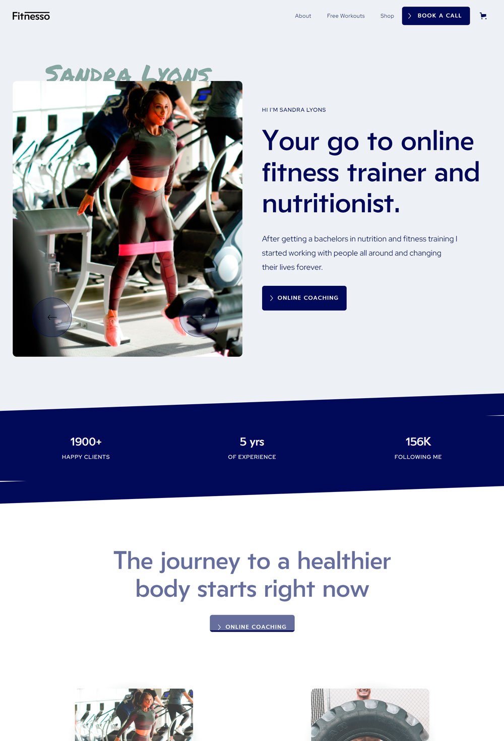
related article: 26+ Best Squarespace Templates For PhotographersFitnesso is a well-designed template with loads of freebies and CTA buttons
What We Love
The clear Book A Call button beside the menu bar allows visitors to see the most important action they need to take. The website's color scheme gives it a professional look, and the images are well-placed. Every section has a CTA button, which is great for SEO, and loads of free resources to attract users. Fitnesso does a good job separating the freebies from the paid plans to avoid confusion. Lastly, the payment method listed at the end of the home page makes it easy for visitors to find the payment options available to them. If these payment options were also listed on some parts of the home page, it would have been more effective.
related article: 21+ Best Squarespace Blog Templates In (Free & Premium)20. Yoga With Marta
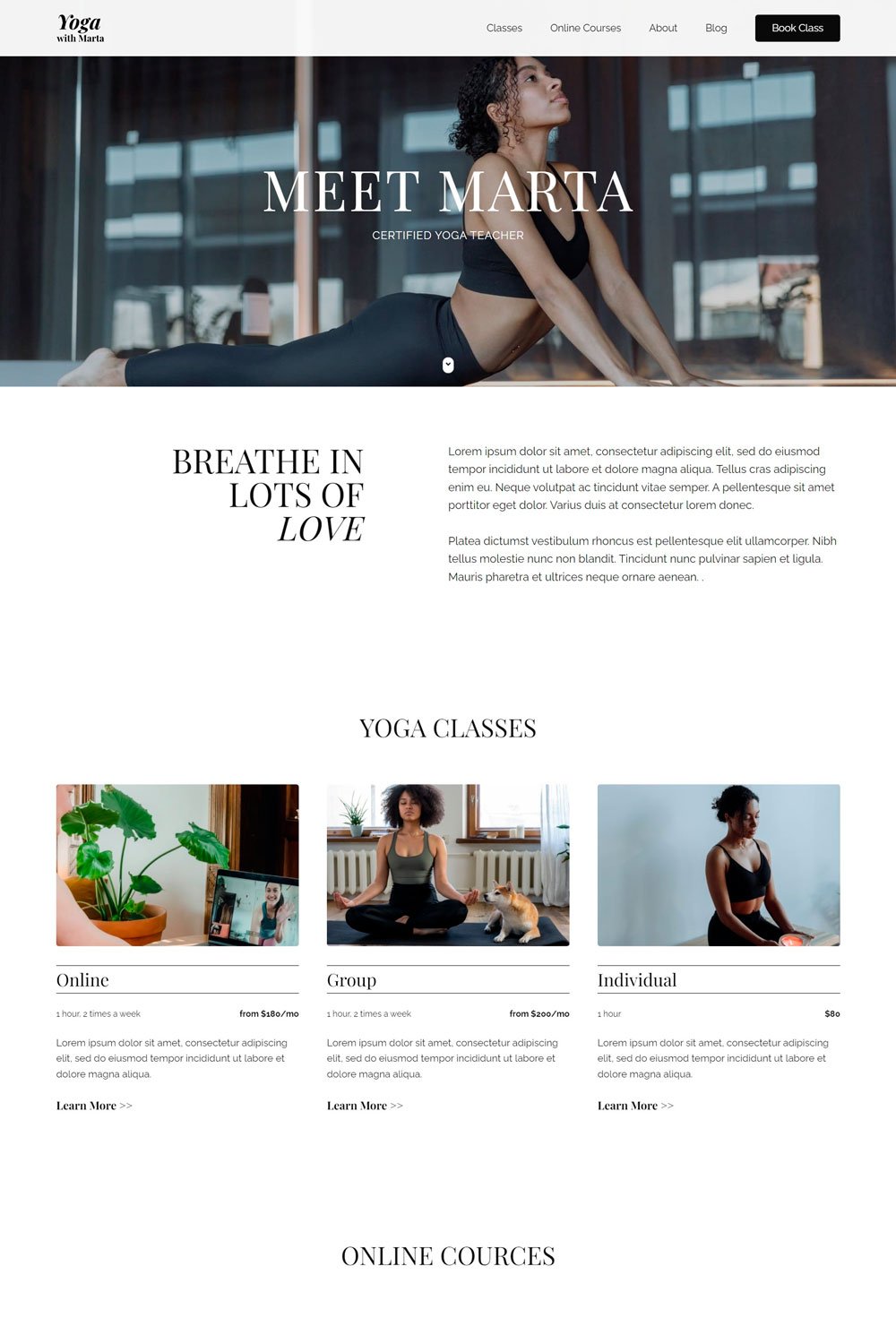
Marta combines elegance, simplicity, and professionalism at the same time. A great website template if you want to achieve a chic look
What We Love
Health websites are not meant to be boring, and Marta proved a point. The images, structure, and elements give Marta that clean and elegant use. Also, the website keeps things simple by going for a white background. The Yoga classes and online courses are easily accessible from the main menu, which is good for easy navigation. In the end, we love how Marta keeps everything simple and elegant.
related article: 6 Simple Website Launch Announcement Ideas & Graphics21. Yoga Matter
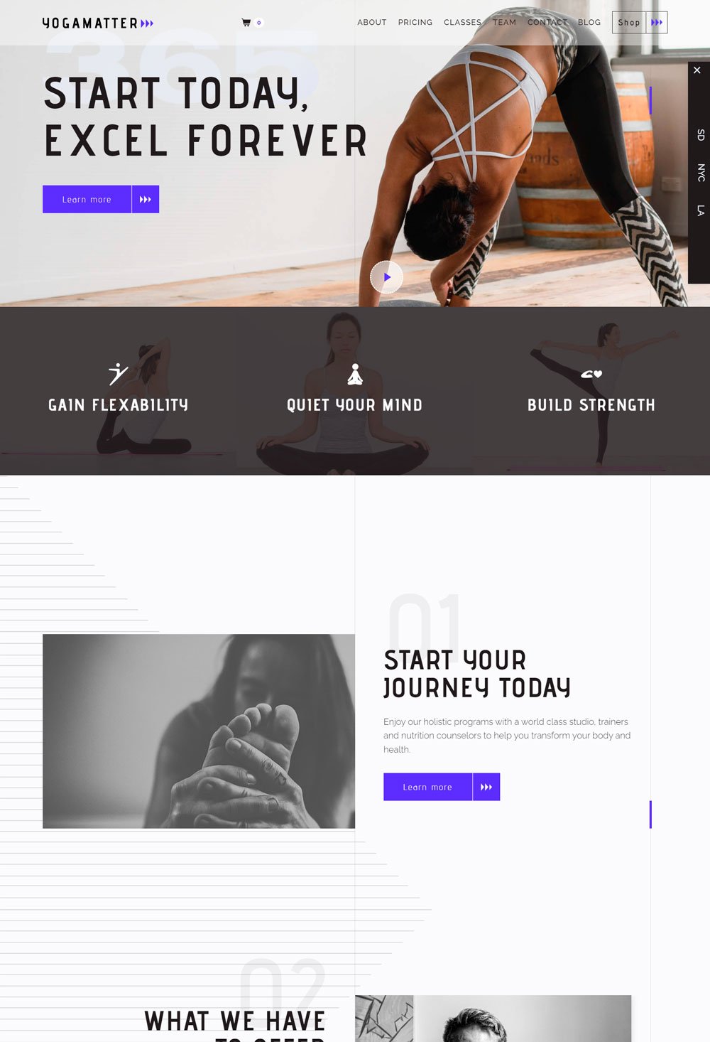
Looking for a modern health coach website? Think Yoya Matter.
What We Love
Everything about Yoga Matter is modern, making it a great template for websites that want a modern and unique online presence. First, the full-sized image s a great choice, and the location bar at the side of the page leads you to the studio in the specific location with opening hours information. This is a thoughtful and creative approach to highlighting your studios in different locations. The pricing page is well-structured with categories to help clients find the right plan. Lastly, the unique overlay of the classes page is another way to group services into effective categories. In a word, Yoga Matters is not just beautiful but a unique website that is sure to create a visually appealing and professional online presence
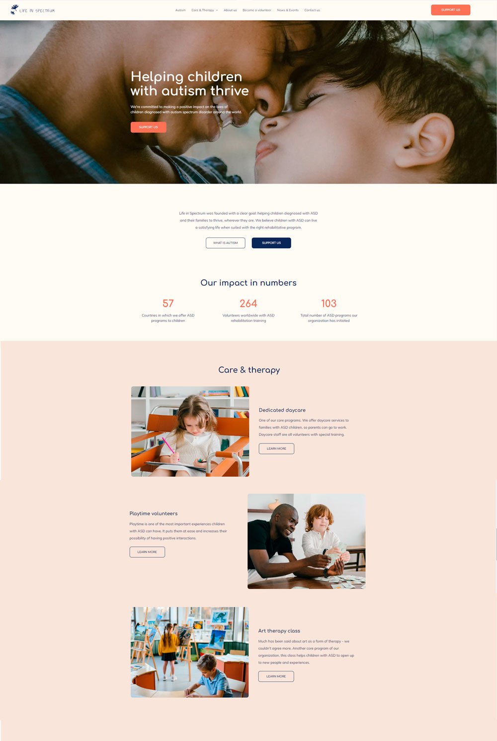
related article: 21+ Best Squarespace Portfolio Templates To Show Off Your Work22. Life In Spectrum
Life In Spectrum is a Children's health and wellness platform that is carefully designed to show the parent that their children will be duly cared for.
What We Love
The use of cheerful images to show children enjoying their learning process is enough to make a strong first impression on any parent. The home page can be a converting landing page when combined with compelling copy. The structure and pages in Life In Spectrum and generally well-designed and converting.
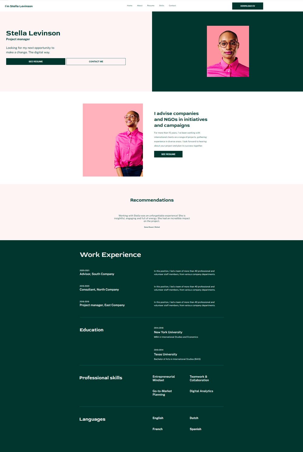
related article: 41+ Beautiful Wedding Website Examples For Your InspirationI'm Stella Levinso, a personal coach portfolio website that focuses on minimalism and highlights only necessary information.
What We Love
The website starts off with clear call-to-action buttons that save visitors the stress of going through the home page. The Download CV button is also a great way to show that one is an experienced and certified health coach. Moving on, it highlights important recommendations and past job experience to give employers a full picture of what to expect. The other pages featured on the website are all well-designed to give a seamless look.
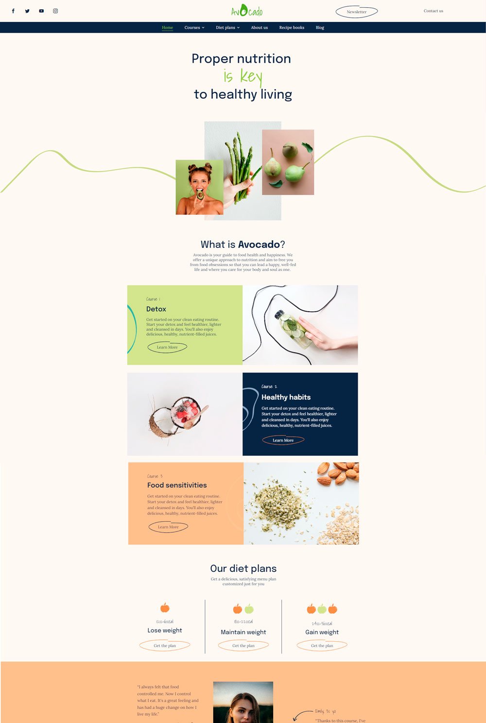
related article: 41+ Best Squarespace Plugins For Your Website24. Avocado
Who says health websites cannot be fun-looking? Avocado makes use of fun images and interesting colors to create a website that customers love.
What We Love
The use of high contrasting colors helps Avocado highlight the most important information, which is a great way to ensure you are passing the needed message across. We love how the courses are interestingly listed, instead of the boring old way. Another thing worth noting is how the diet plan page has meaningful sub-pages that allow visitors to quickly visit the page that matters to them without needing to scroll through the entire page.
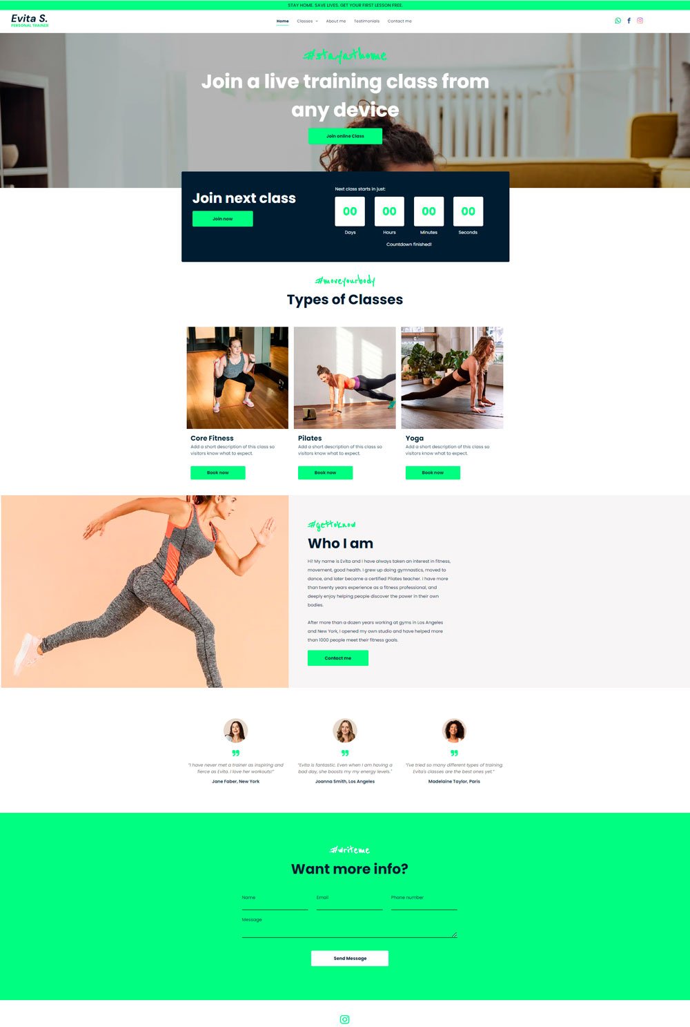
related article: 31+ Podcast Website Examples To Inspire Your Own25. Evita S.
Evita S. health coaching website maintains a clean interface
What We Love
The countdown timer used to indicate when the next class is starting is a fail proof strategy for creating a sense of urgency in visitors, which in turn leads them to signup for the class. Also, the categorization of the classes creates more clutter-free navigation, and the testimonials directly featured on the homepage effectively clear doubts in new visitors' minds. Lastly, the Instagram block and social media icons on the homepage is a great way to give visitors a sneak peek into what the website's socials look like.
related article: 51+ Best Gifts For Business Women [Top Picks]26. Heal Website
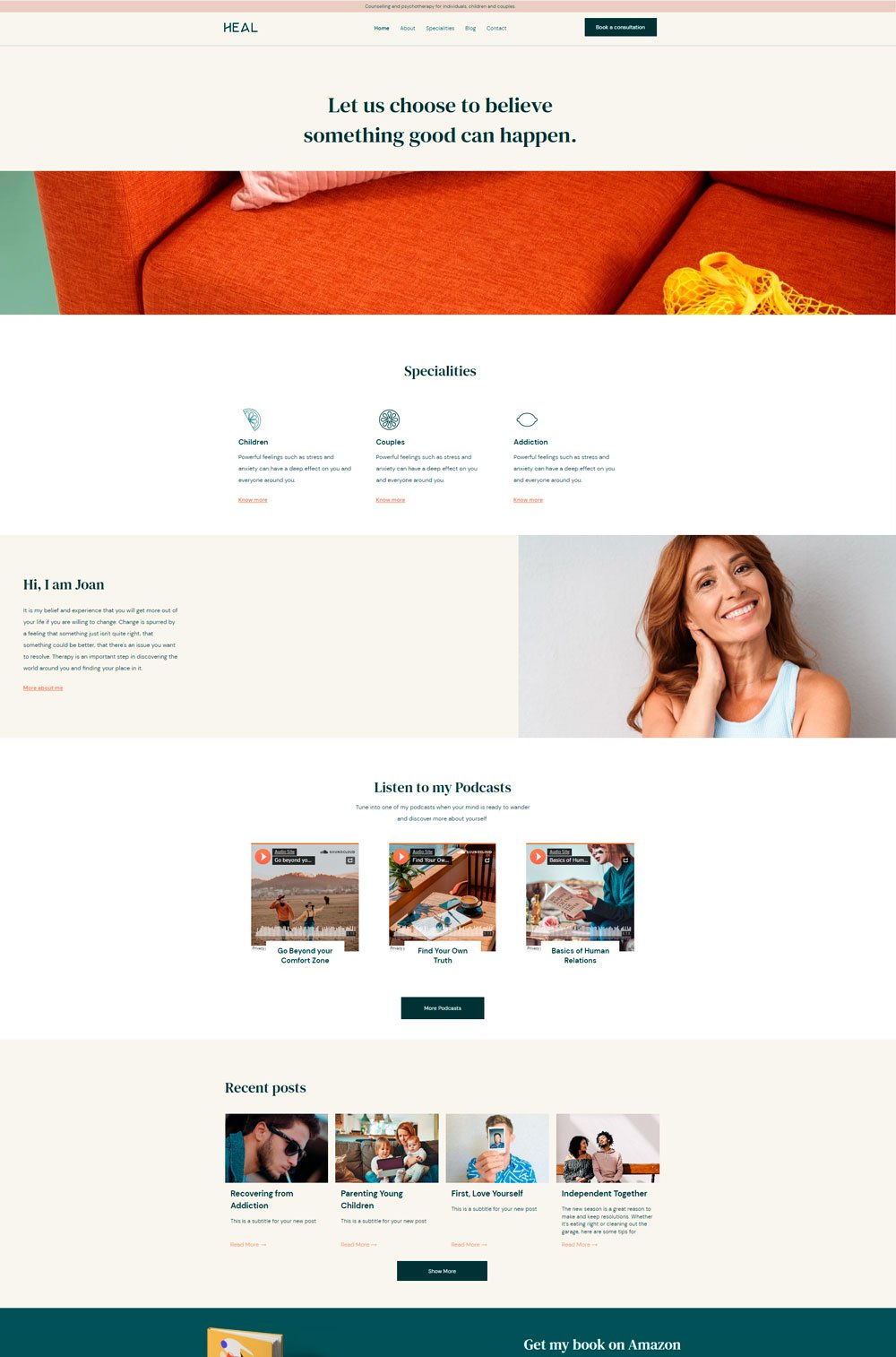
Heal is a well-designed website with defined pages and intuitive arrangement
What We Love
Podcasts are one way to promote your wellness website because tons of people listen to one or two podcasts, so Heal did a great job in featuring some of their podcasts on the home page. Also, the specialities page, substituted for the services page, is well-structured with a call-to-action button and a detailed explanation. Heal is a great coaching website template for your next design.
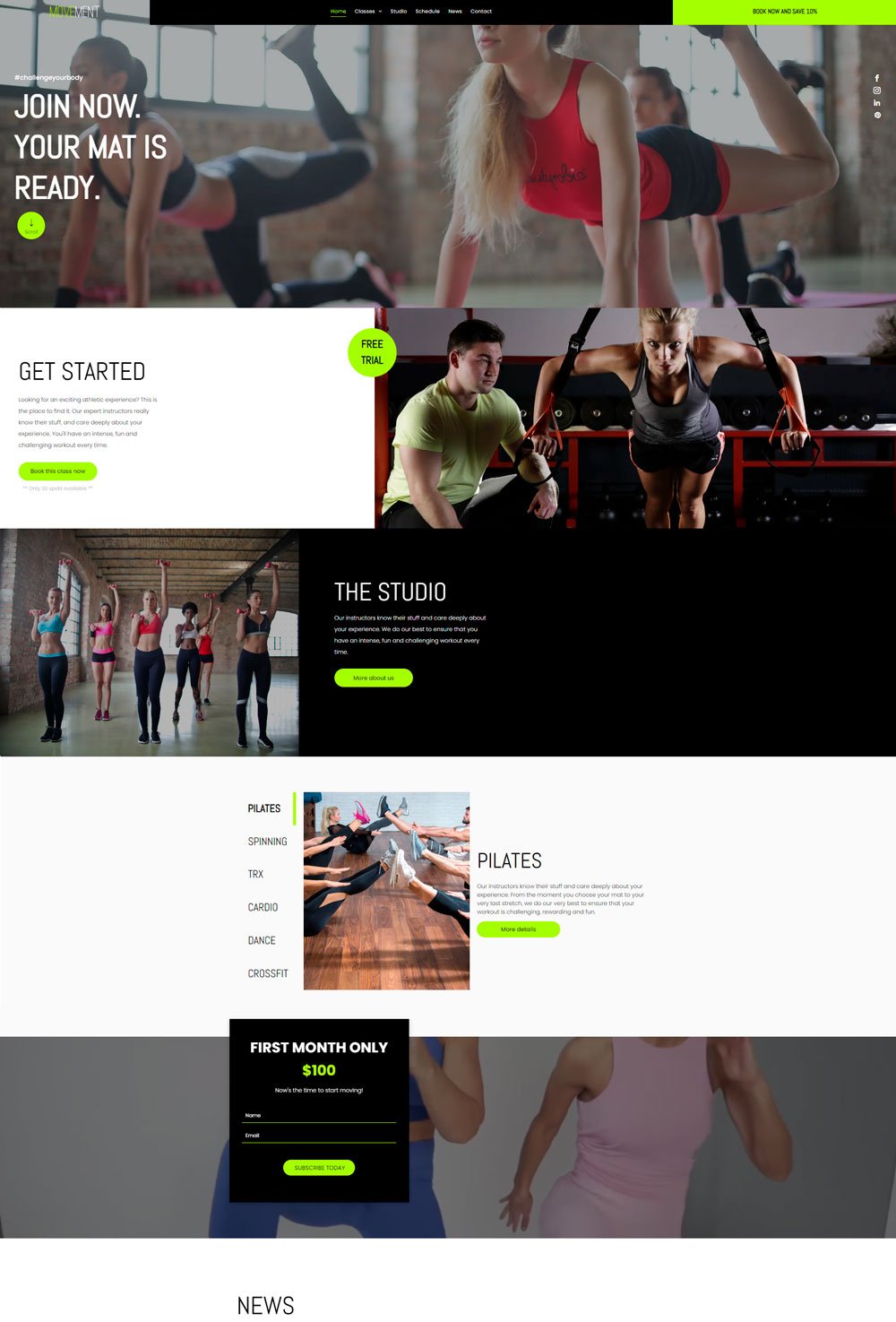
related article: 51+ General Contractor Websites (Plus Templates!)Movement makes use of lots of images and detailed explanations for passing an unmistakable message across
What We Love
The use of images is great, and the joyful short video clip against the month plan is a great motivator. Movement did a good job in the design, arrangement, and CTA buttons. Definitely, a great template to consider for your caching business.
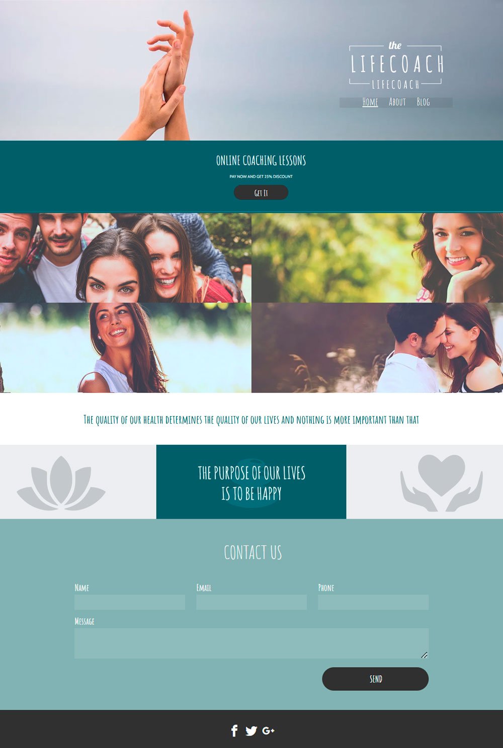
related article: 31+ Best Bakery Websites Inspiration & Templates28. The Life Coach
What We Love
I love the font of this website. It stays professional yet friendly. The Life Coach features great images, clear CTA, and short but important information to keep visitors stay brief and profitable.
Best Coach websites for wellness industry
Whew! What a great ride through lots of templates for your next health coaching website design. Fortunately, all these websites are templates that can be purchased, so you don't have to worry about recreating any section. You can just buy and start editing right away
