
31+ Best Bakery Websites Inspiration & Templates
Imagine walking down your city's street; your nose is welcomed with a mouth-watering aroma of freshly baked bread, and your eyes can't help but notice that moist chocolate cake with extra glazing. Yum!
Now imagine a website that gives you that type of heavenly feeling!
In today's blog post, we will be taking a close look at the best bakery website designs that are all shades of 'yummyness' and functionality. Websites that get viewers' mouths watery at first glance and can't help but place an order.
These bakery websites templates will serve as a web design inspiration if you are thinking of designing your own bakery website. Get ready for a delicious journey; you might want to grab a snack.
Looking for a unique website design for your business? Explore our Squarespace Web Design packages for a stunning website. Need to enhance your site's visibility? Our Squarespace SEO services are here to assist you. Curious about our work? Take a look at our Squarespace website designer portfolio for some inspiration!

Websites Inspiration For Your Bakery Business

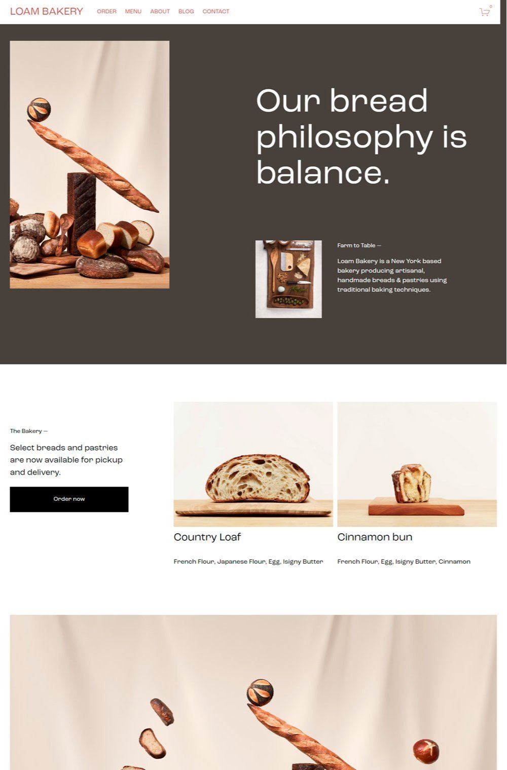
We love the clean design of this website. It comes with loads of pictures of good-looking bread that instantly makes you start thinking of bread. The homepage arrangement highlights important information while focusing on those mouth-watering bread. Another thing worth noting is the generous whitespace that it gives to every element. Loam Bakery features a breathable web design that allows new visitors to navigate the website without getting confused.
2. Bakery Website: Sugaro
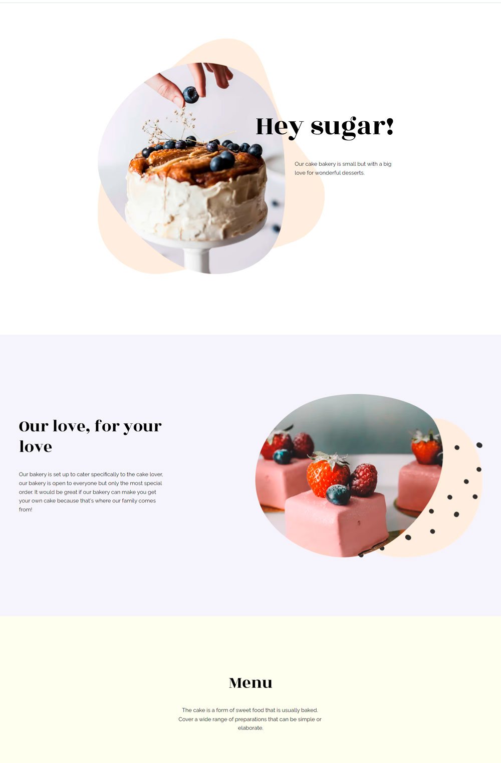
Sugaro bakery website design template features pastel colors, abundant white space, and good-looking pastries images. This one-paged website features everything customers need to know at a glance. The menu is directly listed, and customers don't need to start looking through categories or printable pdfs to fully view what to expect. Did we mention that the white background gives the website a minimalist, simple look? Sugaro is one of the best examples if you are looking to design a minimalist bakery website.
3. Bakery Website: Campos

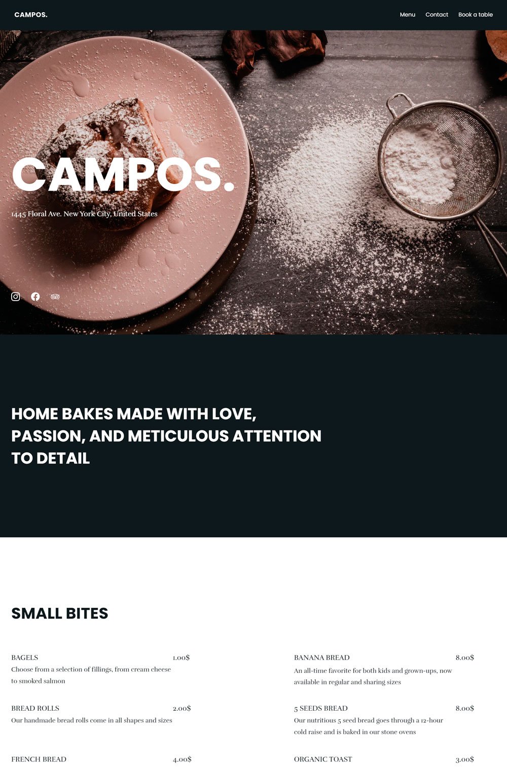
The word 'delicious' slips from any visitor's mouth once they land on Campos. The full-sized, mouth-watering image at the top of the website prepares visitors' minds to expect delicious treats, and the website didn't disappoint. We love the generous use of images, and it shows a peek into how the physical bakery lookout helps to create anticipation in customers' minds. Another notable feature is how near the menu was categorized into food and snacks.
Related article: A Complete Guide To Setting Up A Store On Squarespace
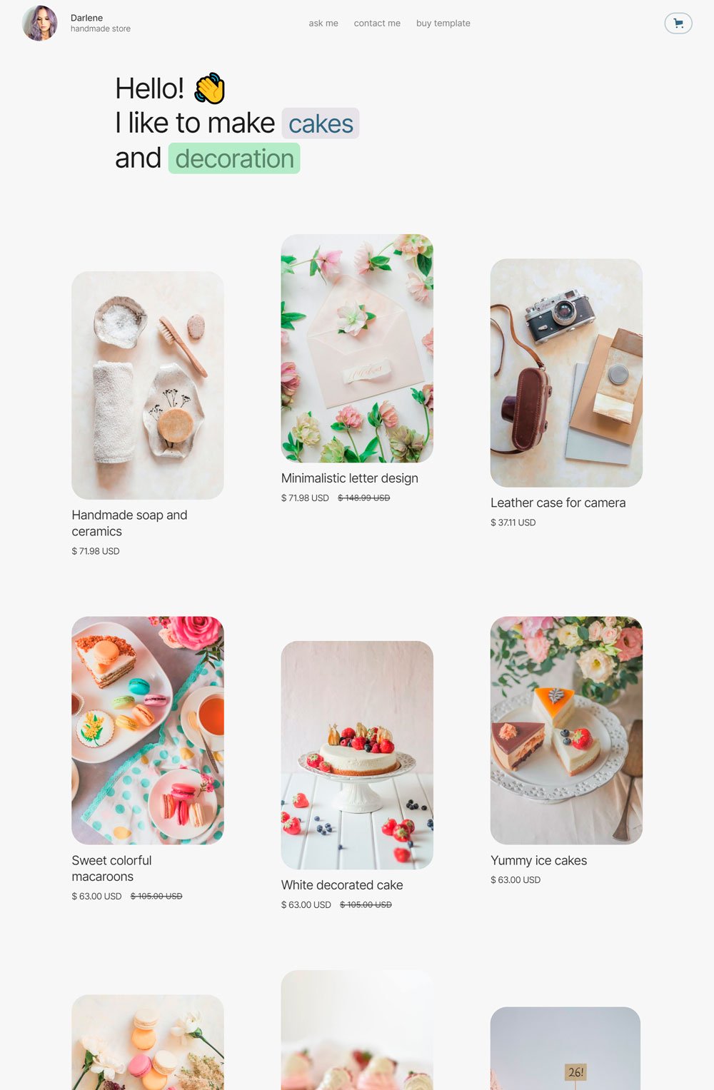
Darlene is all shades of cute. The use of pastel colors and cute animations when you hover over the baked goods gives customers that wholesome experience. Darlene takes a different path from websites that only display one baked good by displaying as many images as possible to tickle potential customers' tastebuds. Also, that cute GIF video at the end of the page is a thoughtful addition. Lastly, other bakery websites often neglect customers' reviews, but Darlene pastry shop did not. I will definitely recommend the website design for cute yet simple bakery websites.

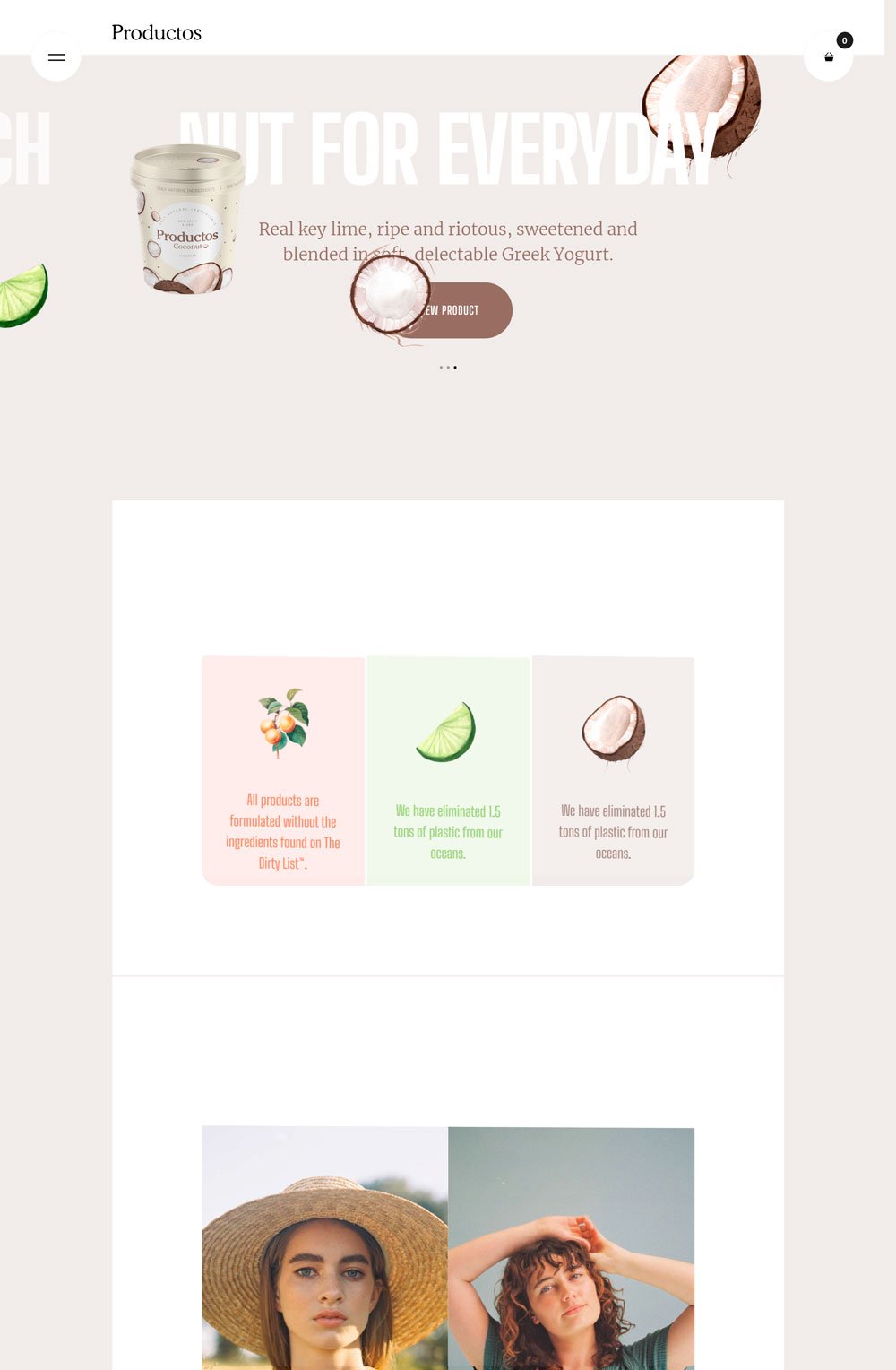
For the love of greek yogurts, this website design is simply stunning. Productos is a greek yogurt website that got its design right. The cute animation all over the place gives it that fun touch. From the sliding pictures to the dramatic menu display, Productos did a great job. One thing to focus on is the effective categorization of their product page. There are four categories to make searching for products easier for website visitors. Lastly, the way the Instagram feed scrolls through when you are on the main menu is a great use of space and a good marketing tactic. I would love to rant about Productos, but let's end it by saying this is a great bakery website to draw inspiration for your own website.
related article: 51+ General Contractor Websites (Plus Templates!)6. Bakery Website: Ginza

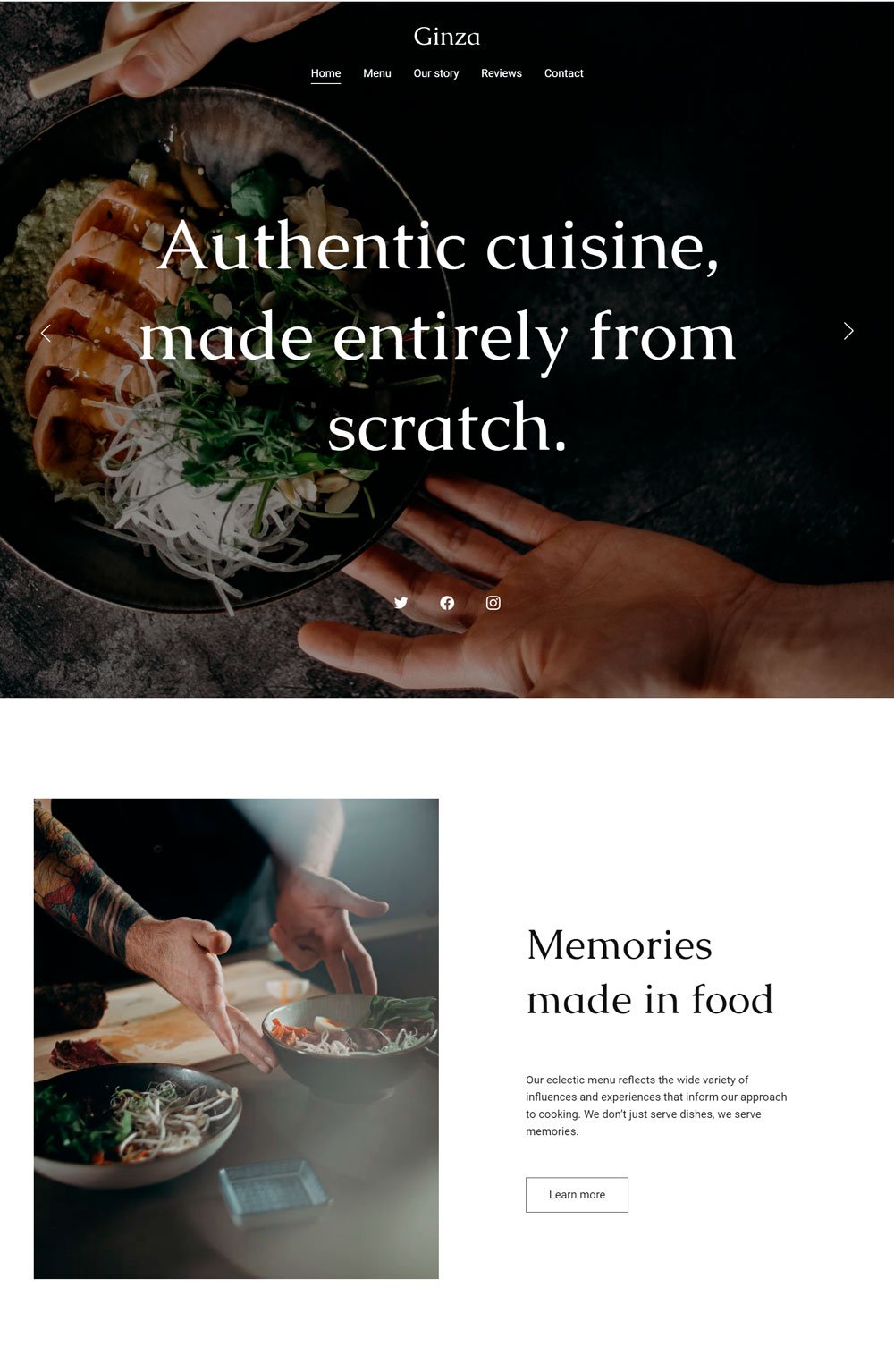
Something is cooking, and it looks damn good. At first glance, you will automatically know that Ginza is a restaurant that offers irresistible cuisines. We love the header's high-quality image and the social buttons on it, making it super easy to check out their social handles immediately. Going forward, the way the home page is arranged is commendable, and the fact that they solved visitors' pain point-- bringing pets to a restaurant before they even think of it, is a great way to convert visitors to customers. Overall, Ginza website design is visually appealing. Kudos to the web designer.
Related article: 26+ Best Squarespace Templates For Photographers7. Bakery Website: Dishes & Recipes

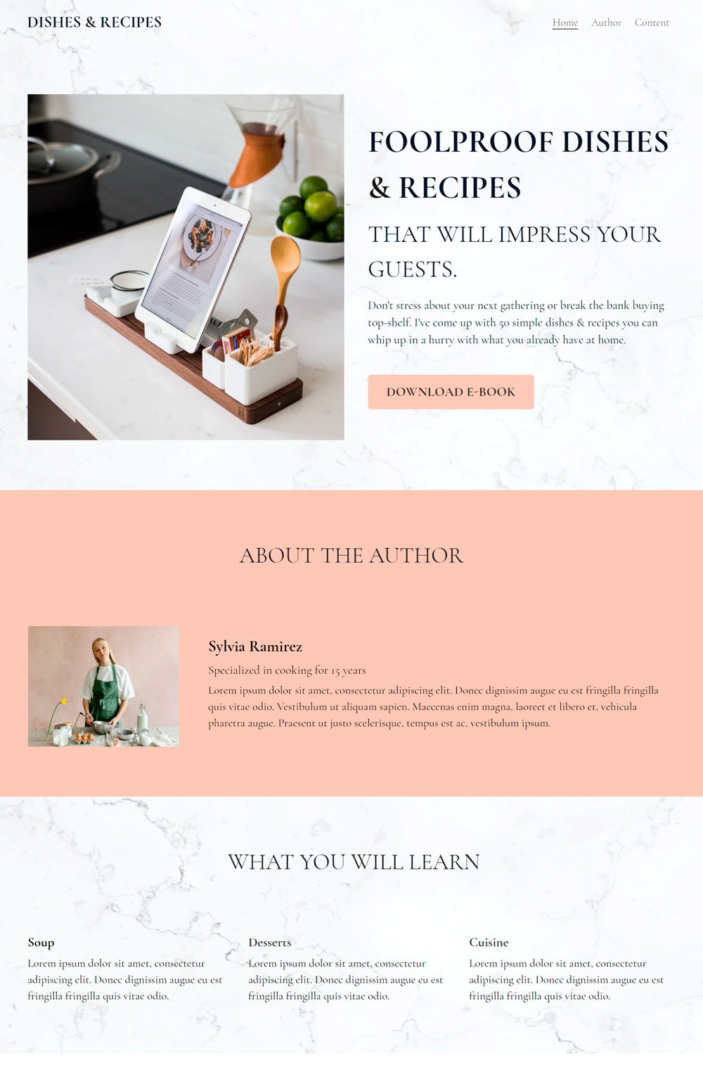
Dishes & Recipe is a site for purchasing online recipes, and we love how the website is both simple and visually appealing at the same time. The watercolor effect on the white background gives it that dynamic look. Also, the website goes straight to the point with its one-paged feature, making it a great example for those who want to sell baking ebooks or recipes online.

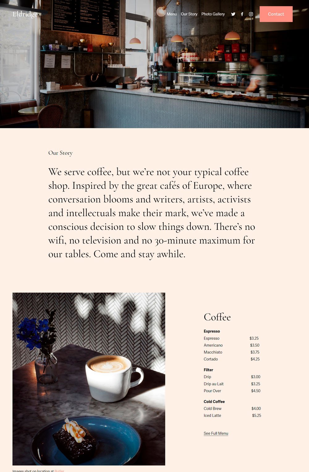
The smell of brewed coffee in the morning is enough to energize anyone. Eldridge is a bakery and coffee shop that got it right. Its full-sized header image displaying the coffee workstation makes visitors feel comfortable about its physical location, and the arrangement of the homepage is strategic. I cannot fail to mention Eldridge's photo gallery page that allows visitors to feed their eyes with tastebud-provoking images that will immediately make them online orders.
related article: 41+ Groovy Font For Your Next Design9. Bakery Website: Delicious

The simple fonts, high-quality images, and custom forms for visitors to sign up is a comprehensive approach to a bakery website. Delicious goes straight to the point and list out the delicacies you will enjoy with them. One commendable feature is the map that was integrated into the homepage, which is a great way to give new visitors direction.
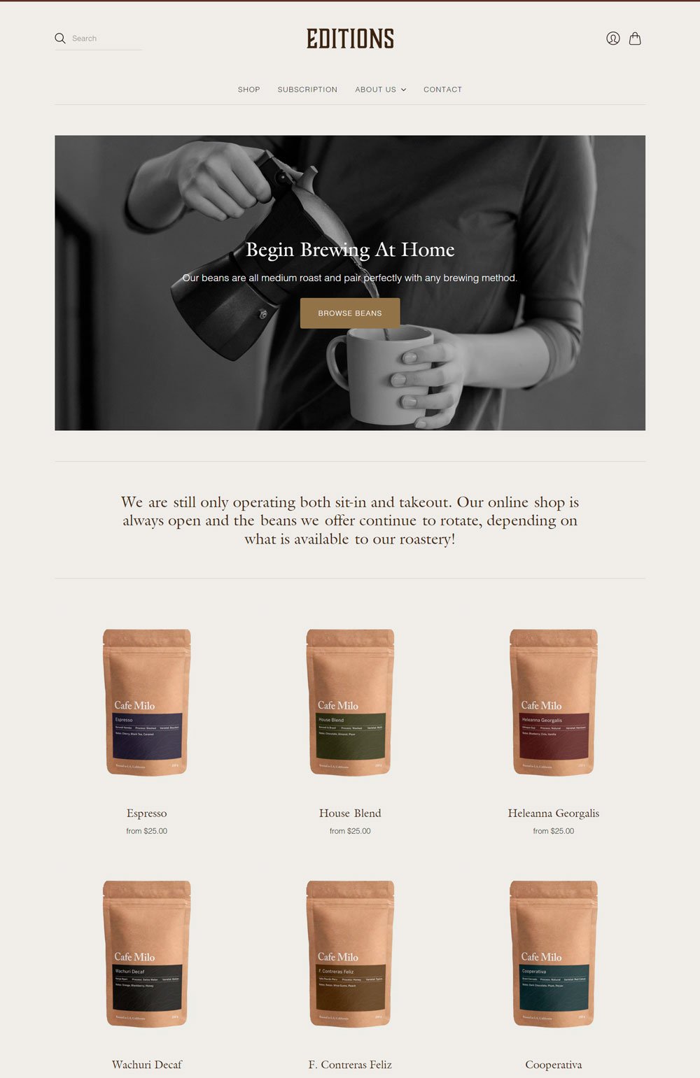
related article: 28 Best Health Coach Websites (Plus Templates!)10. Bakery Website: Editions

Editions are your bakery website design inspiration for coffee lovers who are thinking of selling coffee products alongside their bakery business. Editions make use of neutral colors and go straight to listing the products you can shop online, which is a great marketing strategy that saves customers and improves sales. Some of the white and black images give it that classy look.
Related article: 21+ Best Squarespace Blog Templates
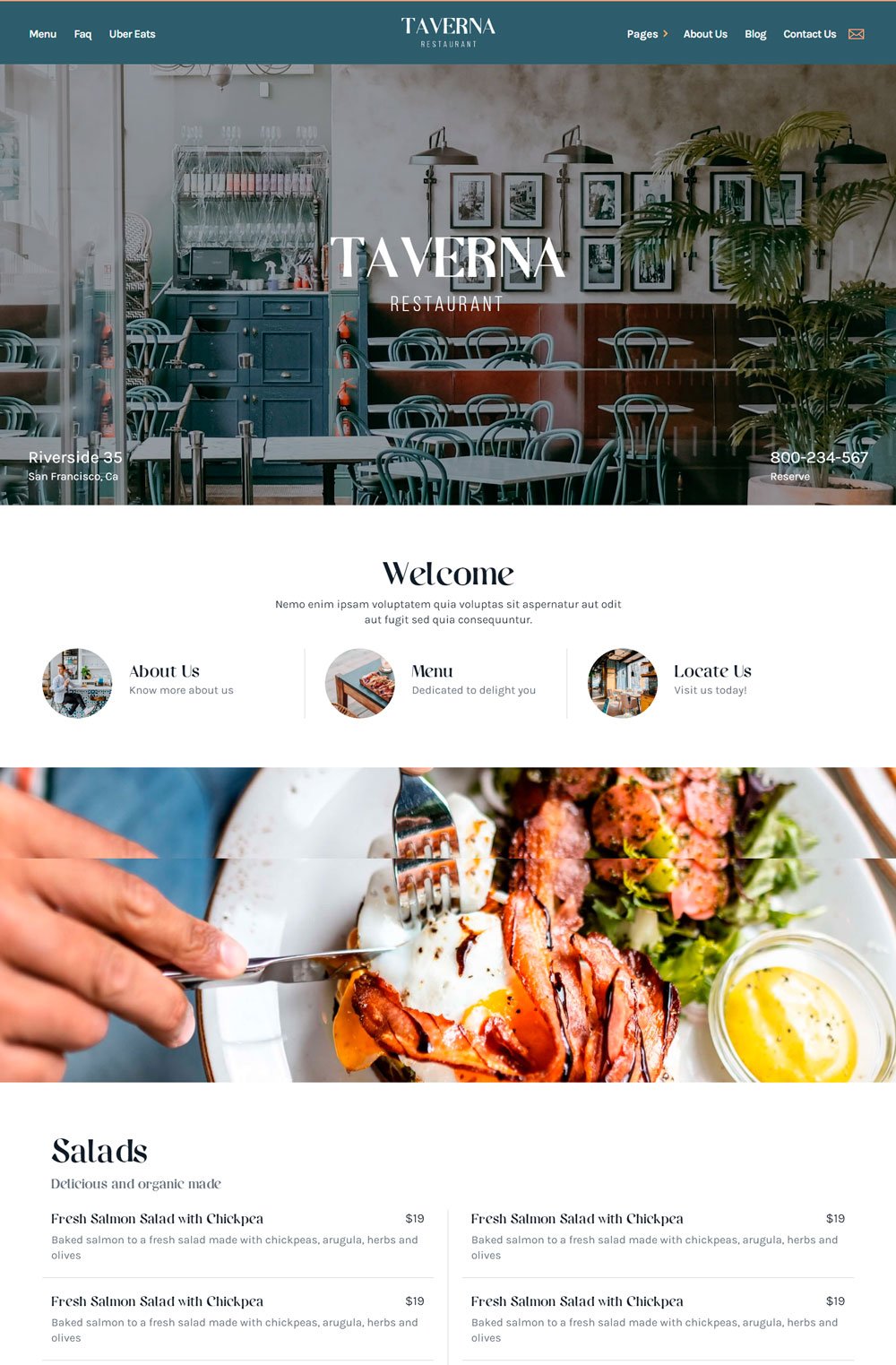
Taverna is simply stunning. The strategic arrangement of this website is highly commendable. The homepage features everything a potential customer needs to place an order. The CTAs; about, menu, and locate that come immediately after the picture is a thoughtful approach for visitors who want to perform a specific action. The location tag on the San Francisco is a thoughtful addition. Also, you cannot help but notice the ravishing images accompanying each menu categorization. Yum! Overall, this is one of the best bakery website examples to inspire you.
related article: 51+ Best Sports Font For Graphic Design, Branding, And Logo Design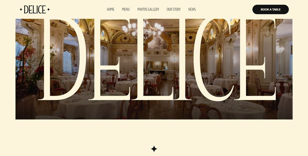
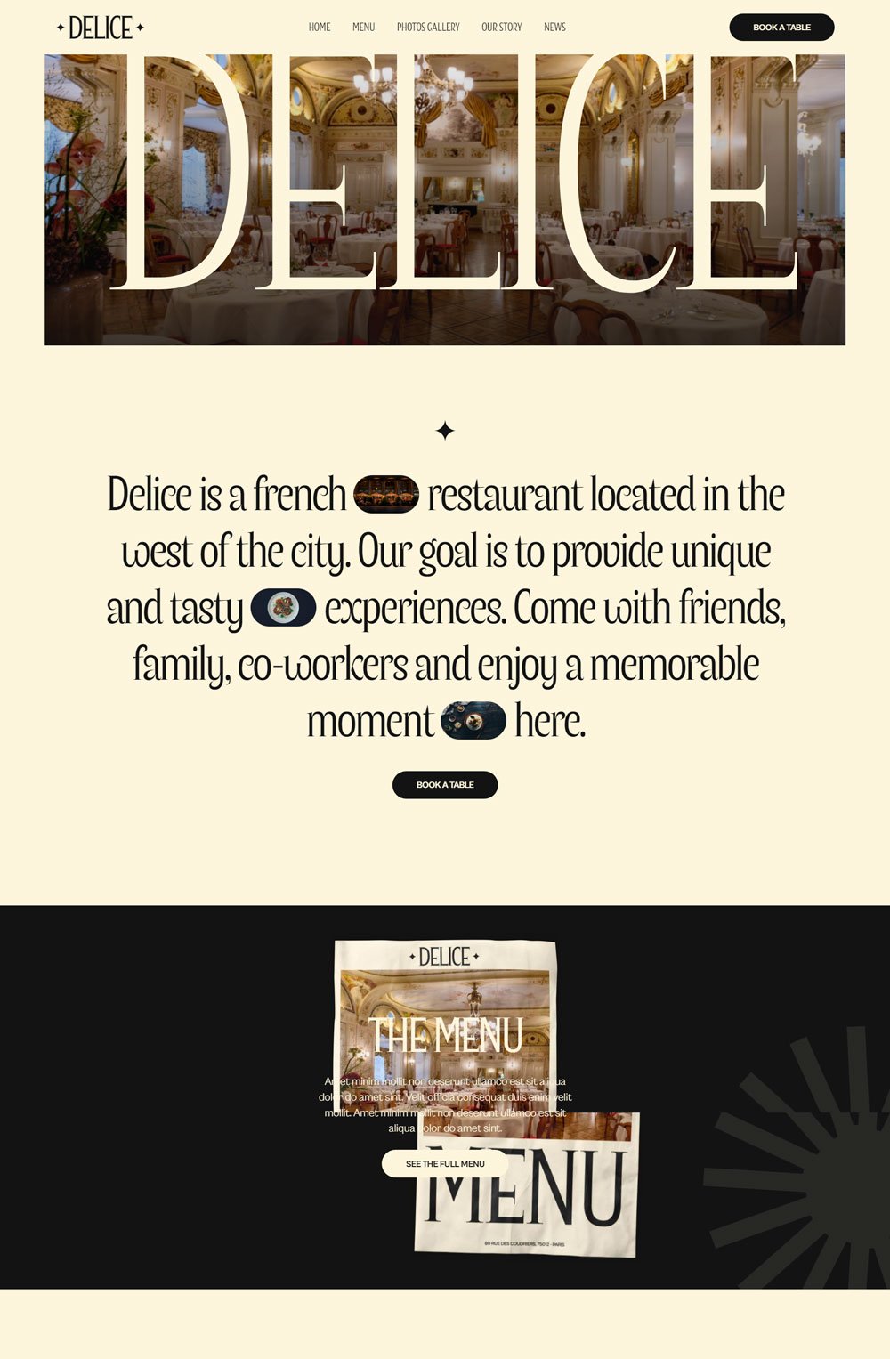
You know a luxury restaurant from their website. Delice is all shades of elegance and luxury. The use of luxury fonts, pastel colors, and sliding beautiful pictures just gives this website a chic look. I love the way their menu was categorized effectively. You can see everything you need to have a great three-course meal. Another thing is how simple their book a table page is. Looking for a great example for your own work? Think Delice

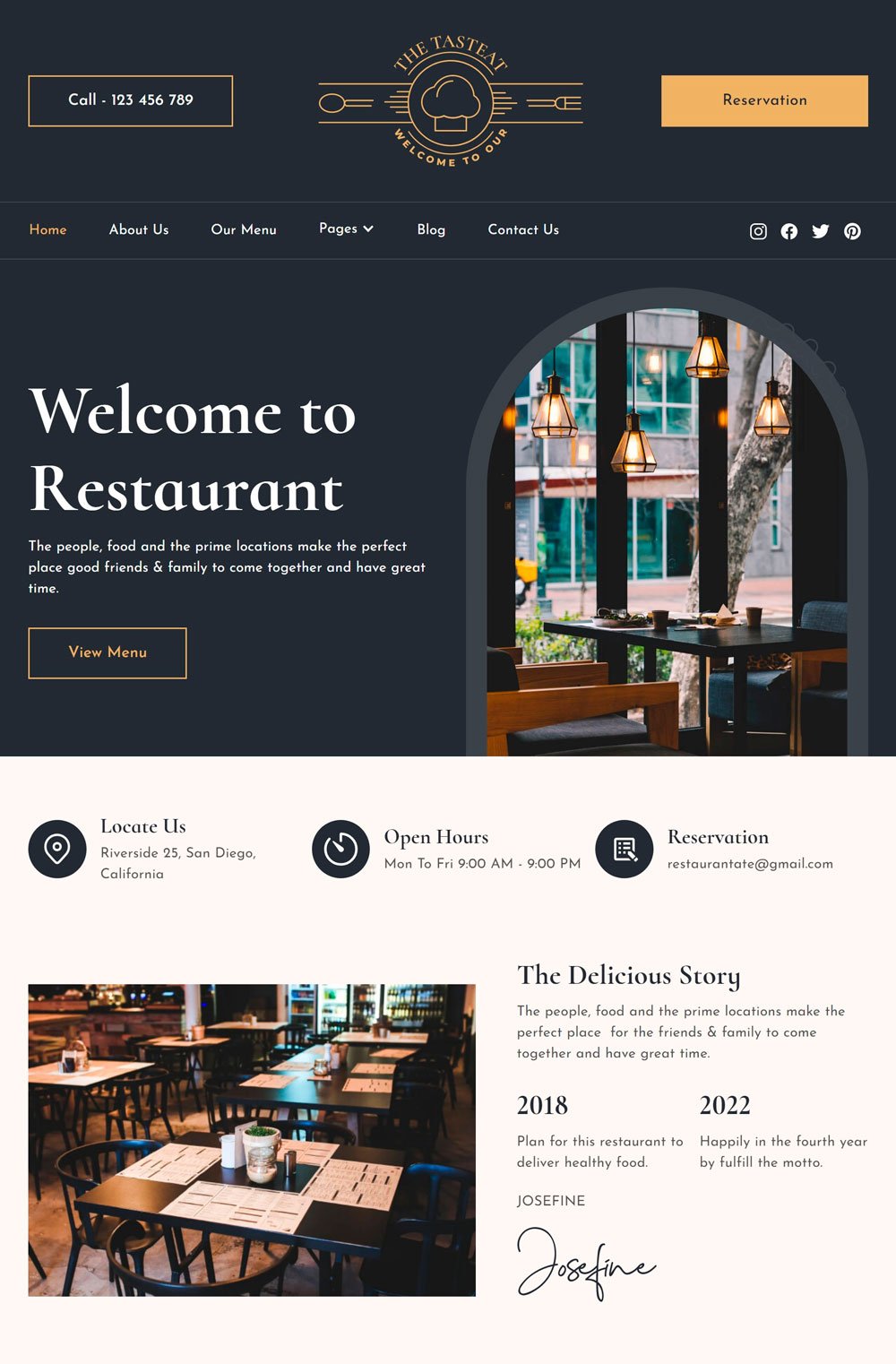
The first unique thing that caught my attention was the cute bullet-like images of each treat on the menu. That's a great way to eliminate the boring menu listing while avoiding a full-sized image that will take up too much space. The popular dishes section is super helpful for customers who cannot decide what to eat, and the Our Offer Dishes section is a thoughtful idea to attract more customers on a budget. Talking about the color scheme, TastEat did a great job with a clean website design and generous white space. The TastEat whole website is a great inspiration for your bakery business.
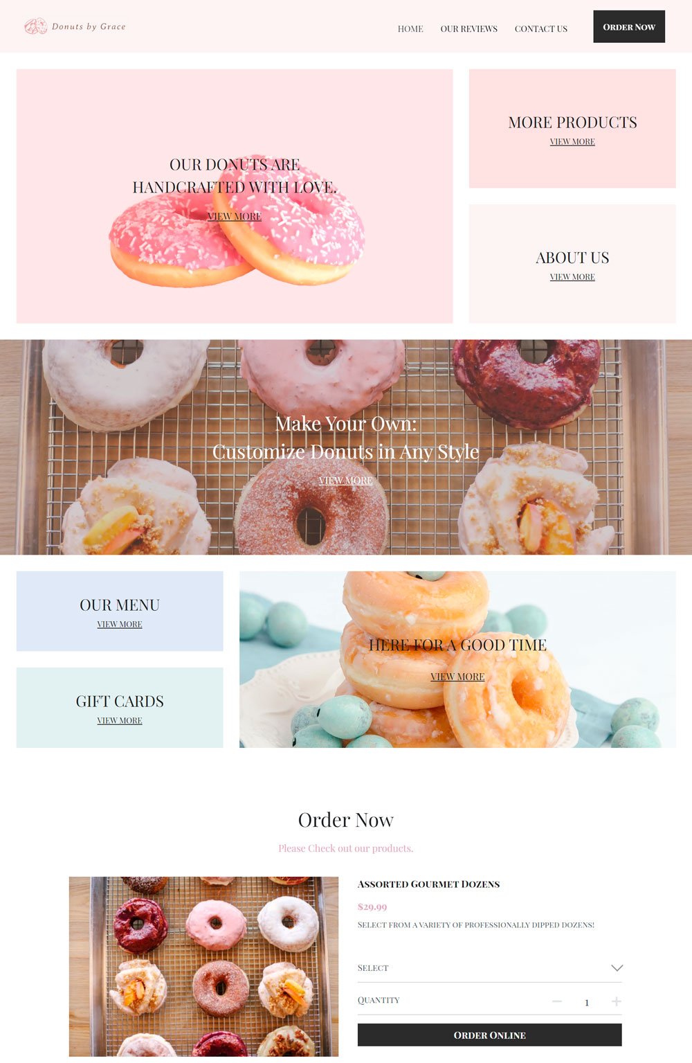
Related article: 6 Simple Website Launch Announcement Ideas & Graphics14. Bakery Website: Donuts by Grace

I love donuts, and I can't help but appreciate how irresistible this website is. The first donut you see on Donuts by Grace makes you want to have a big bite of the donut. We commend how each section is filled with irresistible donuts. Doing this is great for building a donut climax in every visitor until they click that order now button. Another thing I would love to touch on is the reviews. Reviews are a great way to convince new customers that your business is worth visiting. This Pastry shop website features a good website design.
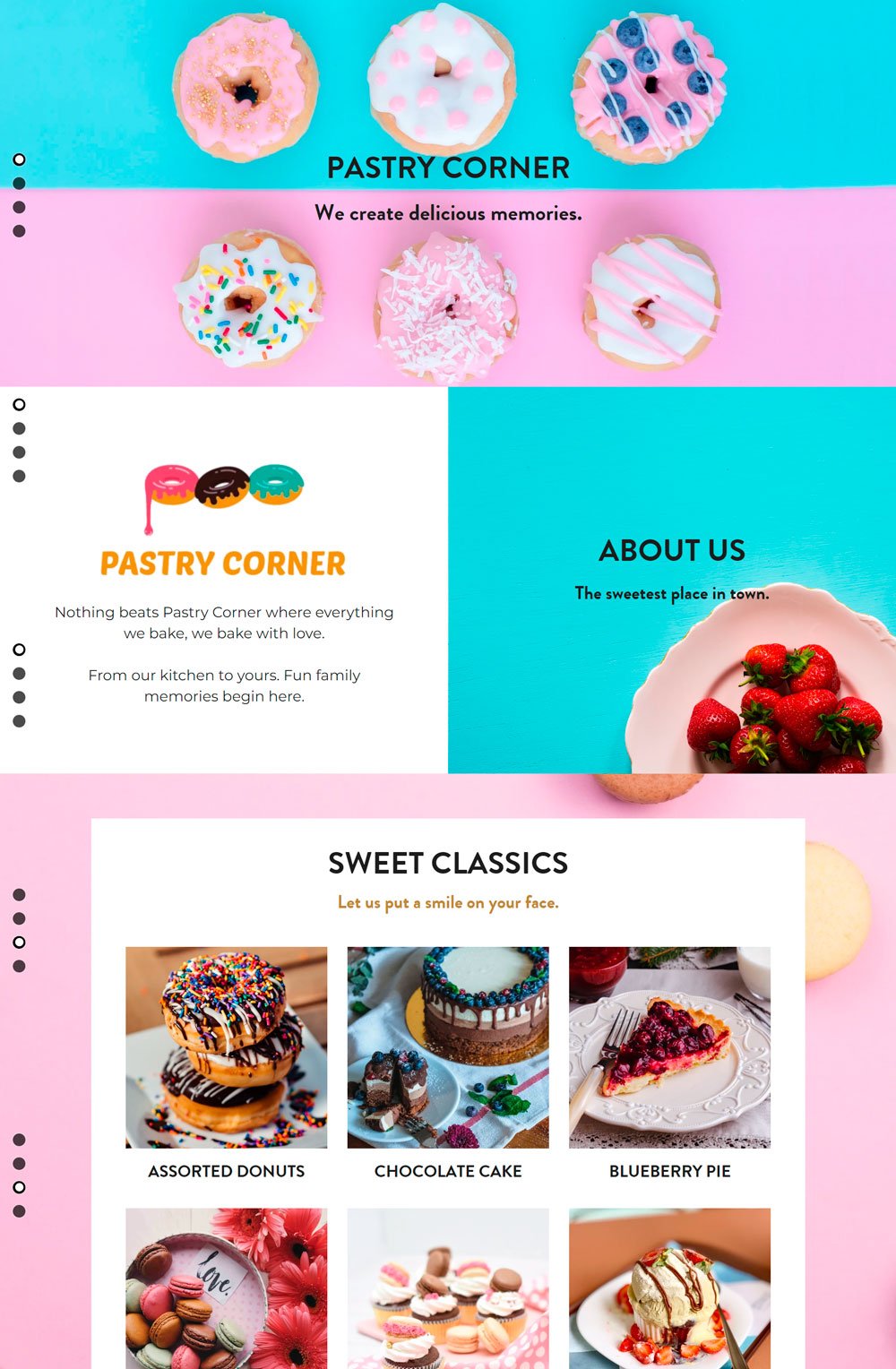
15. Bakery Website: Pastry Corner

The vibrant colors and high-quality image make Pastry Corner an irresistible bakery website. Their tagline, 'we create good memories,' was affirmed by those good-looking donuts at all sides. Going to functionality, we love that customers are able to view their cakes and other treats from the home page, and you also get the chance to make a reservation. The only thing we didn't quite understand is the lack of a menu, but since it is a bakery website template, we'll let it pass. Overall, Pastry Corner has a good website design.
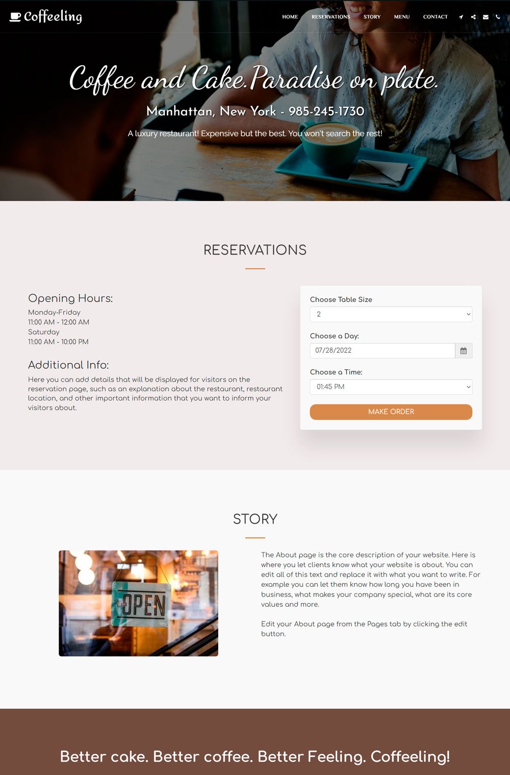
16. Bakery Website: Coffeeling
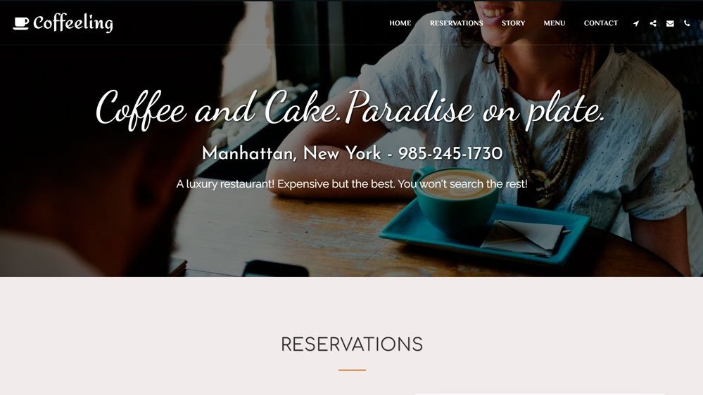
Coffeling features happy customers with sweet expresso on their table, a great way to set the mood. One thing you will notice with coffeeling is the reservation section that you have access to without even scrolling, which is great for old customers who are already loyal.
Then, it goes on to cater to the needs of new customers by highlighting important sections they will find helpful. Another thing I couldn't get my eyes off is the coffee brown menu background that sets you in the mood to take a coffee.
Related article: 51+ Best Gifts For Business Women
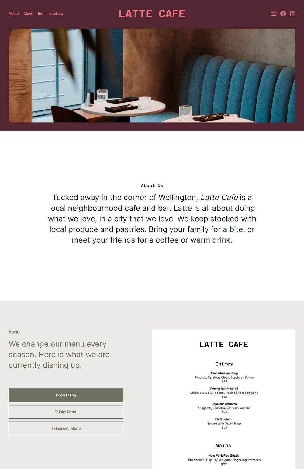
Looking for a simple cafe website? Think Latte Cafe. This coffee and bakery website goes straight to the point with its homepage. No clutters, no distractions. This is one of the best bakery websites if you are looking to design a simple, minimalist brand.
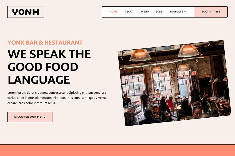
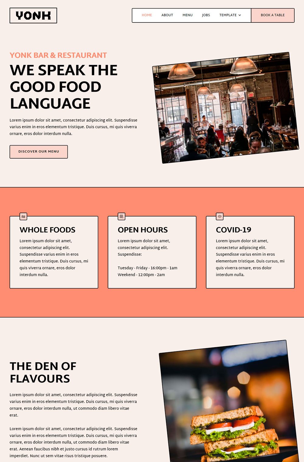
Yonk definitely took a more sentimental approach to their website design, which did work. The thick black borders give every element its individuality and shine. The busy cafe gives you that nostalgic feeling and makes you want to belong, enjoying the sweet aroma of coffee and oddly-satisfying chattering voice while you sip your coffee. Oh, my! I love how their menu is obvious and given priority; then, the slanted images create a unique look to the website.
Lastly, the easy categorization of their menu helps you go straight to what you are interested in. I love Yonk because of its sentimental design and unique perspective. This is definitely a great website to inspire bakeries.

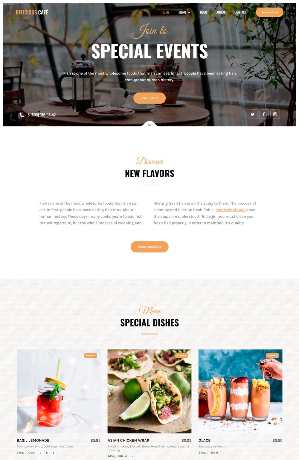
Delicious Cafe is a definition of elegance, thoughtfulness, and clean design. A bakery website design can give anyone a sneak peek into what to expect. If bakery websites are badly done, people will think that the bakeries aren't worth a stop.
Delicious Cafe pays attention to little details that are overlooked but matter to different customers. Let's start with how they state the gram and calories of each pastry. A customer watching her weight will definitely appreciate this thoughtfulness. Another thing to take note of is the two CTA on the header image. While customers are still virtually savoring that food, they can view the menu or find out more about each delicacy. The tiny images beside each menu list are a thoughtful addition. Delicious is your best shot if you are thinking of designing a beautiful, functional, and thoughtful bakery website.
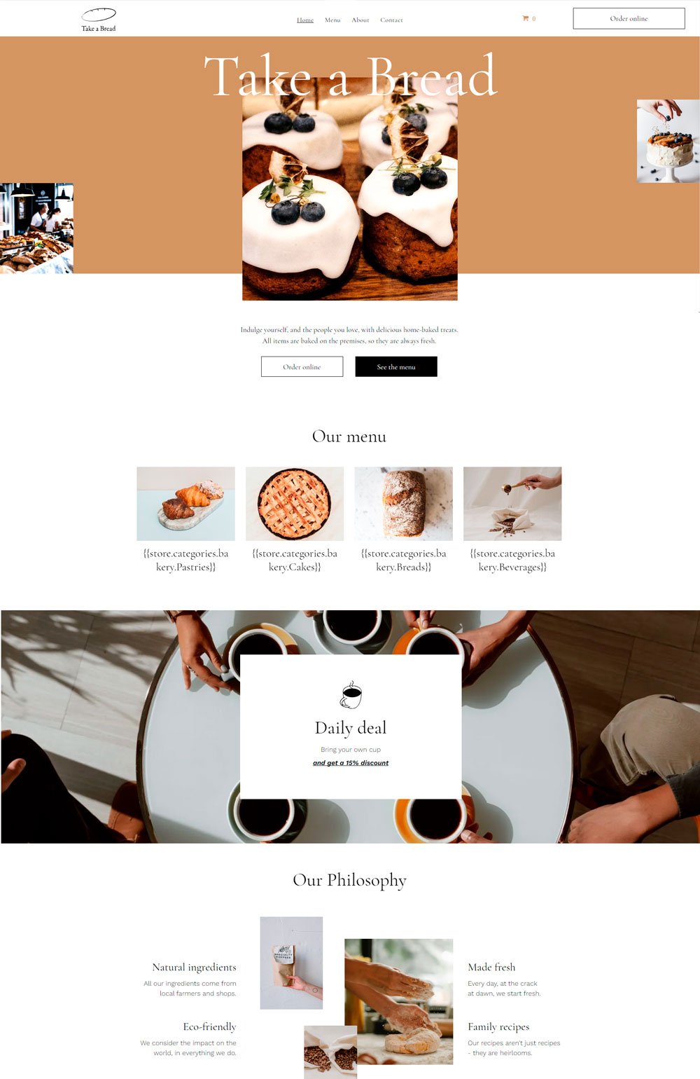
20. Bakery Website: Take a Bread

Are you sure you don't want to take some bread on your way out? Definitely yes! Take a Break bakery shop did a great job highlighting their sweetest treats in a minimalist way. The bakery website goes straight to the point and says, 'No worries, just make sure you order bread on your way out
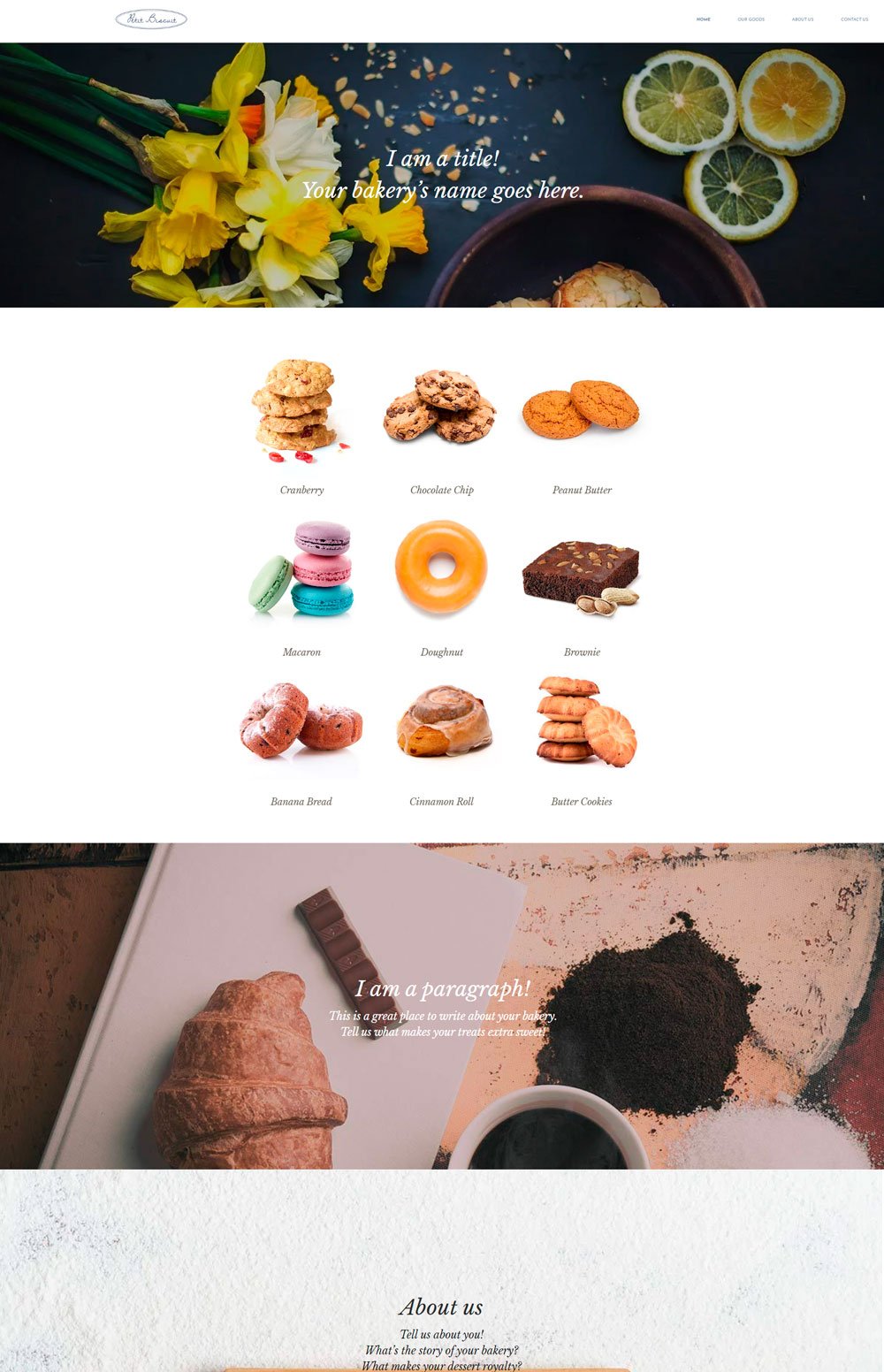
Related article: 21+ Best Squarespace Portfolio Templates To Show Off Your Work21. Bakery Website: Petite Biscuit

Petite Biscuit gives you a direct, unfiltered view of their cranberry and other sweets you stand a chance to get. The modernism of this website was done well, and it is great for any brand that wants to add a touch of modernism to its design. This bakery website template kept everything simple and went straight to the point. Definitely a great way to avoid unnecessary details.
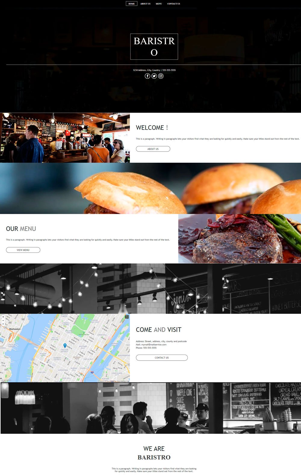
22. Bakery Website: Baristro
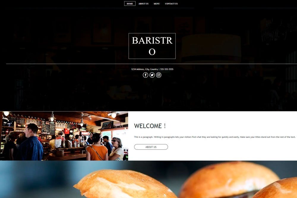
Ever seen a classy bakery website design? Well, Baristro is a great bakery example. The clean, san-serif font, clear demarcation’s and black background make Baristro a simple yet classy website design inspiration. I like how they divided their menu, which is very important for user experience. The accompanying images create a visual experience of what visitors will get. However, this template is a great inspiration for a brick-and-mortar shop that wants a web presence.

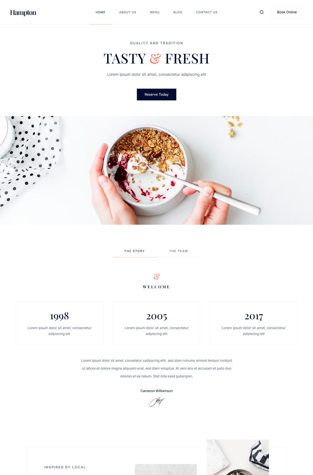
The hampton sure knows how to appear elegant and take visitors on a ravishing journey. Hampton nailed that elegant look with the generous white background and minimal use of color. The white background makes every image and text pop out, which is actually a great way to maintain minimalism. Going through the structure, I like the Reserve today CTA button that you see when you land on Hampton and then the Make a Reservation banner that isn't far reached, in case you missed the first CTA. Want a home delivery? Not to worry, Hampton got you covered. Overall, Hampton did a great job is strategic home page arrangement and minimalist look.
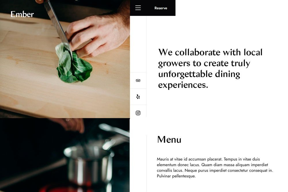
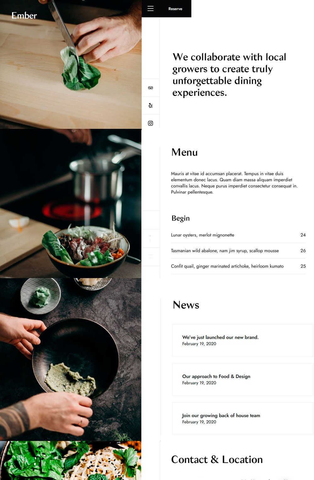
Ember is an extremely modern restaurant and bakery website, with one side of the home page fixed and the other side scrollable depending on your selection. This is a great way to avoid distractions and allow visitors access to every information they need to make a successful order. I really love the reserve button beside the hamburger menu. It is a great way to keep it in sight. Also, how their cuisines images slide through while you are busy with other information will keep your eyes filled with loving images. This is one of the bakery websites that choose to be unique. Kudos to them.
Related article: 41+ Beautiful Wedding Website Examples For Your Inspiration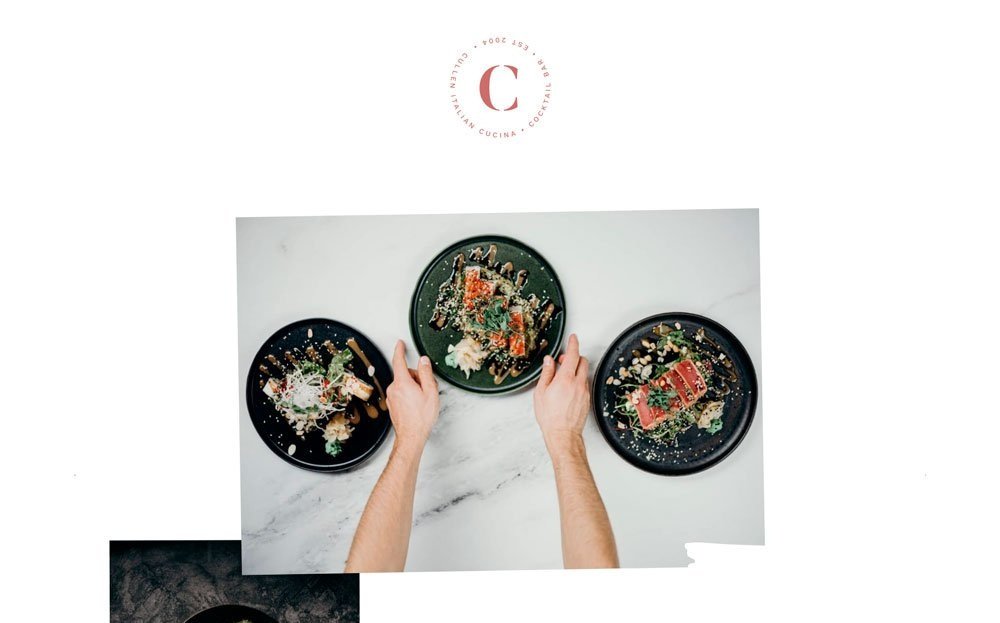
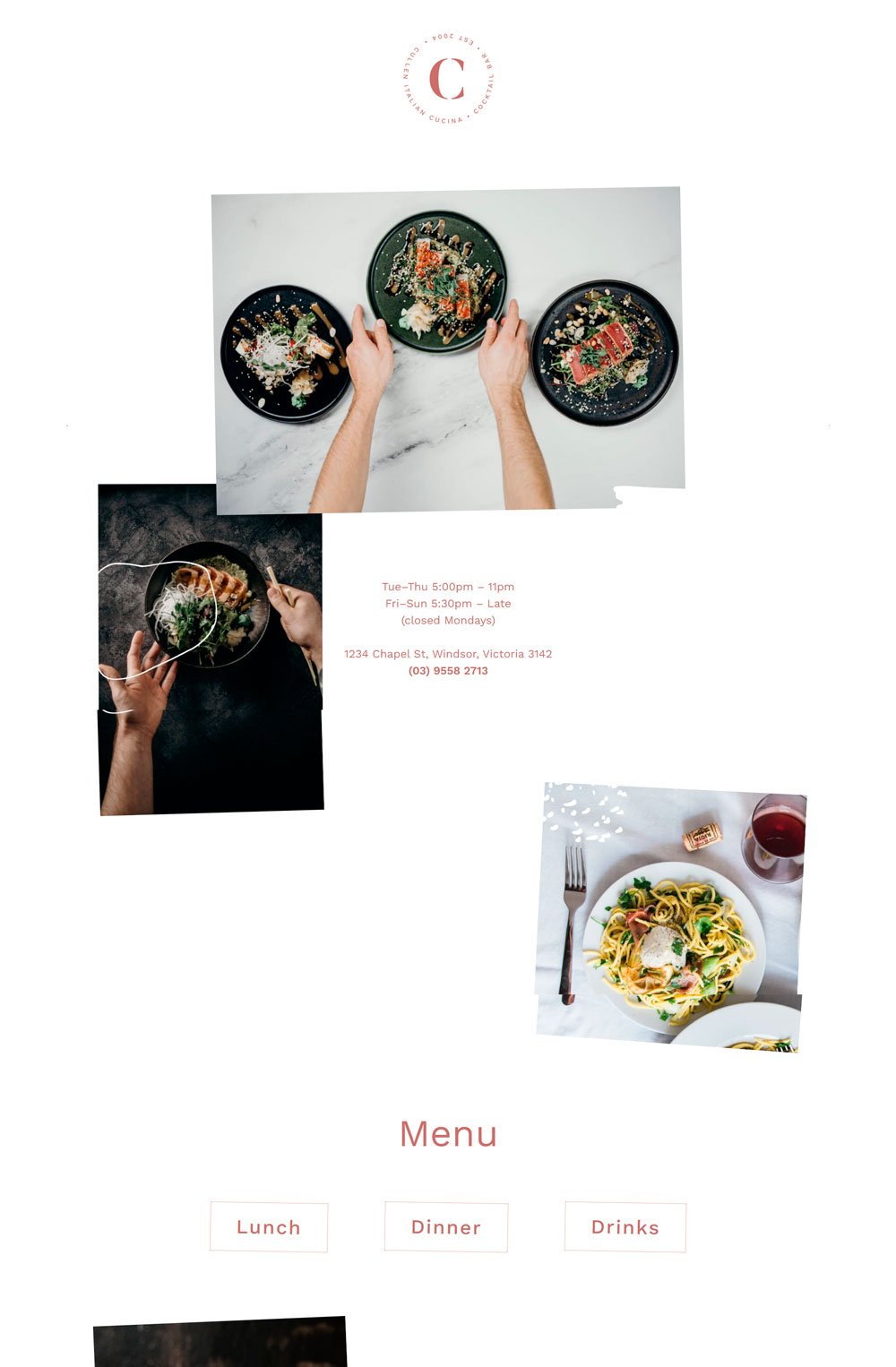
Websites are getting creative these days, and Cullen is one of them. Although it presents its information in a simple manner, it adds a touch of fun to it with the tilting animation. The menu on the left and the Call-to-Action button on the right are other ways to use space creatively. I love the functions page that allows people who have an event coming up to take a look at the food menu they'd be getting.

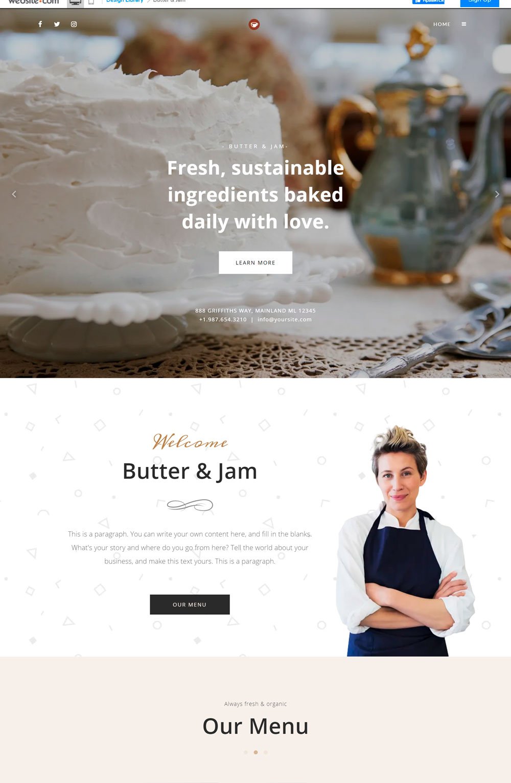
The full-sized image of cakes that slides through when you land on the page is tempting. Butter & Jam offers cakes, coffee and drinks, and other sweet treats, and they present these things heavenly. The bakery website stuck to simple font and clean images. You even get a cute section to introduce the pastry chef.

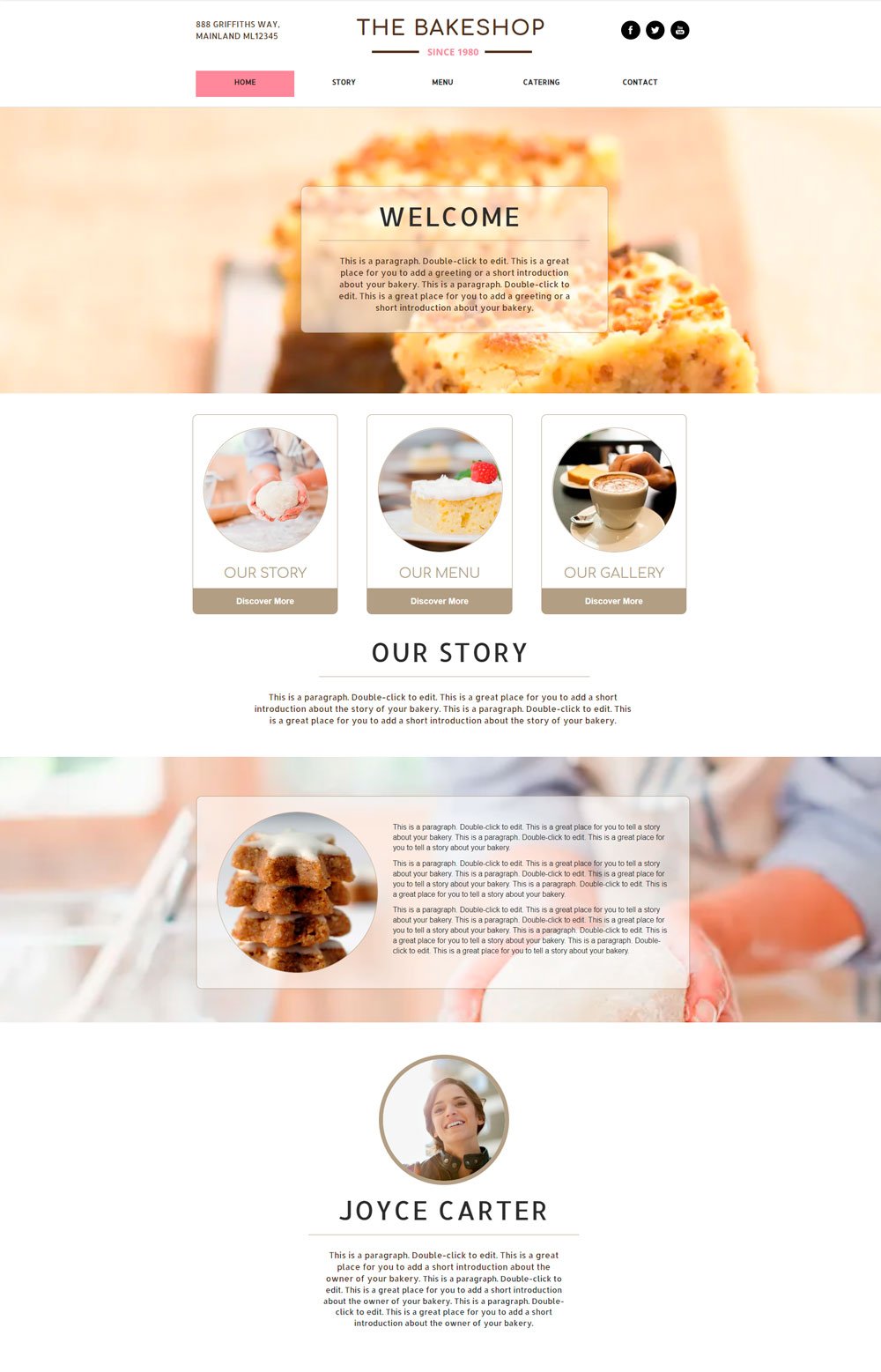
Okay... This is one of those bakery websites that has a vintage and modern look at the same time. I love the pink accent color on the website, it adds a touch of trust to it, and the way the homepage was kept shot? You don't even need to scroll. The Bakeshop limited their homepage to a welcome message; anything else you need to know? Feel free to use the Menu. Another thing I would love to point out is how they featured their address and social icons on each side of the menu. So, customers wouldn't have to bother about scrolling to the end of the page. The BakeShop is a 'perfect' bakery website design example of simple and short.
28. Pixpa: bakery website design

Can you spell the coffee? Sure I can. The state-of-the-art header image is enough to make anyone hungry for coffee. The use of pastel colors and high-quality images portrays the business as professional and trustworthy. The generous images create an irresistible nostalgic feeling for coffee, and they are unapologetic about it. Although there is no order page, the blog page can be easily converted to a menu/order page if you will be going for this template. Overall, Pixpa did a great website design job by using high-quality images, cool colors, and worthy structure.
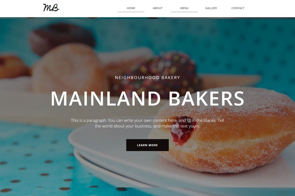
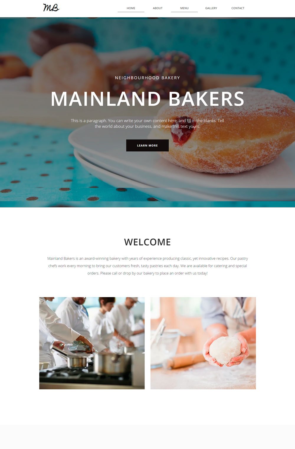
Looking for baked goods and good coffee? Mainland keeps its homepage simple and includes necessary links to other pages. I love the fact that there is a gallery page where you can feed your eyes with delicious treats. This is particularly helpful if you have many pastries pictures that cannot fit on the home page. Also, the About page is well-structured, with plenty of images to greet your eyes. MainLand is a great bakery inspiration for your brand.

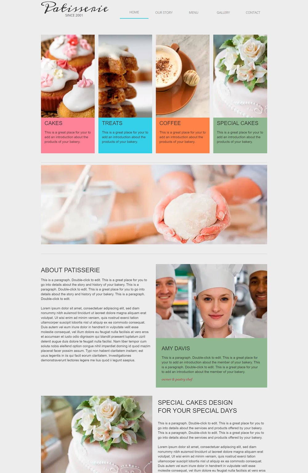
I like how they list out the pastries they offer without wasting time. You can see everything you can purchase from Patisserie at first glance. Also, their menu is one of the simplest menu structures out there, but it works, so that shouldn't be a problem. Patisserie is one of the simplest bakery websites.
Related article: 31+ Podcast Website Examples To Inspire Your Own
Sweet cake is a colorful website that tingles your senses. I love the way they played with vibrant colors without getting it messy. Just as its name implies, you get different types of cakes on Sweet Cake website. I love how they incorporated images into their menu page to spice things up. Sweet Cakes are a great inspiration for your business website design.
Best Website Builder For Your Bakery Website
Are you looking for an award-winning website builder that comes with all the features needed to build a beautiful, functional, and converting website? Think Squarespace.
Squarespace is a website hosting platform equipped with the necessary tools to make web design and website creation easy with understandable steps. No code or prior experience is required to get started with Squarespace, and it has proven to be one of the best website builders for small and medium businesses.
Great Bakery Websites Inspiration
Who got hungry along the way? We've gone through the best bakery websites that you can draw inspiration from. I hope you found that perfect bakery website that gave you loads of ideas and tips that you can use when building your website.
