31+ Best squarespace Coaching Templates [2024]
Let's face it, you love helping people achieve their goals and become better individuals in all areas of their lives, and you can't wait to help more people! This means you are looking for a way to reach more coaching clients and establish your authority in your coaching niche. Nothing helps you achieve that better than a coaching website!
You need a coaching website that is well designed to make you
stand out from the thousands of coaches out here
gives your business a professional representation
strategically designed to convert visitors to potential clients with its layout, SEO features, and aesthetic design
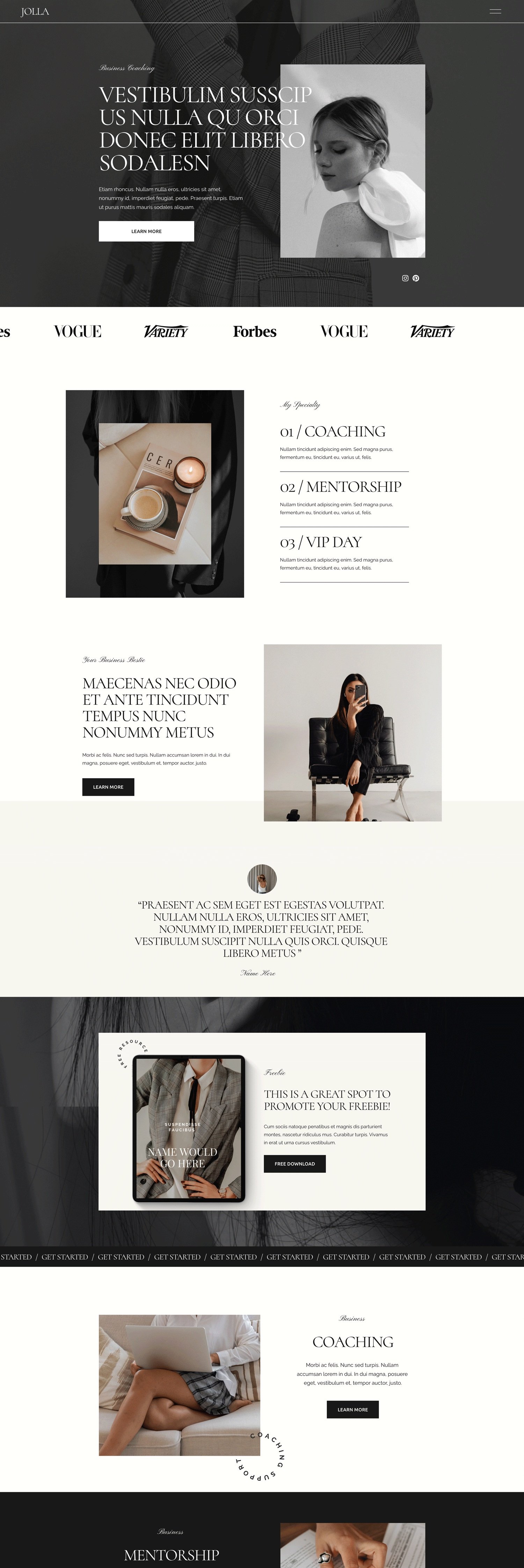
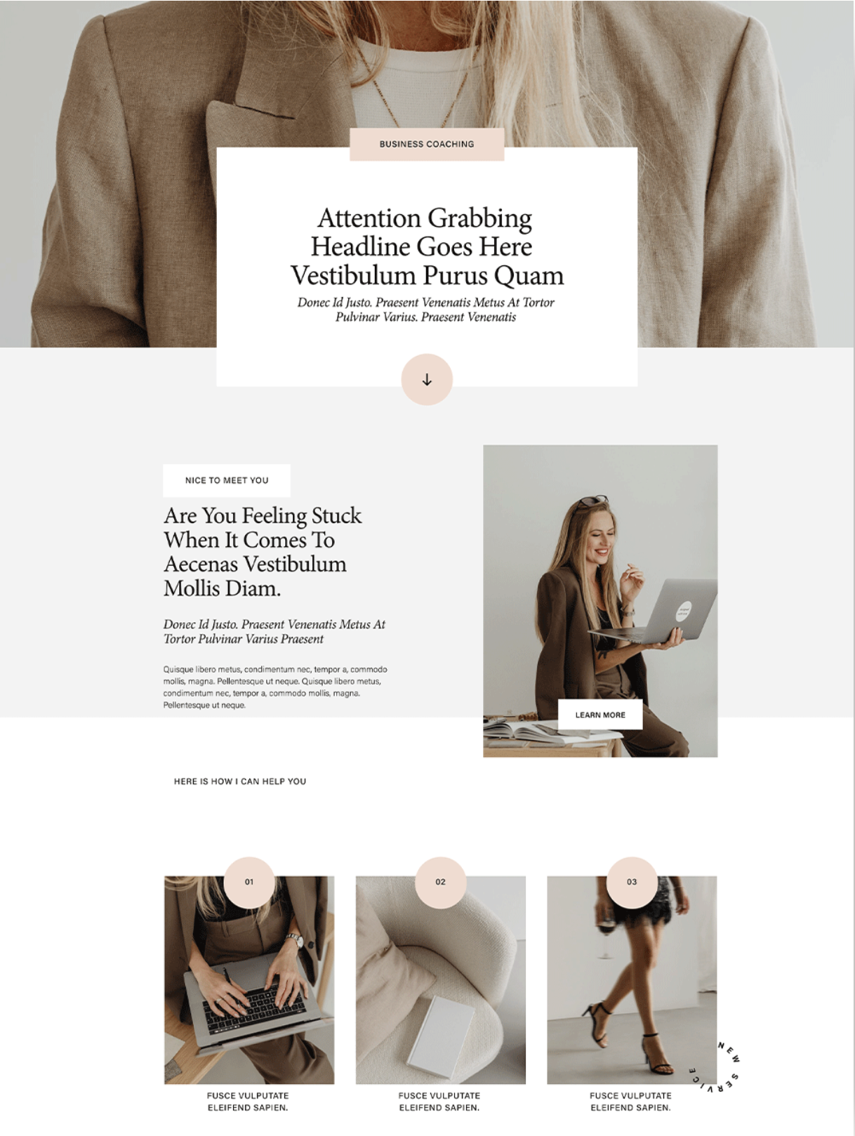
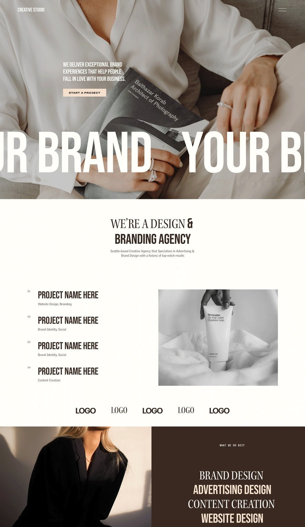
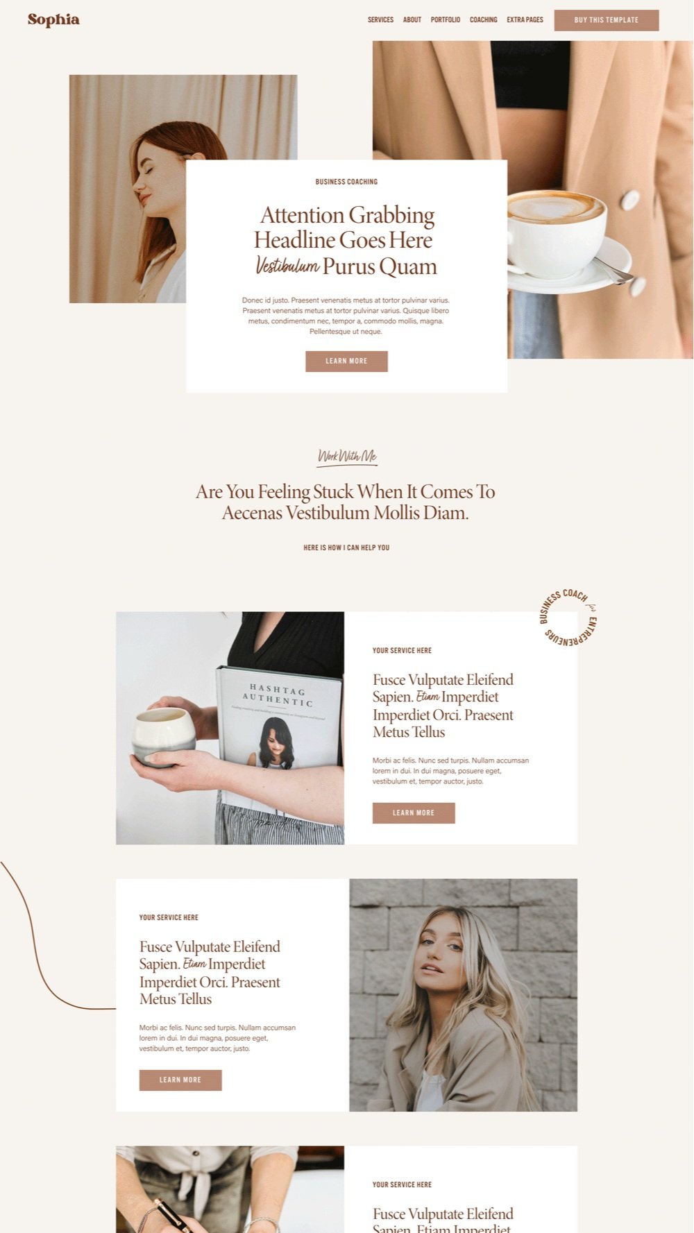
We've come up with 31+ stunning and professional coaching website templates you can draw inspiration from or purchase for your coaching website. We will consider factors like design and standout features to give you a deeper insight into each template.
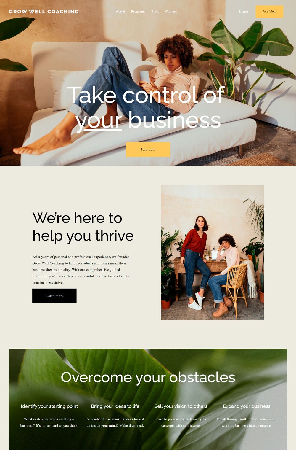
A coaching website should tell a compelling story and keep visitors interested with the visuals, text, and layout, which is what Grow Well website template does. It features a lot of visuals and a strategic layout.
Design and Layout: Grow Well Coaching website keeps things minimal regarding the color scheme. It uses neutral colors for the background and brighter colors for call-to-action buttons to make them stand out. One lovely thing about Grow Well is that it features many images, which is great for a life coach who wants to add images and videos to their website. In addition, the website's layout follows the contemporary layout, which is great for converting visitors to clients. One last thing to note is its great number of call-to-action buttons.
Standout Feature: One thing I love is the use of images alongside testimonials to give the website visitor a more scope of imagination. Testimonials are generally a good feature on your home page and can positively influence your client's decision.
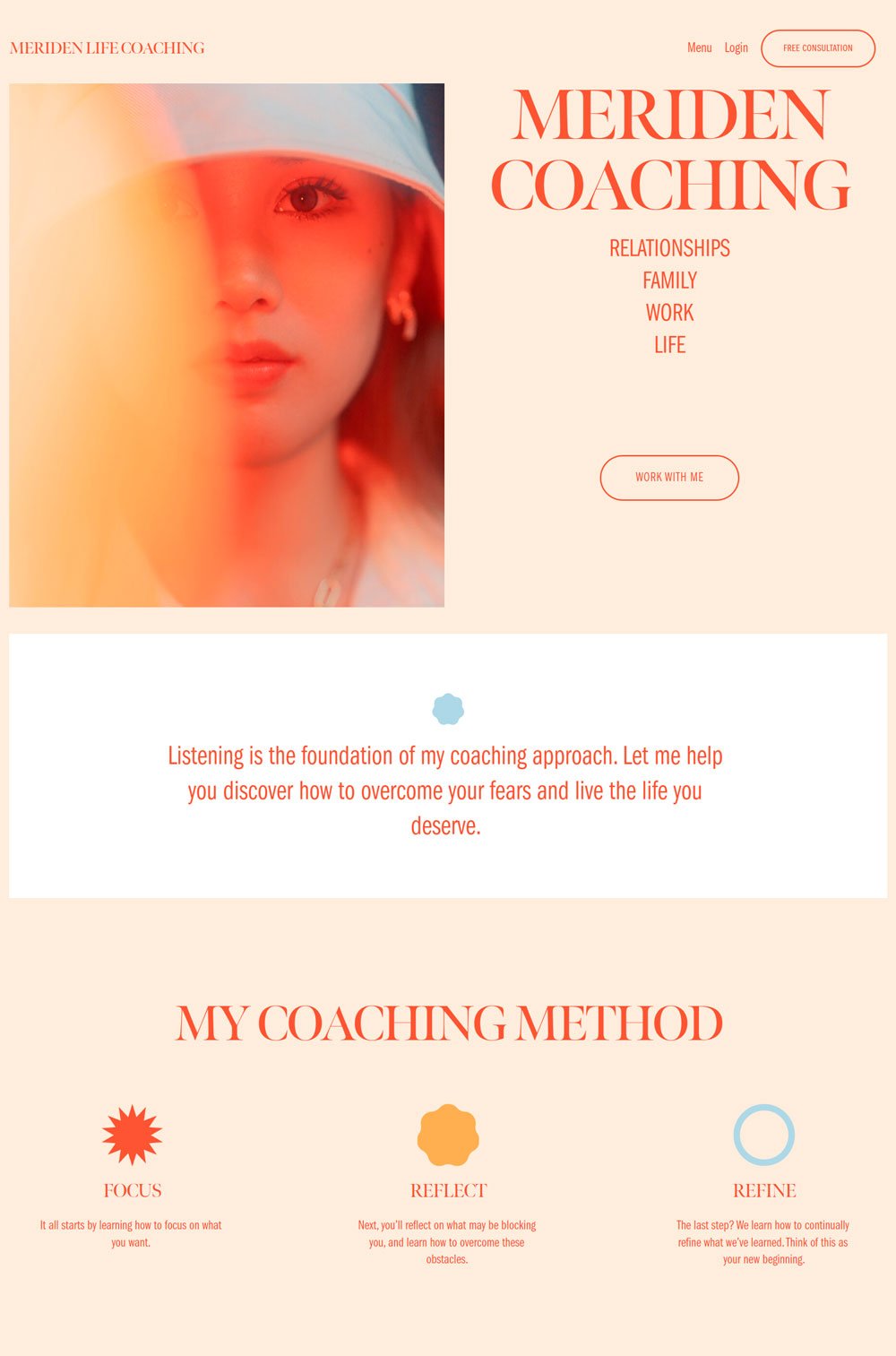
You can instantly tell this is a coaching website after a few seconds on the website. However, unlike other coaching websites, Meriden keeps it simple and straight to the point, with the copy and categorization right on the home page.
Design: The orange color scheme and the mixture of serif and sans serif fonts gives Meriden a professional yet relatable look. Also, using visuals beside each text gives Meriden a dynamic vibe and further makes your stay interesting. The layout is particularly modern and easy to flow with. Great for life coaching and health coaching websites.
Standout Feature: One thing that stands out is the clear service/coach categorization a website visitor sees immediately after they land on the home page. This is a great way to tell clients your specific niche without having to waste their time. For example, Meriden swiftly says she deals with relationships, family, work, and life coaching. Another small but cute future is how the buttons fill up when you hover over them.
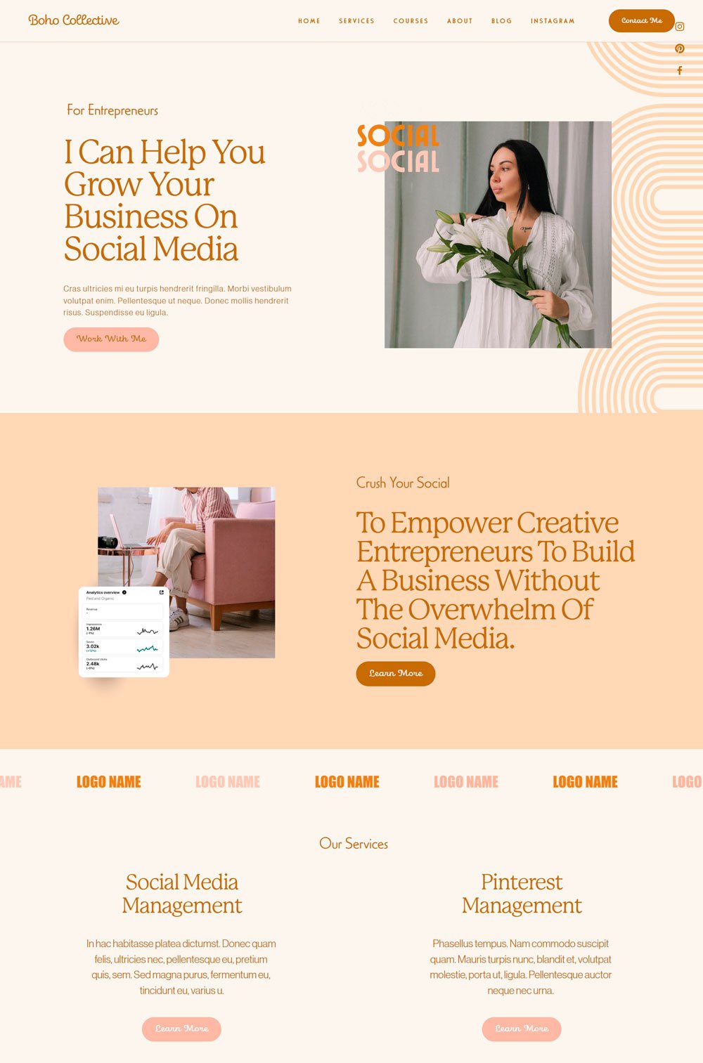
I love how modern and chic this website looks. No rule says that coaching websites should always be serious and formal. Boho Collective is simply breathtaking and great for different types of life coaches who want to add a touch of elegance and beauty to their website.
Design and Layout: The design does the talking immediately after you land on the website. From the color scheme, fonts, elements, and layout, Boho Collective does a great job. I like how each section is well defined with different colors. It helps website visitors know that each section talks about a different thing. Lastly, the use of animation, cute shapes, and the generous use of visuals is a great way to help website visitors flow.
Standout Feature: The fixed social icon bar on the right side of the website is a good addition. It allows first-time visitors to access your socials without having to scroll down to the footer of your website. Another thing worth noting is how the service page is well laid out. Everything your visitors need to know, such as how you work, the pricing plans, and what to get, is strategically arranged to create a seamless flow. And if they have doubts, there is an FAQ section on the service page.
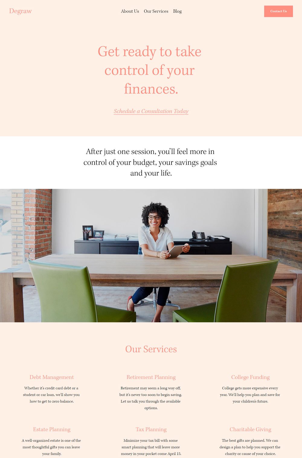
4. Degraw
You will find Degraw interesting if you are a financial or business coach. This coaching website keeps things simple and comes with everything you need to run a successful coaching website.
Design: Degraw is conservative with its design and keeps things simple with its layout. There are a lot of visuals and strategic call-to-action buttons. As you may notice, the home page doesn't contain much information but focuses on the most important points.
Standout Feature: The standout feature will be how this website template keeps everything short and straight to the point. There are enough visuals and generous whitespace around each element.
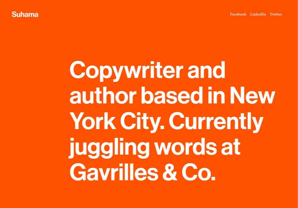
related article: Beauty Salon Website Template For Squarespace5. Suhama
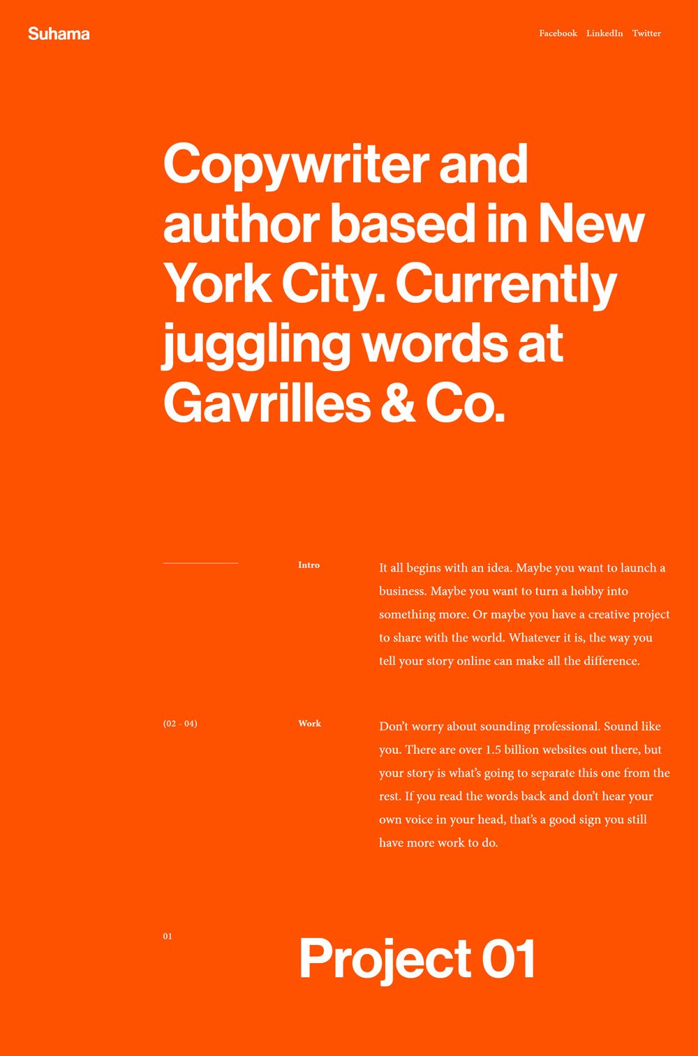
If you are serious about keeping things simple and want a one-paged website with only the necessary information, then you should try out this website template. Initially built as a portfolio website, Suhama can fit as a simple coaching website.
Design: Suhama sticks with a bright orange background, making every text stand out. There are no visuals. Just plain text, and there are no pages except the home page. However, you can add visuals since it is built on Squarespace.
6. Social.co
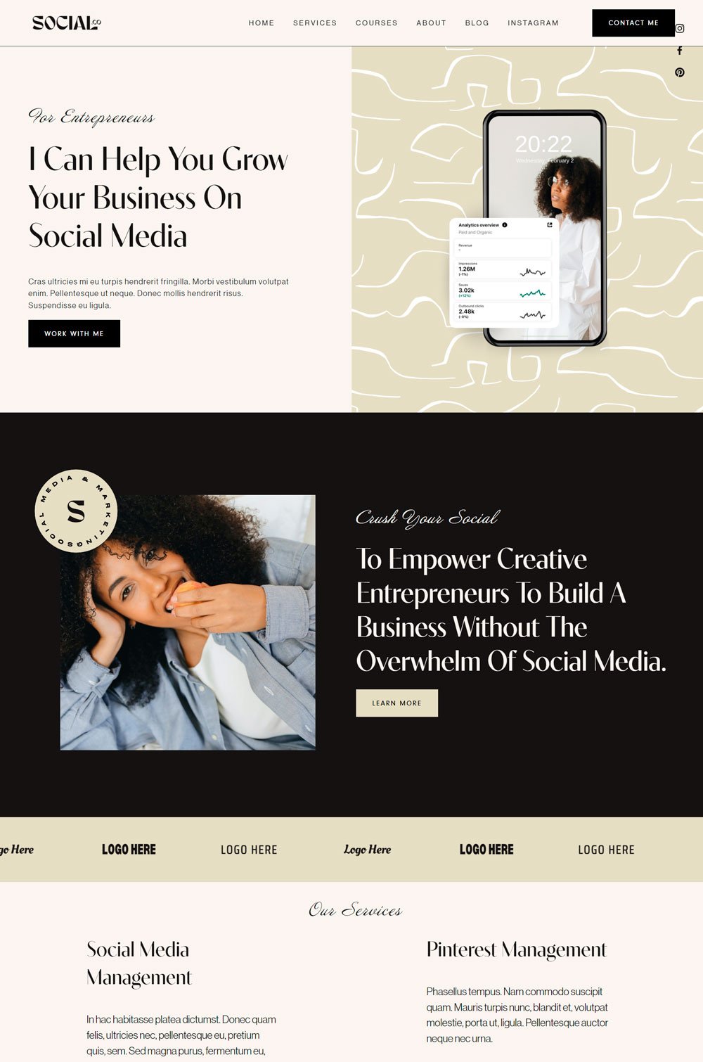
Social.co is one of those sleek and pretty websites design out there. Everything about the design is aesthetically pleasing and passes for a professional website. One thing I love about this website template is its cleanliness. Social.co is great for a career coach, leadership coaching, business coaching, or any other type of coaching niche.
Design: Social.co does a great job in the design. The alternating background color gives each section a different vibe. Also, the clear contrast between the text and the background is worth commending. The layout also creates a seamless storytelling experience for your potential clients.
Standout Feature: Using statistical images beside each testimonial is great social proof and will be useful if your results are quantifiable. Apart from that, the integration of Instagram reel is sleek. Of course, if you don't want that, you can easily add a video clip of you doing your thing directly on your home page.
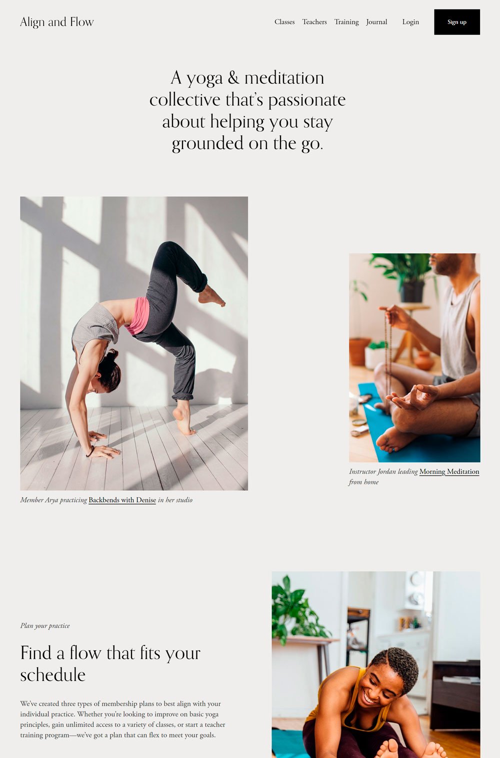
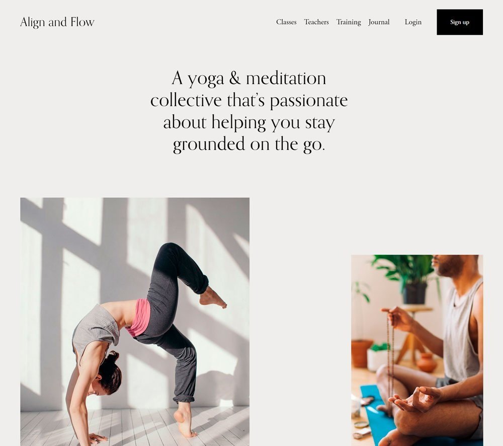
At first glance, Align and Flow is a yoga website template, but it made it to this list because of its versatile layout and professional design. Align and Flow gives you a blank canvas. So, whether you are a fitness coach, leadership coach, career coach, self-care coach, health coach, relationship coach, or any other type of coach, you will find Align and flow a good match.
Design: Designed for a yoga and meditation coach, the design is neutral, clean, and clutter-free. There is not much going on except the necessary visuals and text sections. The design alone gives it that professional look. The layout is also simple and straight to the point.
Standout Feature: One intuitive feature that shows that the web designer was empathetic is the menu that stays fixed no matter how far you scroll. This is definitely thoughtful because it will save visitors the stress of scrolling back to the top before they can navigate to other pages.
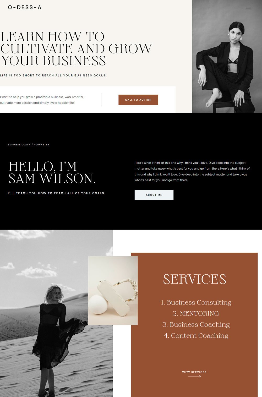
8. O-dess-a
O-dess-a does a great job with the great use of visuals and a nice color scheme, giving it that professional yet luxurious look. O-dess-a is a business coaching website template that features everything you need to run a successful website.
Design: The color scheme ranging from dark to earth colors gives this template a dynamic yet professional look. The strategic placement of images also makes O-dess-a stand out from other business coaching websites. The sections were arranged strategically to create a compelling story in the home page layout.
Standout Feature: The dynamic arrangement of the pages gives you that nostalgic feeling. One page that stands out to me is the workshop page. How the workshop page was designed gives visitors a deep insight into what to expect and compels them to take action.
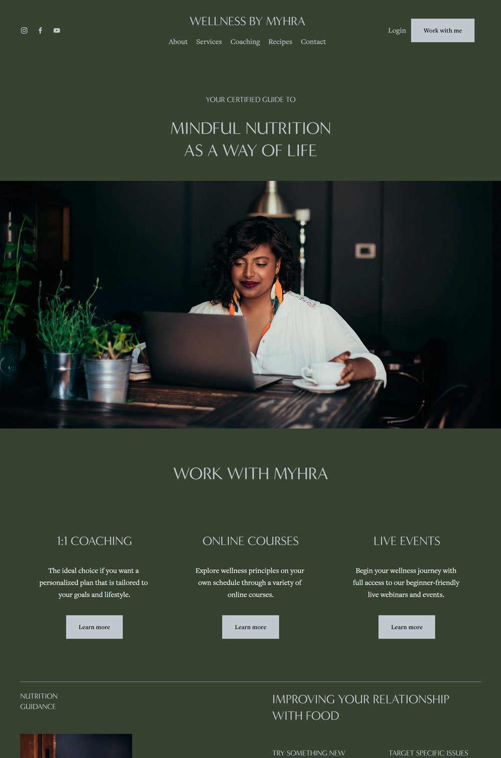
related article: 12+ Stunning Squarespace Real Estate TemplateYou can tell that much work went into this coaching template. However, the choice of fonts, color schemes, and strategic use of images give it that uniform look. Wellness by Myhra gives you a boss lady vibe, which is worth checking out. Definitely, one of the go-to templates if you want to create a successful coaching business website.
Design: The color scheme is not one you will see in everyday design, making the design stand out. Using the image at the beginning of the website adds a touch of color to the overall image. Also, the layout is contemporary and modern.
Standout Feature: Generally, Wellness by Myhra comes with great features, but one thing I would like to highlight is the design of the coaching page. The page is a great inspiration if you want a service page with an in-depth explanation.
10. Jada Ellis
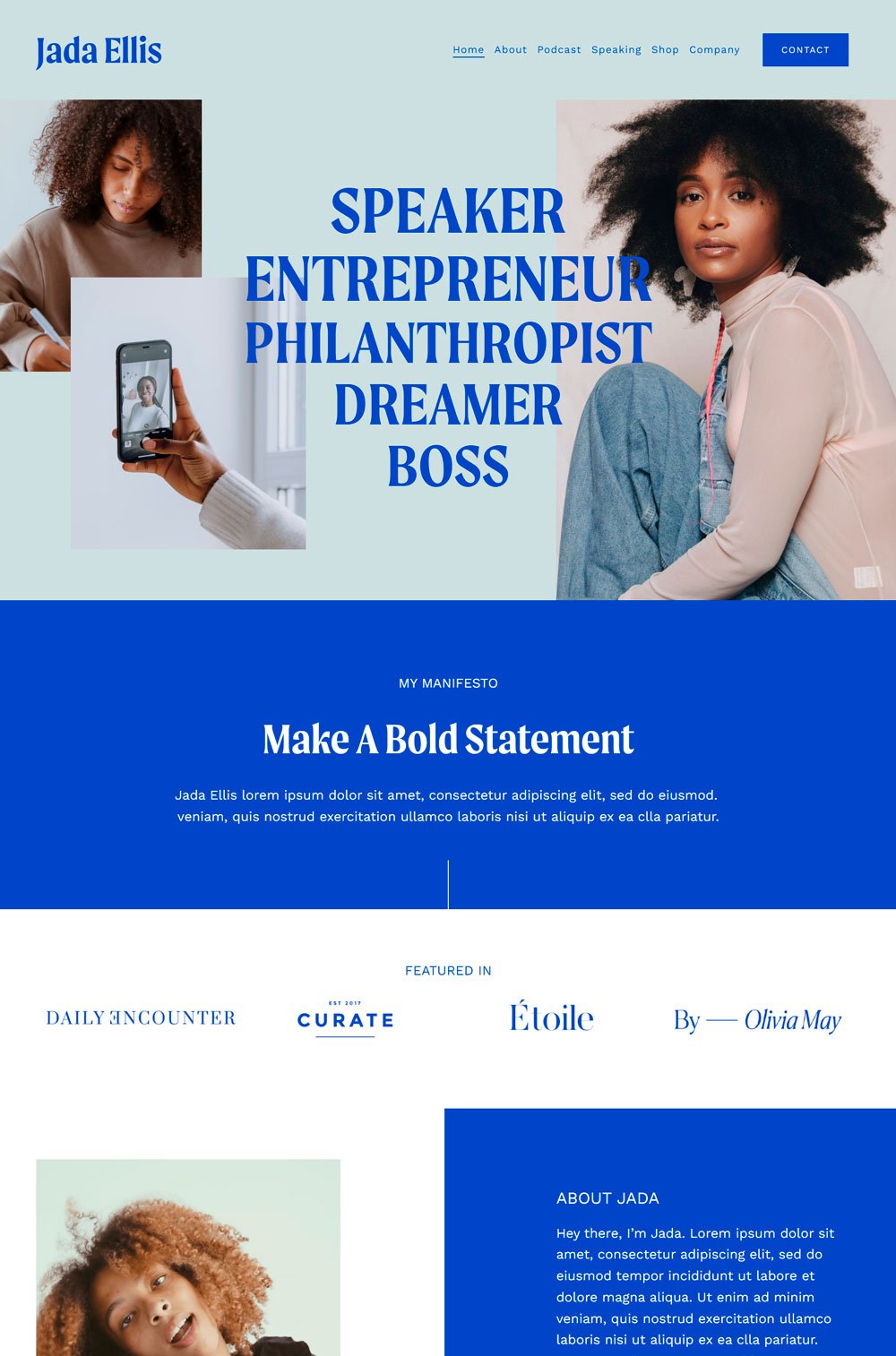
Bold, dynamic, and unique are the right words to define Jada Ellis. Definitely a great inspiration for personal website, leadership coaching websites, or any other coaching niche. So, if you are looking for a bold coaching inspiration that remains conversational and friendly, you should check out Jada Ellis.
Design: The blue color scheme gives it that boldness and trustworthy vibe. It makes the website stands out from other coaching websites and gives it a bold look. While it is a personal website, the layout gives it that dynamic and professional website look. Another thing about the layout is how each section leads into another.
Standout Feature: The standout feature will be the home and speaking pages. The speaking page features youtube images of speakers (if it is a real website, it will be the owner's), which is a great way to show people what you do. Also, the cute addition of the GIF video in the about me section on the home page is cute and chic and can be a great inspiration for your coaching website.
related article: 26+ Best Squarespace Templates For Photographers11. Amplify
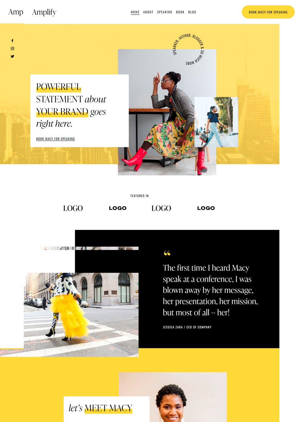
Yellow may not look like the ideal color for a coaching website, but Amplify pulls this off like a pro. The combination with the white background makes this website pop. This website is so beautiful that it gives you a nostalgic feeling.
Design: The layout of this website is simply stunning and unique. The interesting images, squares, and text placement make Amplify a stunning website. The web designer knew what they were doing when they decided to go with yellow. No cap, Amplify is a pretty website for your life coaching websites.
Standout Feature: The video integration on the home page showing the speaker in action is a great way to let visitors know how good you are and what to expect. Another thing that stands out is the strategic use of image.
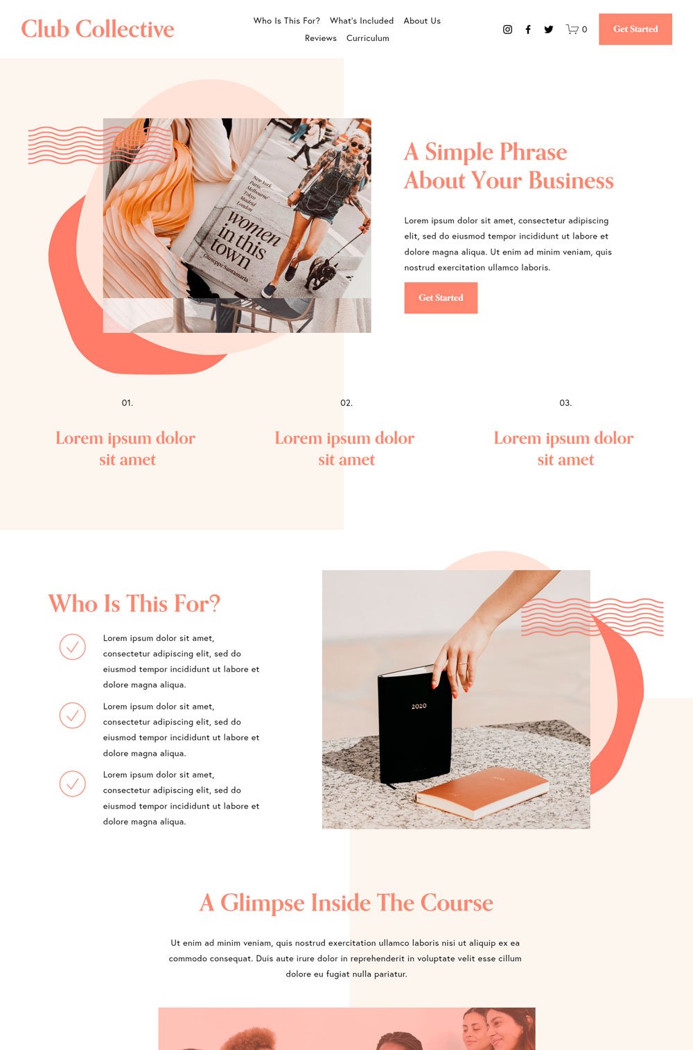
12. Club Collective
Another cute and stunning website coming your way is club collective. Again, the quirky elements and choice of colors make the website template stand out. But what gets me is how the website is versatile enough to accommodate any coaching websites, as long as you edit the template well.
Design: The bright pitch color against the white background makes every heading and button stand out. You can instantly see the important information without even trying. Another thing worth noting is how the home page layout is simple and straight to the point.
Standout Feature: The first standout feature is the fixed menu that also houses the social media icon, which is a great design direction. So, instead of scrolling to the page's footer or checking the sides, you see the socials directly on the menu. Also, the testimonial on the home page serves as social proof and is well arranged.
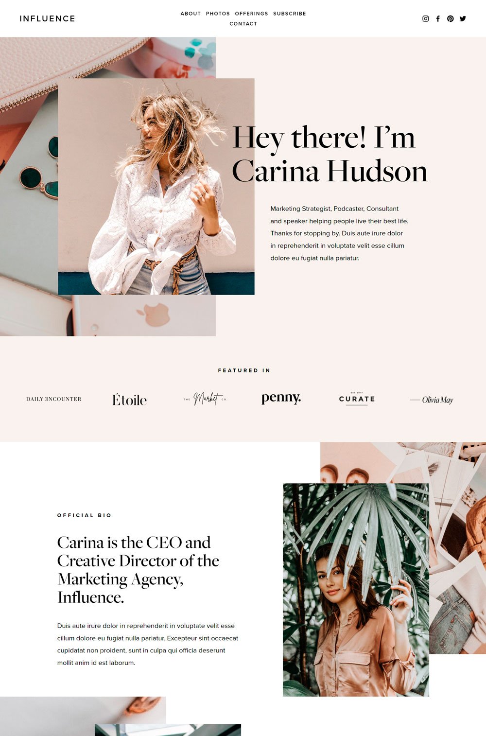
related article: 21+ Best Squarespace Blog Templates (Free & Premium)13. Influence
If you love visuals, and a well-designed website that sparks any visitors' interest, then you will like Influence. I love the use of images, the arrangement, and everything in between. Influence is a personal website ideal for life coaches, health coaches, business coaches, and leadership coaches.
Design: The consistent color scheme and neutrality makes Influence look professional and will be a good representation of a high-performance coach. The layout doesn't do much but follows a modern arrangement and is straightforward.
Standout Feature: The photos page is a highlight of this website. The potential of this photos website is massive. You can easily use it for a portfolio page to list your past achievements with your clients, a testimonial page, or even a place where you can store your speaking video or any other video showcasing you in action.
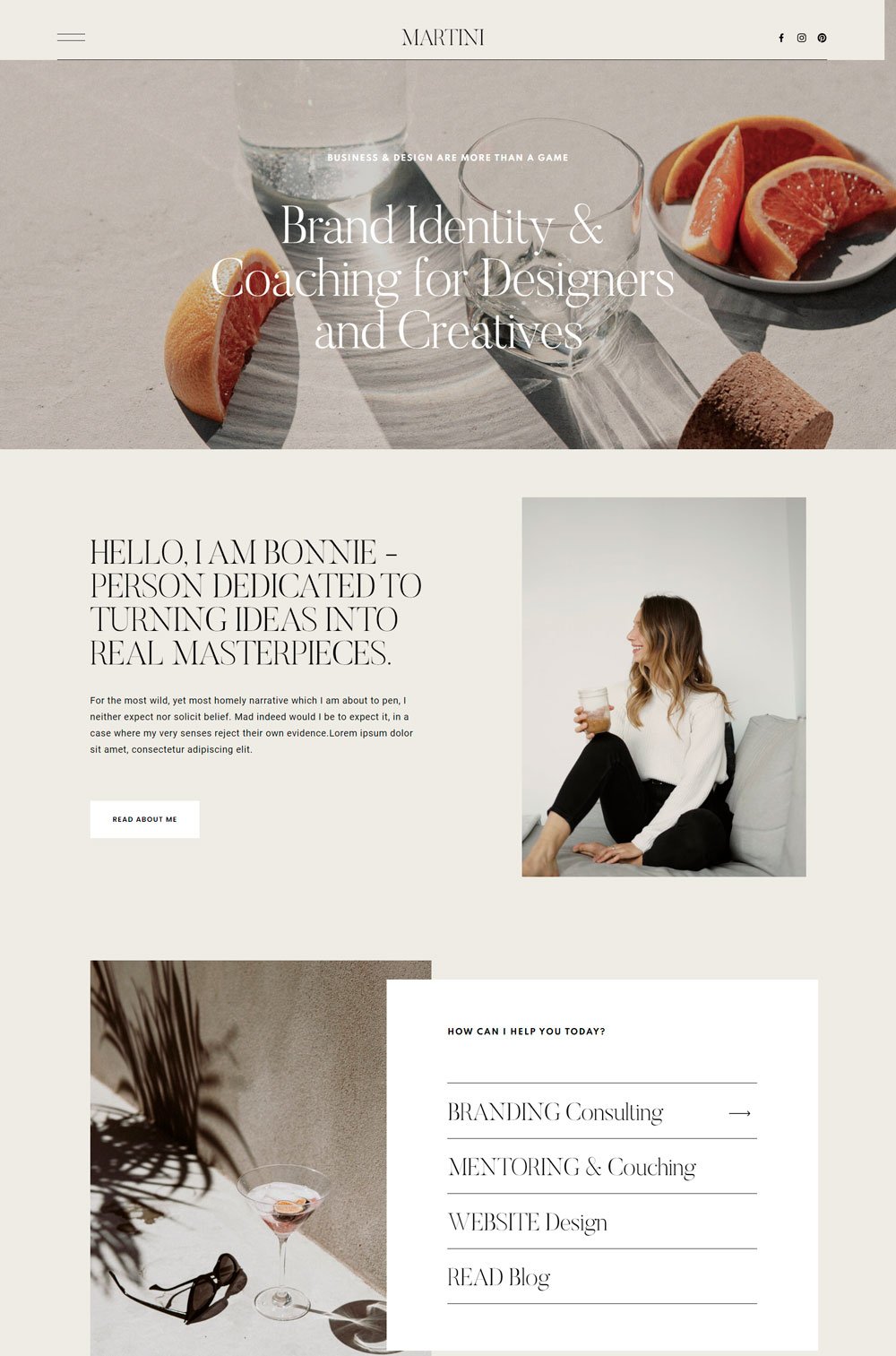
14. Martini
Martini keeps it neutral and clean, making it a great coaching website template for coaches who want to keep things simple and clean.
Design: Using neutral colors gives it that calm, professional, and standard look. Like it passes across an 'I am here for business look. The layout allows enough whitespace for every element to breathe, which sort of draws equal attention to each element. Also, the home page follows the conventional arrangement, with is also great!
Standout Feature: The full-sized header image is definitely a great addition. It can hold your picture or any other cool picture you want your visitors to see first. Another thing that stands out is the number of pages that Martini comes with, giving you enough work area to evolve.
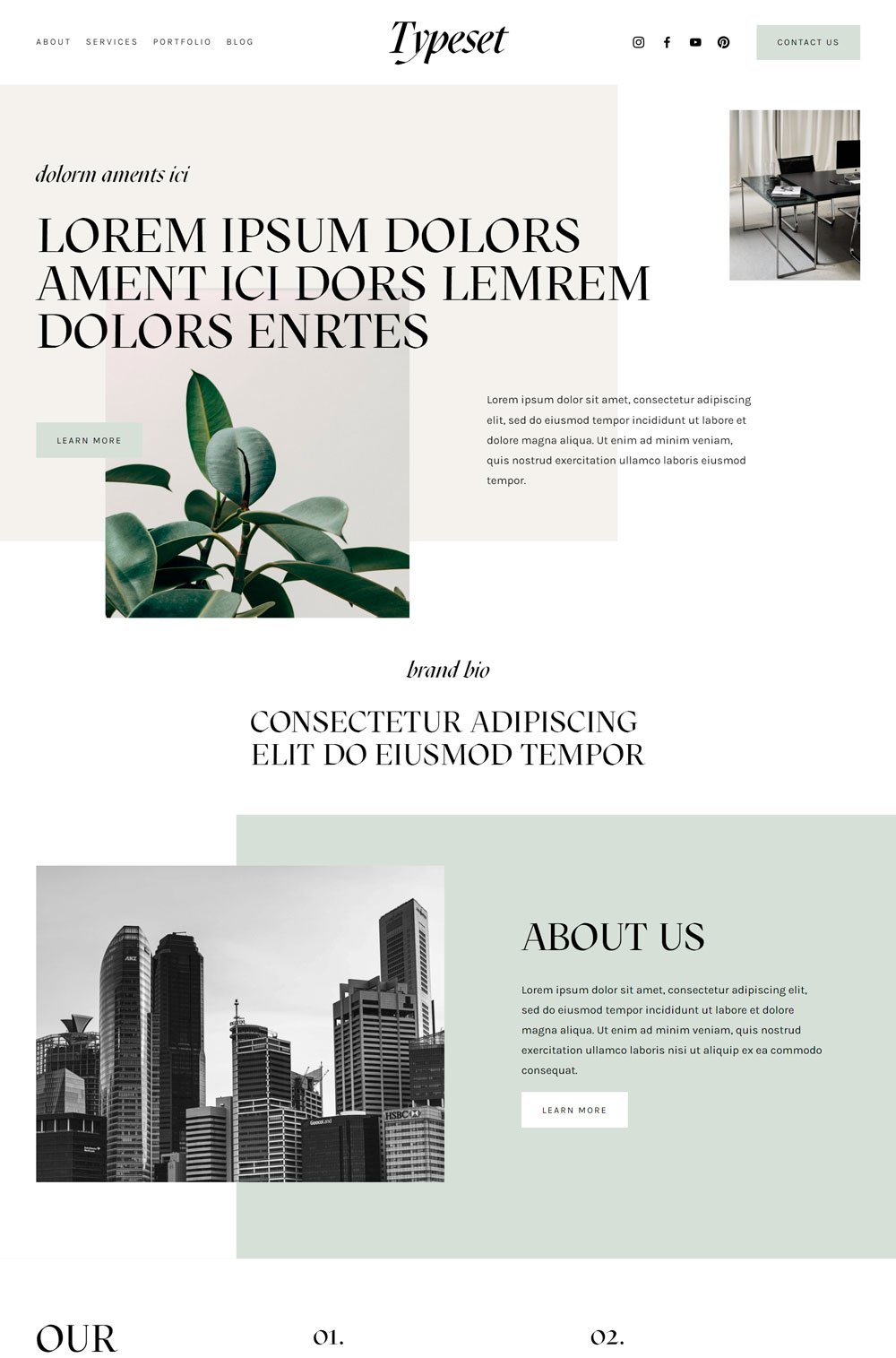
related article: 21+ Best Squarespace Portfolio Templates To Show Off Your Work15. Typeset
Typeset keeps it simple and professional throughout the entire site. Its simplicity gives it this authoritative and professional look which is great for coaches that do not want any distraction.
Design: Starting with the design, Typeset keeps it professional by keeping it simple. The white background and neutral colors give it that everyday look. The layout also is simple and straight to the point.
Standout Feature: The portfolio page on Typeset serves as a great place to highlight your past projects. Also, the cute sliding animation of the images gives it an interesting flow.
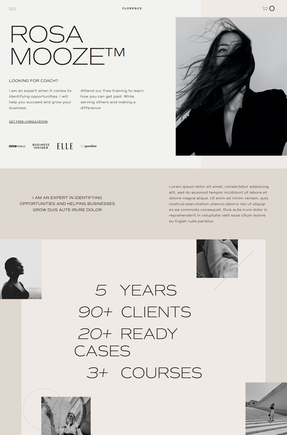
Florence is a dynamic that spice things up with its unique layout and its minimalist, big fonts. In addition, Florences offers that personal connection with the brand with its storytelling layout.
Design: Florence sticks to the vintage white and black theme but still manages to pull it off like a pro. This coaching website template layout uses storytelling to give new clients a deeper understanding of your work and what to expect.
Standout Feature: I feel Florence has great features that do the job. However, the menu design is pretty sleek and adds an aesthetic touch to the overall design. The use of storytelling on the homepage and the social proof is also a great addition.
related article: 41+ Best Squarespace Plugins For Your Website17. Copenhagen
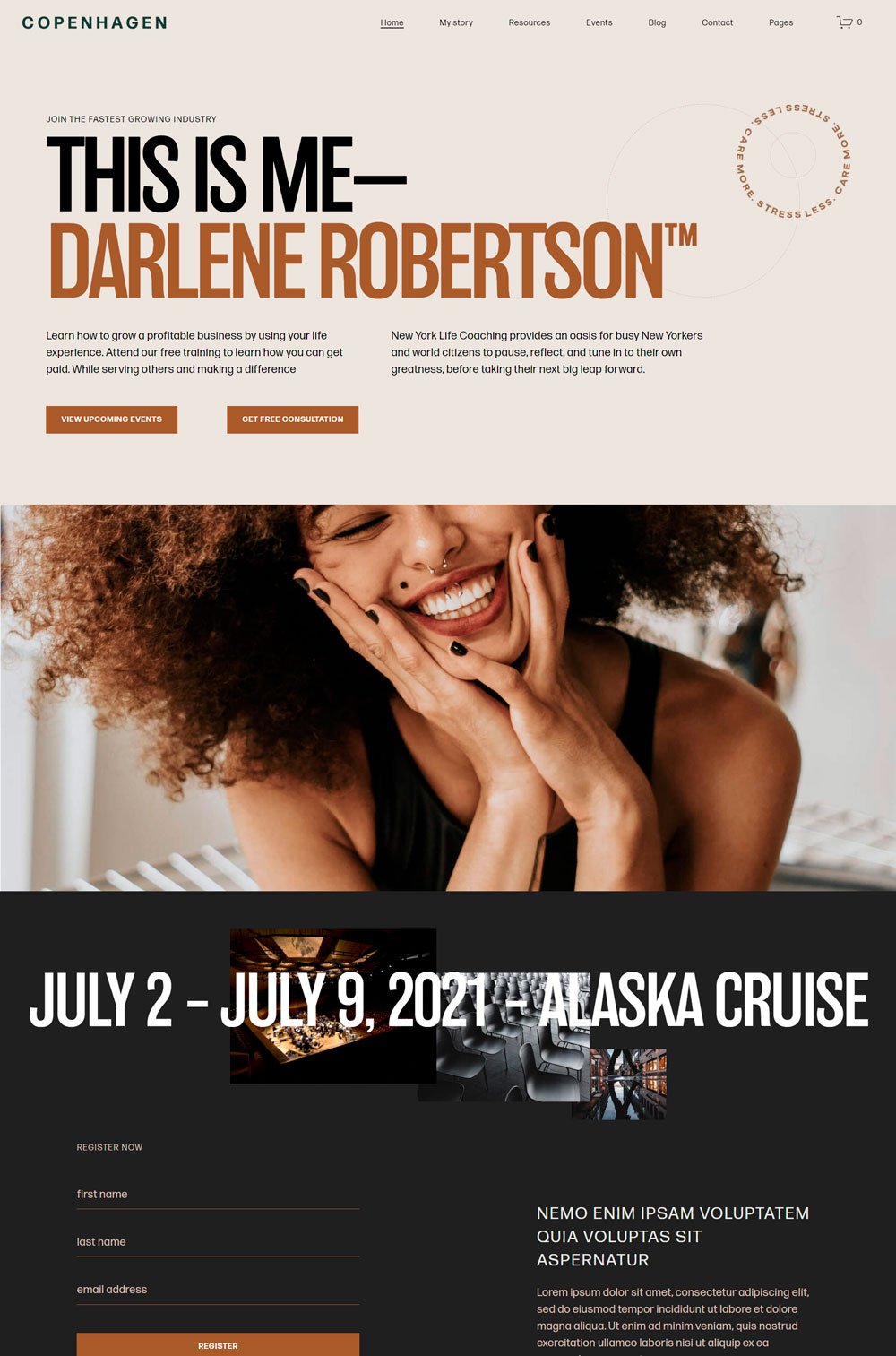
Copenhagen steals your heart away with its clean fonts and simple layout. Copenhagen doesn't do anything extra but sticks to a relatable and professional design. However, the use of images and color gives it a whole different vibe.
Design: Copenhagen does great with its color scheme of brown and black text. The homepage also creatively highlights everything a new visitor needs to know about you and what you do. In addition, Copenhagen did a great job in keeping the home page simple and clutter-free.
Standout Feature: The full video section on the home page is great. You will find this section useful if you are also an international speaker. The video section is big enough and gives visitors a better viewing experience.
18. Exurban
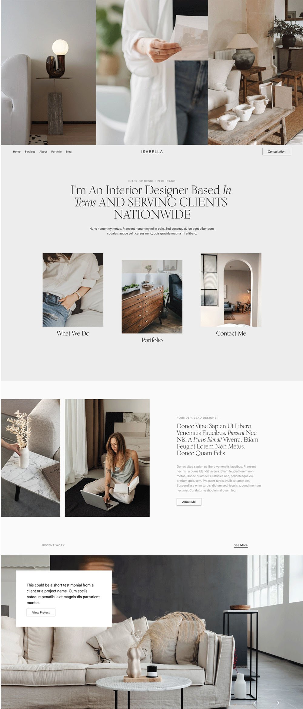
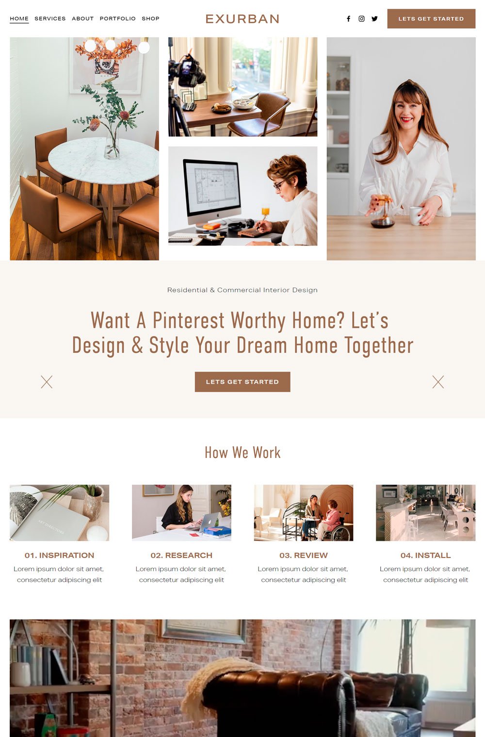
I love how Exurban starts with images. It may look like it is not the best thing to do, but if used well, it can provoke emotions in your visitors and give them nostalgia. Exurban is a home decor/architectural website template, but its dynamic layout makes it ideal for coaching websites.
Design: Whether you are thinking of career coaching websites or business coaching websites, Exurban has the right layout for it. Its brown color scheme gives it that organic look and makes it feel homely.
Standout Feature: I've got to give it to the images at the header of the page and the portfolio page. Both features are a great and unique addition. The portfolio page is a great page for maybe a gallery page or where you can list your past projects.
related article: 31+ Podcast Website Examples To Inspire Your Own19. Thea
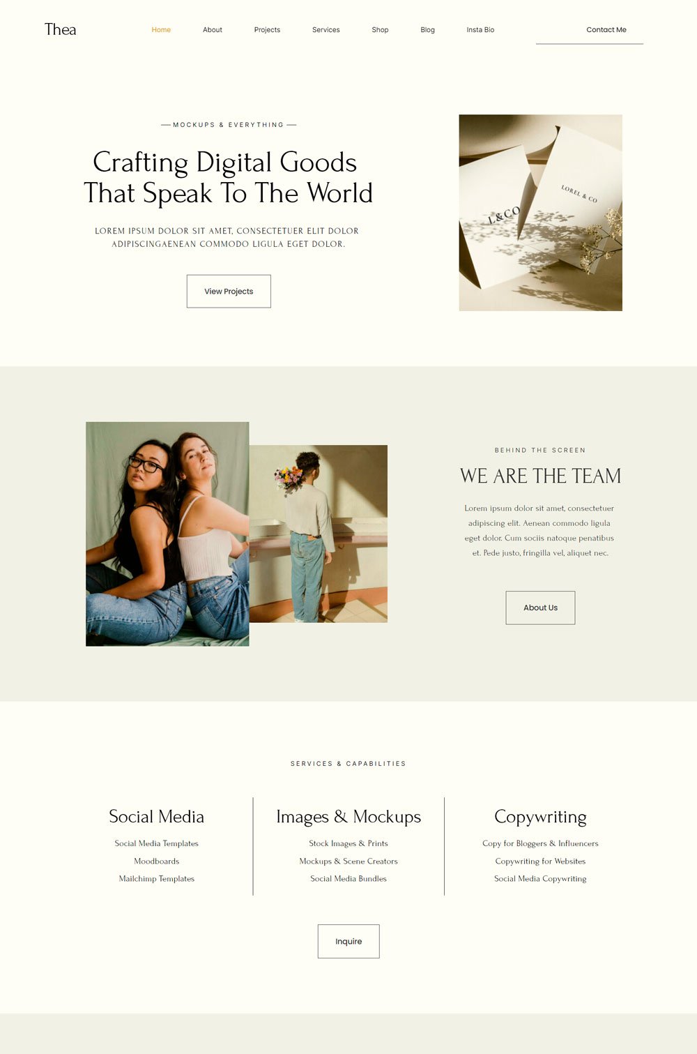
No matter how you try, Thea gives this luxurious and elegant vibe. This general website template is so well designed that it can pass for any website, especially coaching websites.
Design: Thea keeps its colors and serif font simple, but the layout is brilliant. The layout creates a seamless flow across the homepage; each section leads to another.
Standout Feature: Thea comes with a shop page where you can offer online courses or even digital products as a professional coach.
20. Gigi Rose
Gigi Rose is another coaching website template that has a unique look. Using elements, colors and images make it pop while remaining professional. One thing about Gigi Rose is the generous use of images.
Design: Gigi Rose's dynamic design and layout make it stand out. The color scheme also creates a perfect mood that keeps visitors glued. Another thing to commend is the thoughtful layout of each page.
Standout Feature: One thing that stands out in Gigi Rose is its interesting layout. It stands out and remains unique.
related article: 51+ General Contractor Websites (Plus Templates!)21. Orka
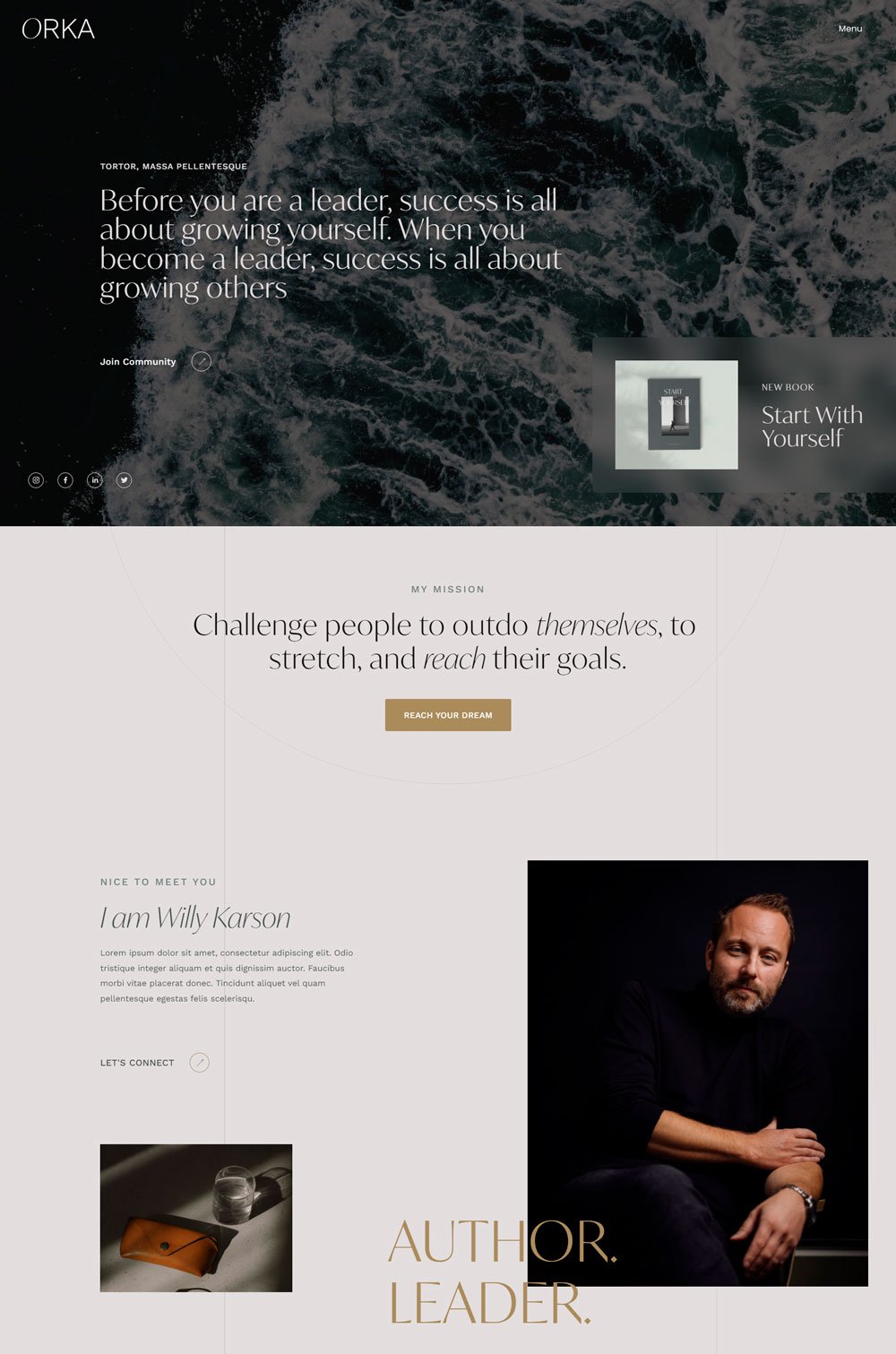
Orka is a leadership coaching website template with dynamic images, an interesting layout, and a neutral color scheme. It keeps everything simple and professional, using bright colors only when necessary.
Design: Orka's design is rather conservative and simple. It doesn't do anything extra but sticks with neutral color throughout the template. However, images spice things up and add life to them.
Standout Feature: I love how the menu slides out with the coach image, compelling text, and social media icons. That is a great way to make good use of space and constantly put positive pressure on your new visitors. Also, the sub-pages under the programs page allow you to arrange your core programs.
22. Ava Grand FE
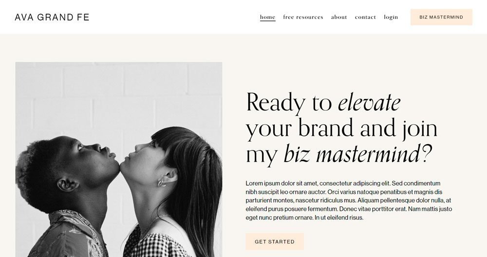
Ava Grande comes in hot! This template design makes it seem like you are leaving different chapters on one website. First, you get the modern vibe; then, suddenly, you get a vintage or retro vibe. The use of colors and real estate is commendable.
Design: I love the color scheme; the different shades of colors give it that life and energy that keeps your visitors pumped. Also, the image and heading combination at the start of the homepage is a brilliant idea. It gives it that unique, bold, and professional touch. Finally, as you may have guessed, it has a great layout.
Standout Feature: The video integration on the homepage is a great way to showcase yourself. The fixed menu allows visitors to access any page on your website without having to scroll back up.
related article: 31+ Best Health Coach Websites (Plus Templates!)23. Good Vibes
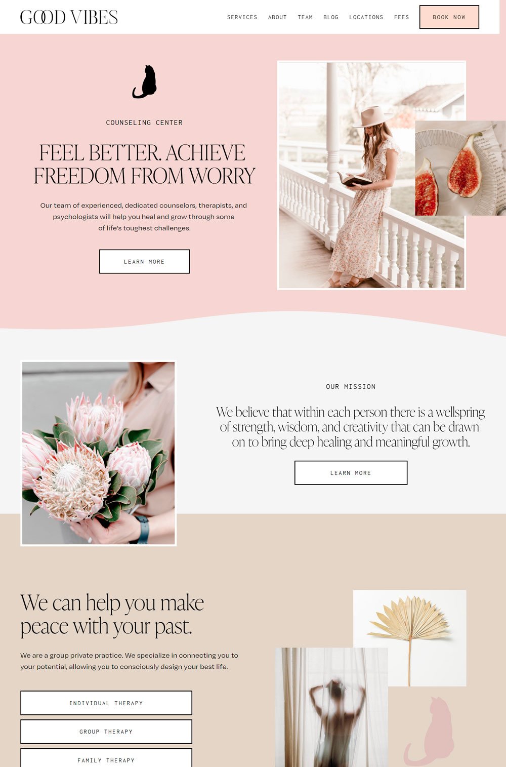
The layout of this website instantly gives you good vibes. Good vibes did a great job highlighting the important information in the layout. In addition, the layout is flexible enough for any kind of coaching business.
Design: The colors are nice, and the call to action button fill makes them stand out. Also, the layout follows the contemporary arrangement and has a lot of strategic CTA buttons.
Standout Feature: The menu includes thoughtful pages that can simplify navigation for new users. Also, the arrangement of each page is cool and understandable.
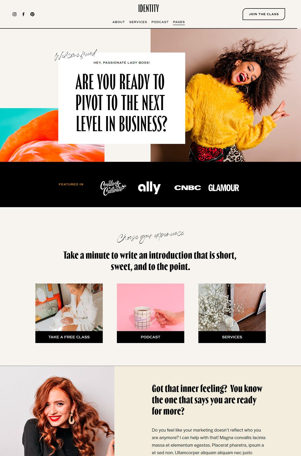
Identity is stunning, and you will agree with me. The use of images and bold text make important information stand out. And there is something about the layout that makes the website look fun and relatable.
Design: The images give the website a lot of colors, which is perfect if you are a wellness coach or lifestyle coach that needs to include many images. Also, the layout is fun and straightforward.
Standout Feature: One page I find fascinating is the service page. The first 'hey, lady boss' line already gives it that interesting vibe. Also, the way each service is arranged makes it easy to understand.
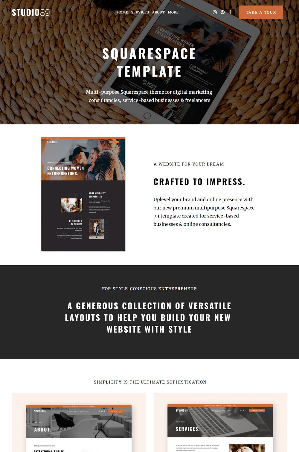
related article: 10+ Best AI Story Generator Tools For Fiction Compared The header image makes all the difference. Studio 89 is a general template you can use for your coaching website. One thing about Studio 89 is that it is built to be flexible.
Design: The generous use of images, whitespace, and nice colors make Studio 89 breathtaking. This website template follows a modern pattern with its layout and other pages. So, if you are thinking of achieving a contemporary design, then Studio 89 is a great choice.
Standout Feature: Everything about the home page is breathtaking. The choice of colors, CTA buttons, whitespace, and all. It makes every element stand, which in itself is a great design.
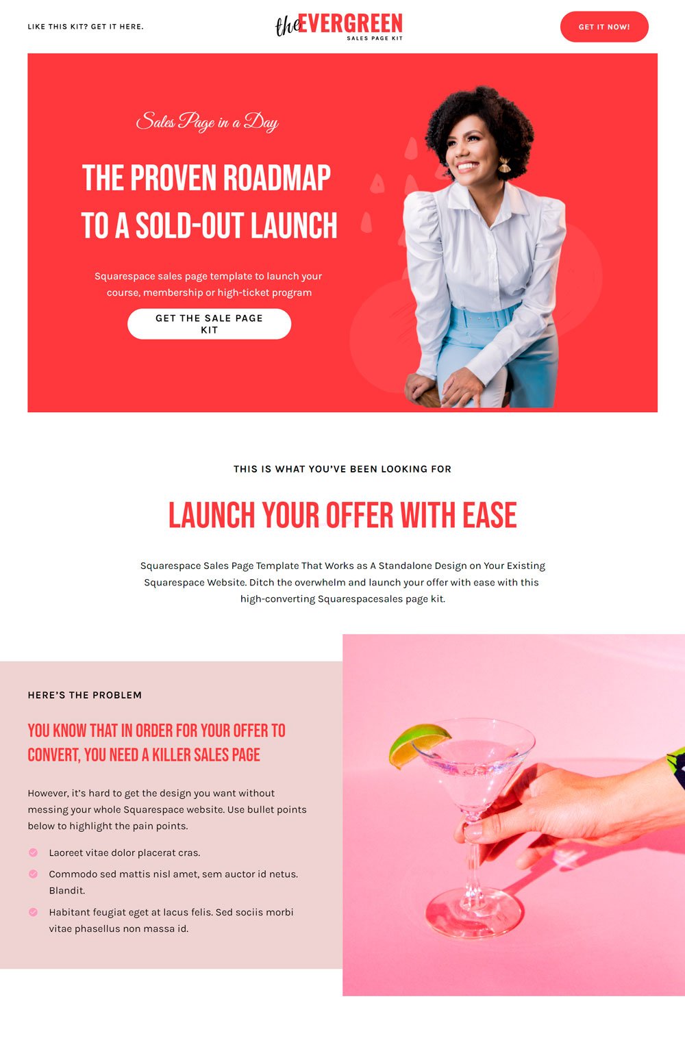
Whew! This website doesn't need to do a lot of talking; it is simply stunning. Evergreen is a coaching website template designed specifically for top-rated coaches. You will realize that this website is professionally designed, from the design to the layout.
Design: You instantly know that a lot of work went into this website. The choice of colors, font, and layout all work in sync to give a perfect sync. In addition, the arrangement of the text gives it a seamless flow through the site.
Standout Feature: One thing I love is the sections. Each section is strategically designed to create a building block until the visitor reaches a climax of decision. Finally, the testimonial feature on the home page is great social proof.
related article: 17+ Best Personal Trainer Website Template And Examples27. Lemongrass
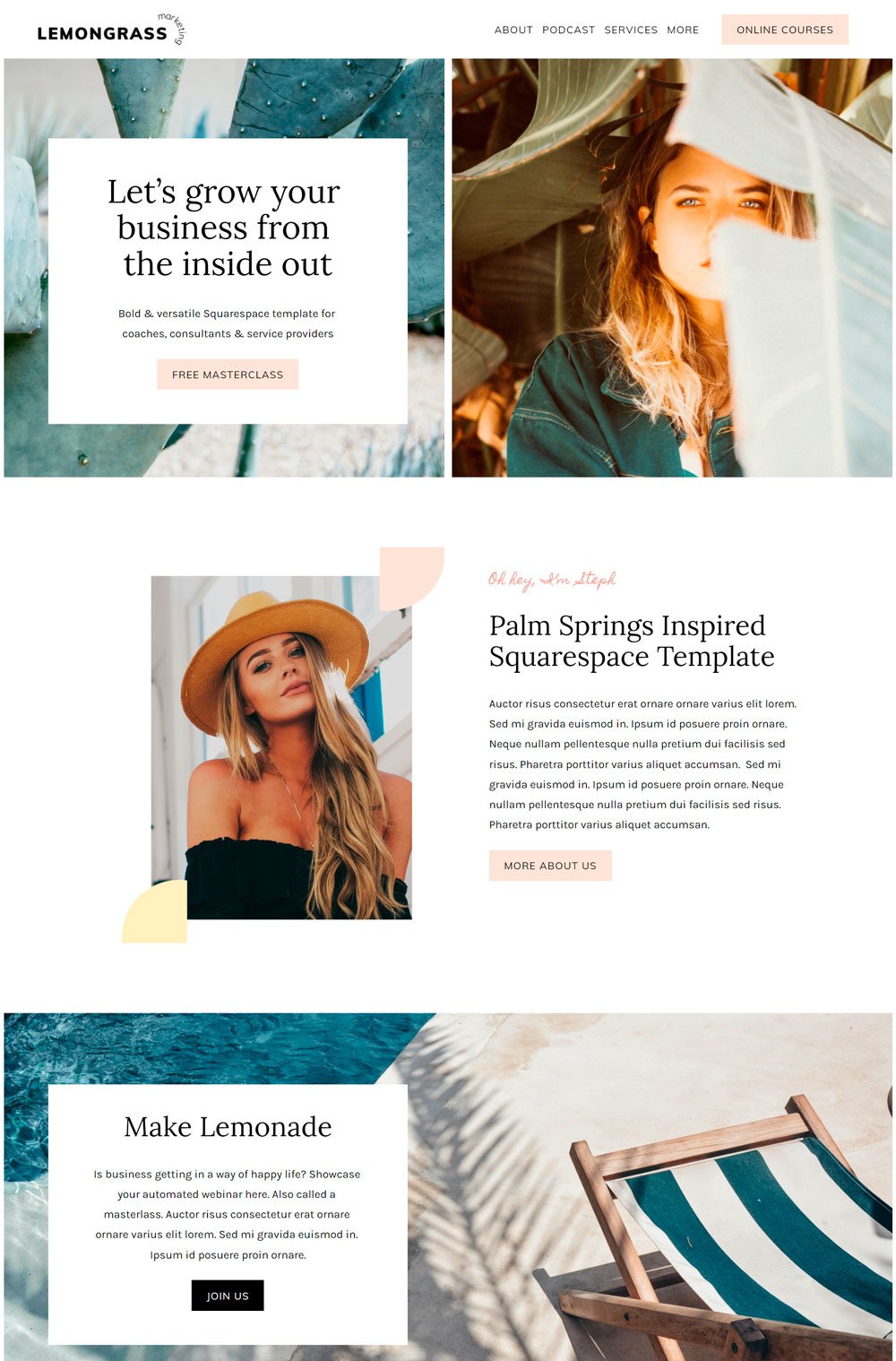
Lemongrass is another stunning website template for coaching business, that fits into different niches. The professional images and clean layout gives it a professional look. Although it is a podcast website, its dynamic layout makes it suitable for a coaching website.
Design: The pastel colors compliment the website template well, and the layout is clean with breathable spaces amidst each section
Standout Feature: The 'a hundred students cannot be wrong section on the homepage is a creative way to introduce testimonials. However, I love how they focus on the main pages on the menu and group the other pages under the link.
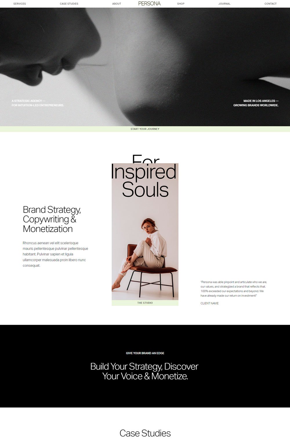
Who says white and black are boring? If you've ever believed that, then Persona will change your mind. Persona is a minimalist website that focuses only on important information and stays clear of any distracting elements.
Design: Persona stays conservative and uses a black and white color scheme, but it makes up for its conservativeness with images. The extensive use of images on Persona lightens up the website template and gives it a dynamic look.
Standout Feature: The standout attribute of this website will definitely be its minimalist nature. The fact that it stays clear of distraction gives it an extra dose of professionalism and neutrality.
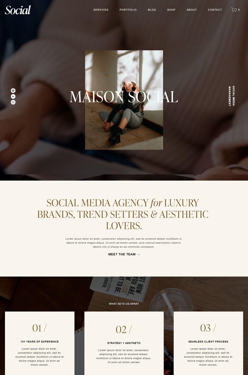
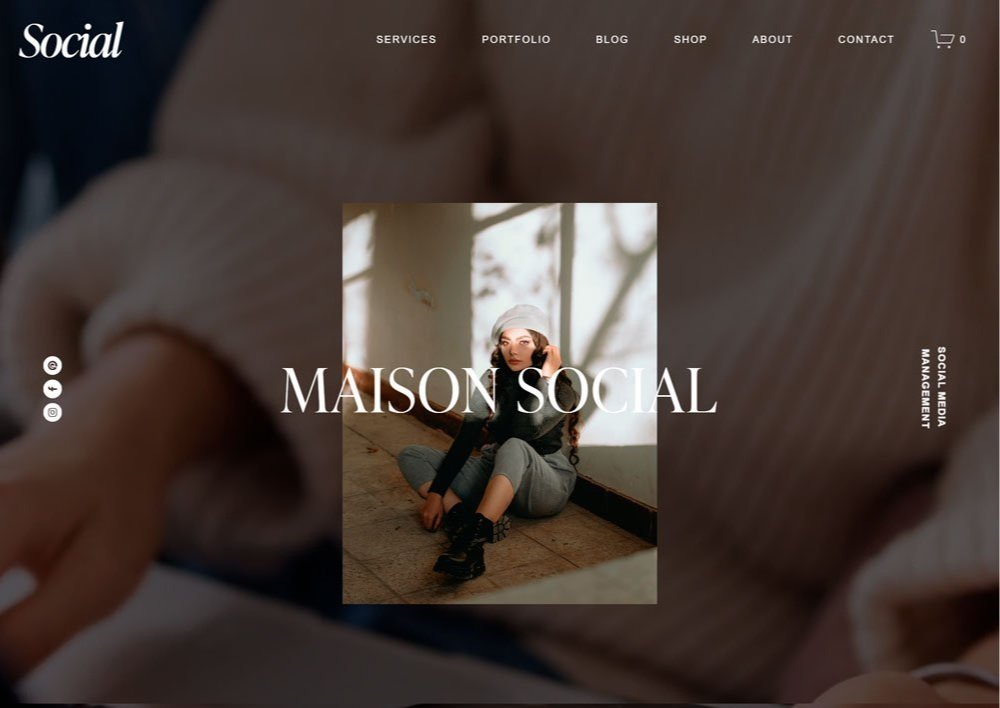
related article: 25+ Best Actors Website Template To Try Out!Social is another website template that steals the show completely. It opens up with a full-sized GIF that crowns the overall luxurious look. Your coaching website will look all shades of pretty with social.
Design: The design is clean, with readable text, and the layout has enough whitespace.
Standout Feature: I love how images represent other pages on the latter part of the home page, and the images enlarge whenever you hover over them. Then, the integration of Instagram reel at the end of the home page is another thoughtful feature.
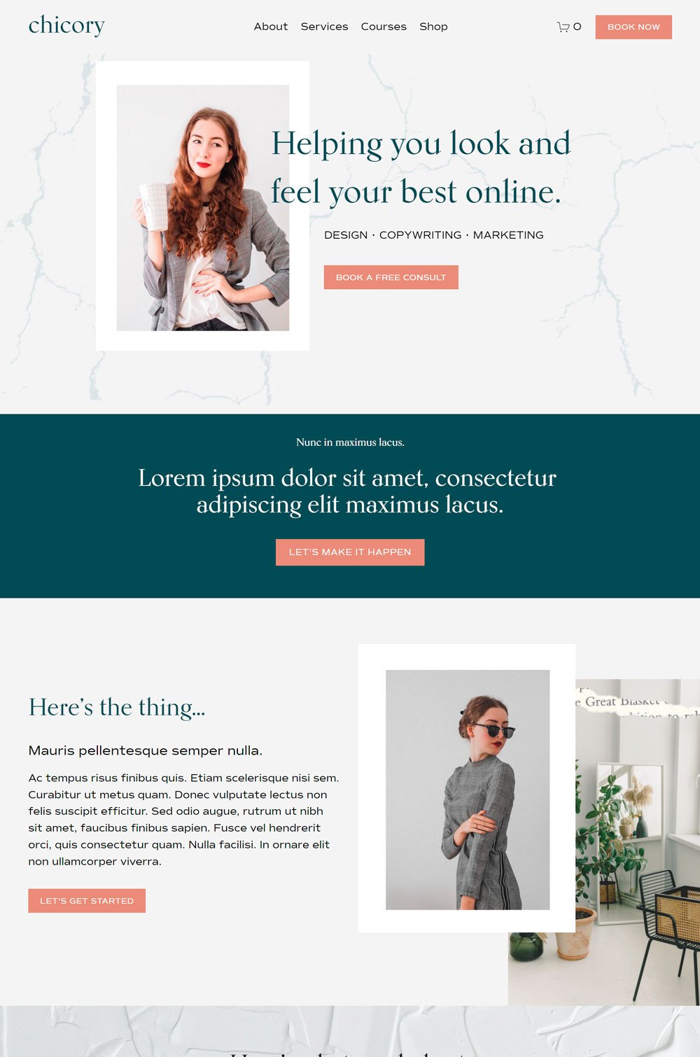
30. Chicory Coaching Website
Chicory is also a stunning website that adds a bit of fun to the professional look for life coach. The use of colors and textures opens Chicory up to the work of coaching. This is a go-to website template if you want a stylish website.
Design: You can instantly tell that the color scheme blends well, and the layout creates a compelling story.
Standout Feature: The course page is one of the most well-designed course pages I have seen. It doesn't give too many details but gives the necessary information to convince any visitor. Besides, it can easily be modified to fit your marketing needs.
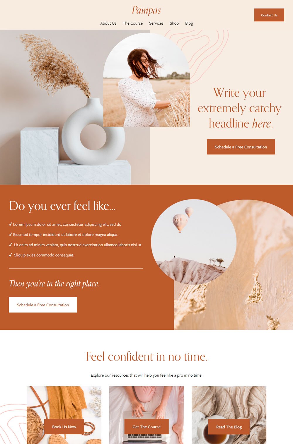
Related Article: 31+ Best Interior Designer Website Templates31. Pampas Website for Coaching Business
We are ending strong with Pampas. The browns and the whites make Pampas stand out and stunning. This is a great template if aesthetics is part of your list.
Design: The shades of color is everything. The brown buttons against the lighter background give Pampas an elegant look.
Standout Feature: It comes with a shop page, a thoughtful addition for coaches that offer online courses and webinars. Also, the shop page comes with categories, making navigation easy for you and the buyers.
Which One Was Your Favorite?
We've explored great coaching websites and templates that are a perfect fit for different kinds of coaches and are well built to fulfill your aesthetics and marketing needs. So, which was your favorite? And I hope you find the perfect website template for your coaching website. You can also check out these therapist templates and personal trainer templates.

