Custom Squarespace website Design for real estate property Management group in Seattle
Buying, selling, and managing real estate properties requires understanding the market, diligence, and expertise. Your clients must be able to see a track record of past management and become convinced that your group is more than capable of managing their properties. There are many ways to establish credibility with prospects and reach out to more clients, but one of the fundamental ways is through an online presence, preferably a website.
A website for your real estate property management group will allow you to showcase your business professionally, highlight your past track record, list all properties, and compel clients to hit that Contact Us button. It serves as a virtual home that anyone can come into and interact with, at any time.
Depending on how optimized your website is, it can bring in more of your ideal clients, establish your business as an authority in its niche and location, and open more opportunities.
While there is a lot that goes into designing a converting website such as SEO, technical optimizations, etc., Other factors such as the website builder, the layout of the website, and aesthetics also contribute to conversion.
Looking for a custom website design for your business? Explore our Squarespace Web Design packages for a stunning website. Need to enhance your site's visibility? Our Squarespace SEO services are here to assist you. Curious about our work? Take a look at our Squarespace website designer portfolio for some inspiration!
Using DALI as an example, I will show you what to look out for when you want to design your custom website.
Case Study: DALI - Real Estate Properties Management
Dali is a Real Estate Agency that buys, sells, and manages properties for a wide range of clients, all around Seattle. They are a booming business that prioritizes transparency and excellence. After being in the market for 20+ years, they've mastered the act of selling, buying, and managing, causing a lot of big clients all over Seattle to trust them with their properties.
Working with DALI International Realty on their website was a fun experience. They had everything and big visions for expanding the business even after tons of years in the industry.
Why They Needed A Website?
Although business was booming all over Seattle, they needed to attract more big clients that they may not easily meet around Seattle, and they also needed a website where they could put up the new properties under their management. However, since they are a Real Estate Management company, they needed a website that was
Formal and Professional: For Real Estate Businesses, there must be a bit of formality and professionalism to show clients that you are ready for business. Although one can be creative with the design, you must ensure that you don't lose touch with professionalism
Establish Credibility: The website must show how long they've been in business and its track record of success
A comprehensive place to add properties: DALI needed a listing page that was simple, elegant and highlighted the beauty of the property
Competitors Analysis
The direct competitors of DALI are big real estate businesses all around Seattle, and neighboring cities. Knowing this, I compiled most of the big real estate agencies around Seattle and took an in-depth look at their website. Some of the things that are focused on are the
Layout & Pages
SEO-Optimization
Copy, etc.
Some insights I got from the top-performing Real Estate Property Management Companies, are
Local SEO: These companies dedicated ample time to optimizing each page to rank online for its Seattle location. Also, each page was SEO-Optimized to appear on search engines for specific keywords
Minimal aesthetics: There wasn't a lot going on when it comes to aesthetics, keeping it simple and professional
Crowded Listing Pages: In some of the websites, I discovered that the listing images were either too small or crowded thereby dividing the attention of the viewers
Uneven layout: Some websites saved the last sections for first, and the first for last, giving an uncompleted and watery narrative
Knowing all these weaknesses and strengths, I was ready to incorporate the good ones into my client's website and strengthen their weaknesses.
Things I Did Differently on DALI
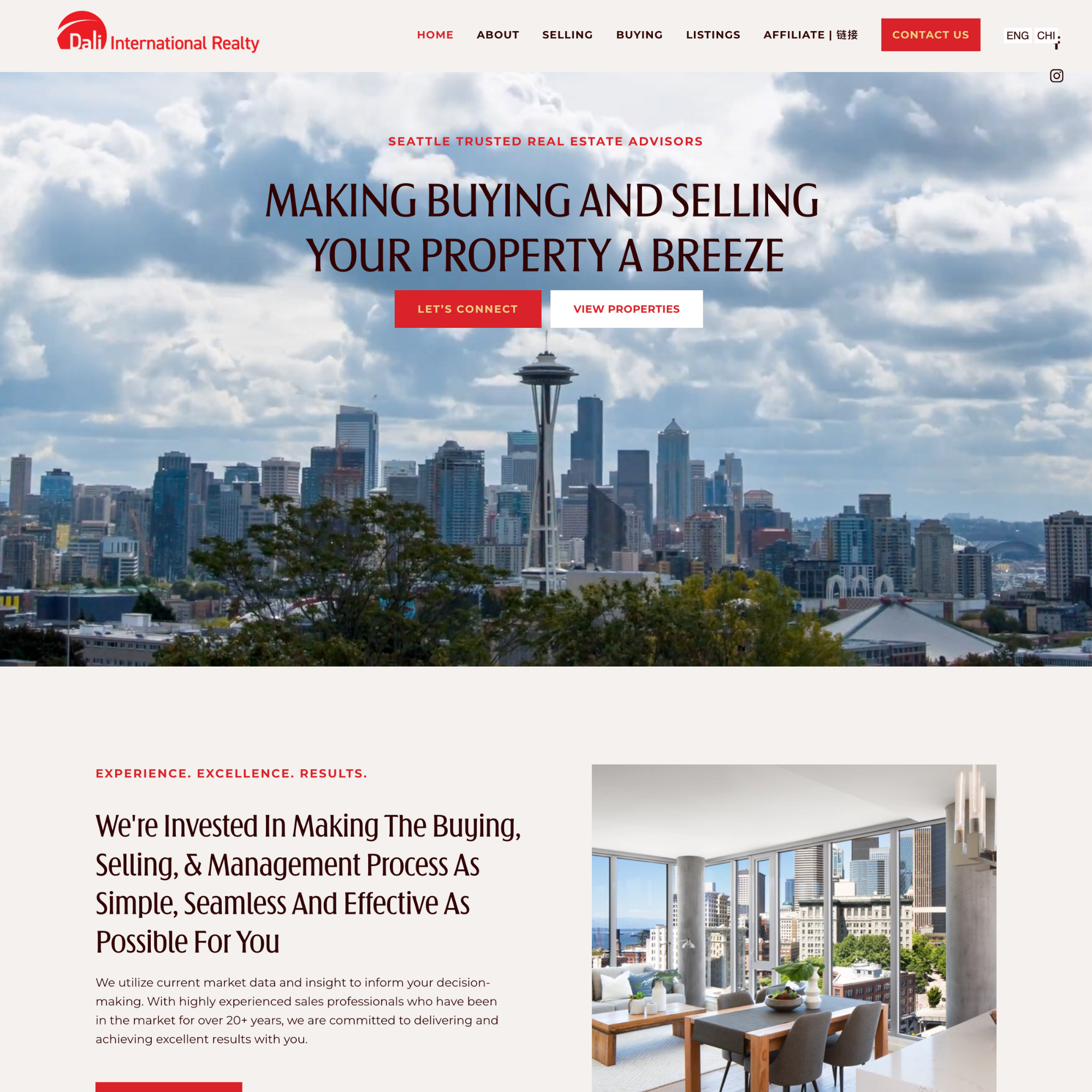
Strategic CTA Buttons: When you land on the page, the first thing you see is a beautiful view of the city, an establishment of trust, and how you won't have to break a sweat to sell properties. So, clients won't have to scroll through a lot of information before they can take action. Also, in the course of the layout, you'll see various CTA buttons at strategic places.
Reduced Bounce rate: Bounce rate is the rate at which visitors leave a website after viewing a page. This usually occurs due to boring home pages, or unnecessary information. Therefore, I ensured that visitors automatically see what DALI can achieve for them after one scroll. They can decide to buy, sell, or manage their properties, and there are CTA buttons after each service.
Effective Listing Page: Each property was listed with large images and an interactive animation that led to the property's page. Also, I ensured there was enough white space between each property to focus the visitor's eyes on one property at a time. When any of the property listings is clicked, it takes the visitor to its page, showing more pictures, details, and a Schedule A Tour CTA button.
Optimization: Since the goal is to become the biggest realty in Seattle, we focused on Local SEO, and the pages were well-optimized for search engines.
Typography
As a real estate management group, there was a need to keep everything formal and use fonts that provoke trust and professionalism. Arnika Variable, a Sans Serif font was used as the heading font. This selection was due to its clean, and classy look. It has a way of elevating any business and giving it an elegant look. Also, it is legible even in small sizes. The paragraph or body font was Montsserat is perfect for the body font because of its legible, clean and classy look. It has a reputation for being one of the best fonts for long-form texts, and its ability to retain its sharpness even in minor font points is remarkable. The overall reason for these two fonts is to keep things simple, professional, and elegant.
Pages
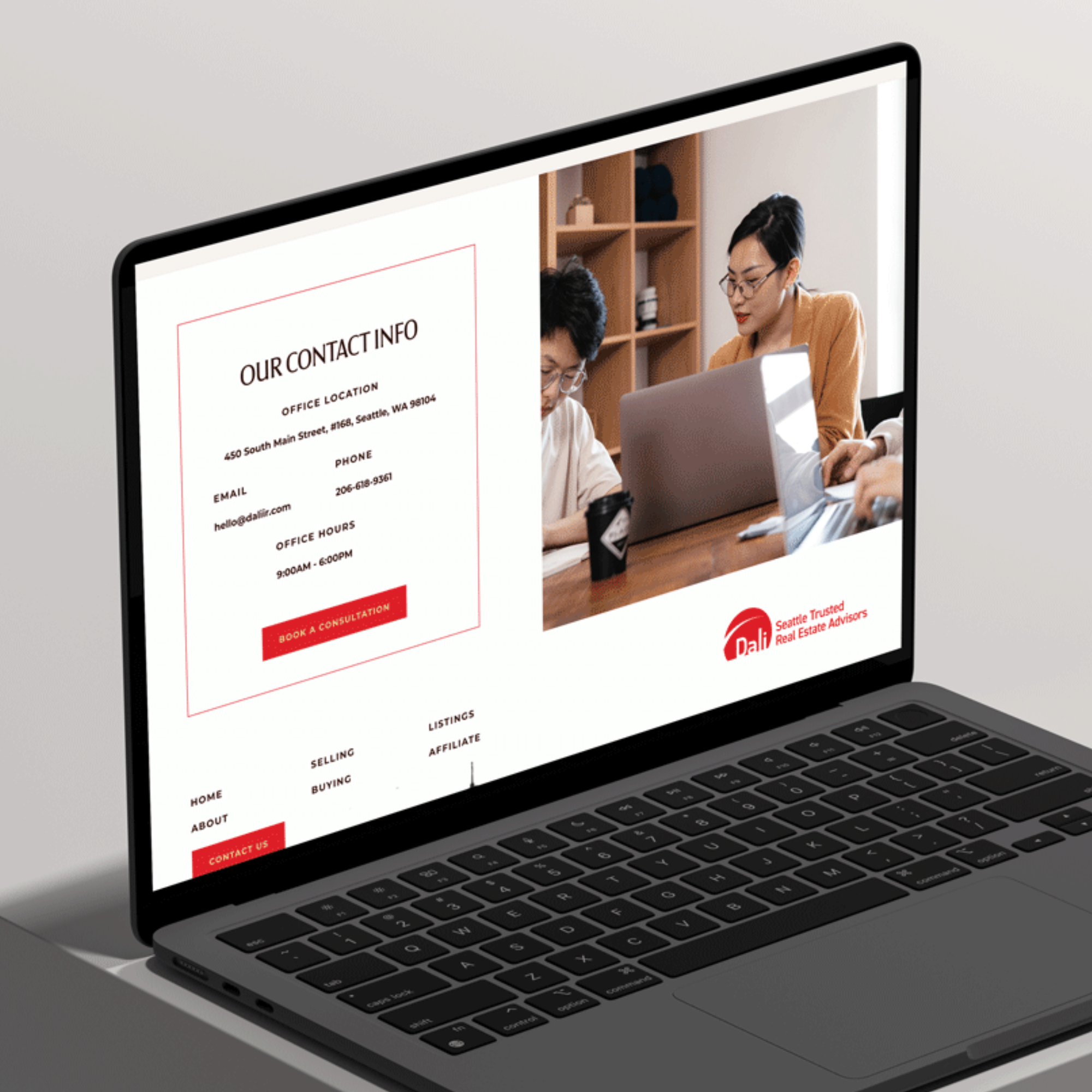
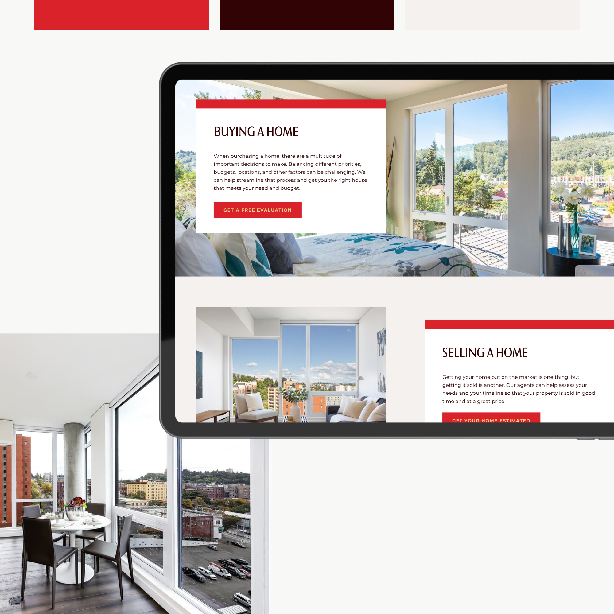
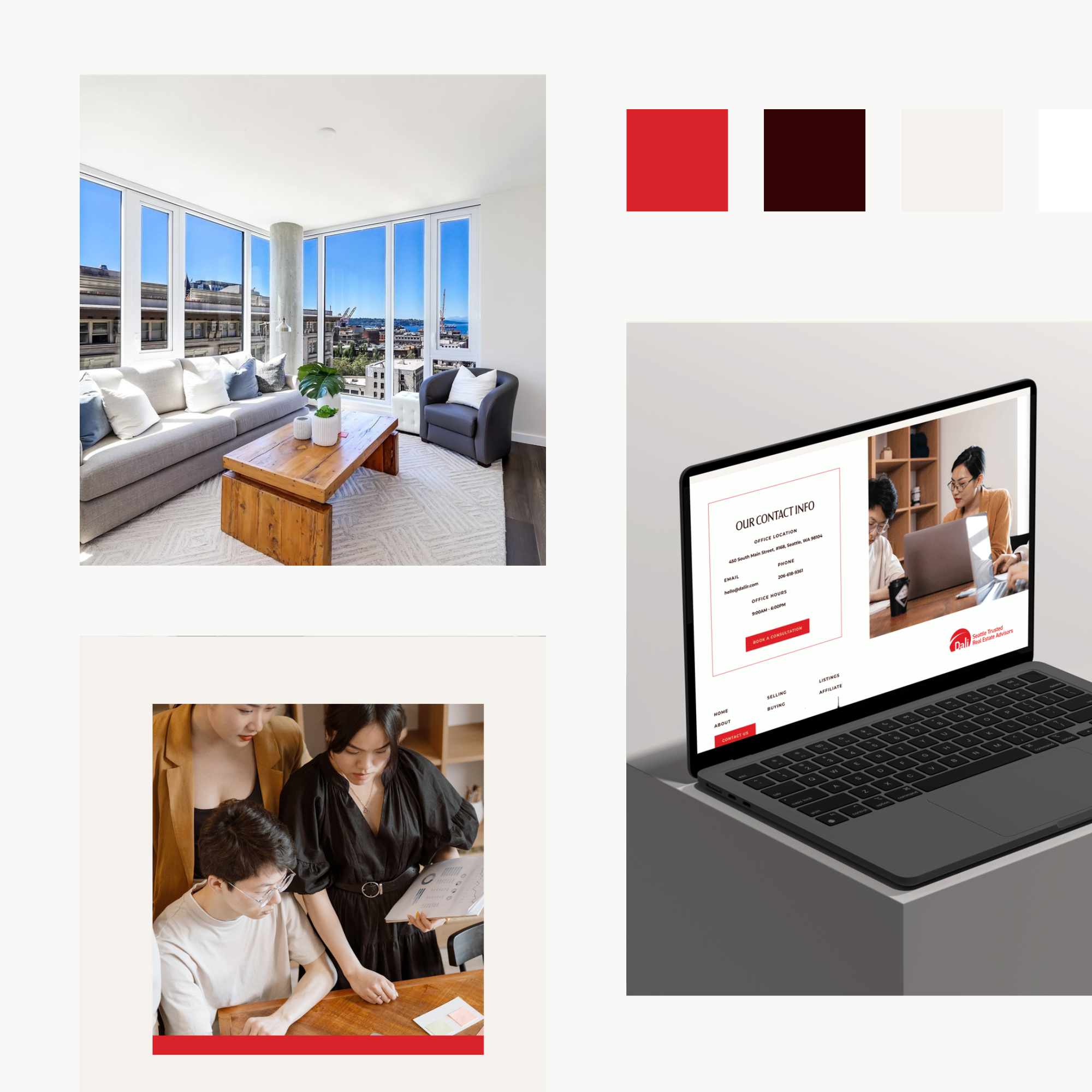
There are five main pages, and I consider them to be the best pages for DALI. There is the Selling Page where clients can get a breakdown of what the service entails, and also book an evaluation with DALI. The page was straightforward. Then the Buying Page does the same thing as the Selling Page, the only difference is that it offers a different service. Moving on to the Listings Page, it houses all the properties available for buying and explains everything a client needs to know. The About and Contact Page was well designed to compel visitors to take action. The About Page talks about the two agents and the office hours of DALI
Layout
DALI wanted a simple layout that highlights their track record and services. A classic example is DALI's homepage, it is short and strategic. Also, we went for a minimal layout that doesn't involve any distracting background and includes a lot of whitespaces to make every element stand out. Also, there are CTA buttons at strategic parts of each page.
The Final Look
After the tedious design process, DALI became one of the best-looking realty websites around Seattle. The pages are so easy to navigate, giving prospects the easiest route to take action. The clients loved it and didn't hesitate to start listing their properties.
If You Want To Build Something Similar For Your Realty Business, We've Got You!
Having a website is no longer an option, but getting the best website for your business may be the issue. It is easy to create any website, but you need one tailor-made for your business. DALI has never regretted the investment in its website because it has brought in more clients than they have imagined.
You need a great website for your business and I am here to help. We will work together to bring your dream website to reality, and you will never be left in the dark about the progress of your website. So, feel free to book a consultation with me.
If you want to take the website template route, you are also covered! We have numerous Real Estate Website Templates on the Template Shop, and you can get started with one today. It is easy to set up and it comes up with a setup guide that tells you what to do at each point of the journey. If you are too busy to start editing your website template, we can take care of everything for you. What are you waiting for? Shop Squarespace 7.1 Templates Today!
Need A Website For Your Business?
Reach out to us for a chat, no strings attached.
